

The Task Seemed Straightforward at First
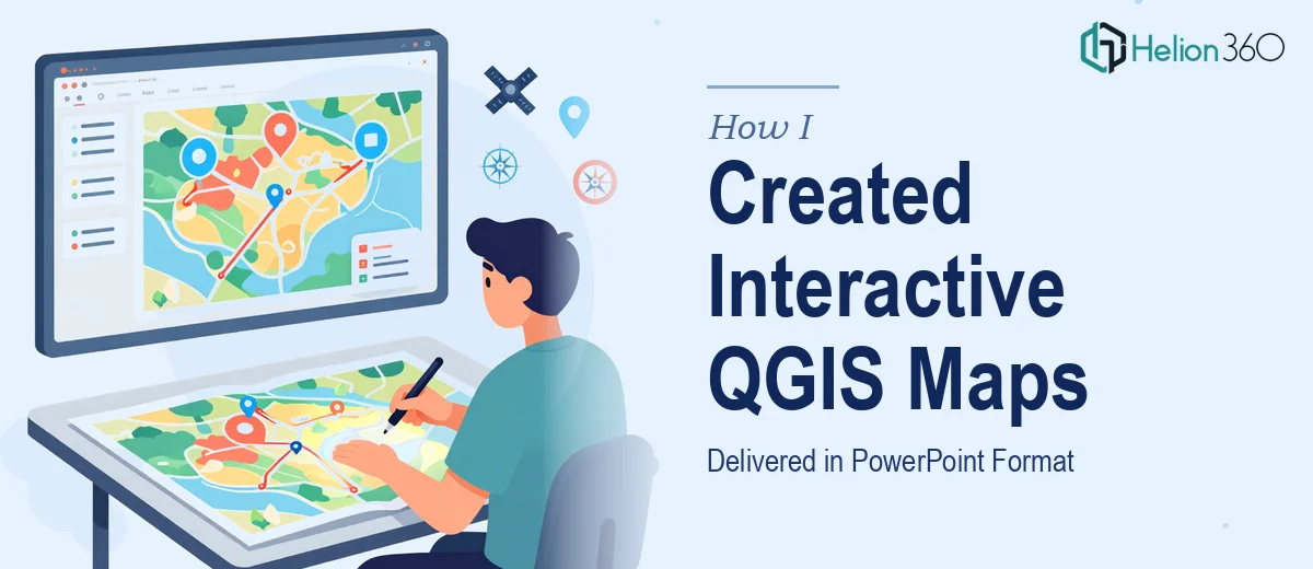
I had a list of addresses that needed to be plotted on a map. Simple enough on paper. The plan was to generate the maps in QGIS, export the relevant files, and then format everything cleanly inside a PowerPoint presentation — complete with the data laid out visually to match a reference example I had on hand.
The deadline was tight. Everything had to be ready by the next morning, which meant this entire workflow needed to happen within a few hours.
Where QGIS Gets Complicated
I've used QGIS before for basic mapping, but this project required more than dropping pins on a map. The deliverables included a QGZ project file, GPKG layer files, and a fully formatted PowerPoint with the maps and associated data presented in a specific style.
Getting the address data geocoded accurately, organizing it into the right GPKG layers, and making sure the QGIS project file was properly structured — that's a workflow that requires real familiarity with the software. Then translating all of that into a clean, presentation-ready PowerPoint without losing the visual clarity of the maps added another layer of complexity.
I started setting up the project myself, imported the addresses, and began working through the geocoding process. But when I hit issues with layer alignment and realized the PowerPoint formatting needed to match a very specific visual example, I knew this was going to take longer than I had.
Bringing in a Team That Knew the Workflow
That's when I reached out to Helion360. I explained the situation — the address list, the deliverable format, the reference example, and the overnight deadline. Their team asked the right questions immediately: the coordinate system I needed, the scale and context of the map areas, and exactly how the data should be presented alongside the maps in PowerPoint.
What stood out was that they understood both sides of the job. QGIS map creation and PowerPoint formatting are usually handled separately, but Helion360 treated it as a single integrated workflow, which was exactly what the project needed.
How the Delivery Came Together
The team geocoded the address list, built out the GPKG layer files with clean attribute data, and assembled the QGZ project file with everything properly referenced. On the PowerPoint side, they formatted each map as a clear visual slide, incorporated the relevant data points, and matched the layout to the reference example I had shared.
The final output included all three deliverables — the QGZ file, the GPKG layers, and the formatted PowerPoint presentation — delivered within the agreed timeframe. The slides were clean and the data was easy to read at a glance, which was the whole point.
What This Project Taught Me
Combining GIS data work with presentation design is more nuanced than it looks. The technical side of QGIS — managing coordinate systems, layer formats, and file structures — requires focused expertise. And turning raw map exports into a polished PowerPoint that actually communicates the data clearly is a separate skill on top of that.
When both of those things need to happen under a tight deadline, trying to do it all solo is a recipe for a rough night. Getting the right team involved early made the difference between a stressful scramble and a clean delivery.
If you're working on a similar project — address mapping in QGIS, GIS data formatted into a presentation, or any situation where spatial data visualization needs to show up clearly in PowerPoint — Helion360 is worth reaching out to. They handled both the technical and the visual sides of this project without missing a beat.
Learn more about how to approach similar challenges:
- Interactive charts for visualization can transform complex datasets into clear, at-a-glance insights — much like the map presentations in this project.
- Raw data into interactive dashboards demonstrates the same principle of converting messy source material into polished, presentation-ready outputs.