

The High-Stakes Interview Challenge
I had two critical job interviews coming up, and they both required presentation components. The hiring managers were clear about their expectations: compelling visual storytelling backed by solid data analysis. I had my research done, my outline ready, and even some rough draft slides sketched out. What I didn't have was the design expertise to transform these raw materials into presentations that would actually land me the roles.
My draft slides looked exactly like what they were—functional placeholders with bullet points, rough charts, and zero visual appeal. The data was solid, but the presentation design made it look amateur. I knew these interviews would be competitive, and my slides needed to stand out.
My Initial DIY Approach Hit Multiple Roadblocks
I spent the first week trying to polish the presentations myself. I had PowerPoint skills, but creating truly professional presentation design was a different beast entirely. My challenges quickly multiplied:
The data visualization was my biggest stumbling block. I had compelling statistics and market research, but turning spreadsheet data into clear, impactful charts that told a story proved much harder than expected. My attempts looked cluttered and confusing.
Visual hierarchy was another problem I couldn't solve. I understood the content flow, but making slides that guided the viewer's eye naturally from point to point required design principles I simply didn't know. Everything felt flat and monotonous.
Brand consistency across both presentations became overwhelming. Each company had different visual expectations, and I struggled to create cohesive design systems that felt professional while staying true to each organization's style.
Time pressure made everything worse. Between interview preparation, research, and my current job responsibilities, I was running out of hours to dedicate to design refinement.
Finding Professional Presentation Design Support
After hitting a wall with my DIY efforts, I came across Helion360. I explained my situation—two important interview presentations that needed to transition from draft concept to executive-ready deliverables. Their team understood immediately that this wasn't about flashy graphics, but about data-driven design that would support my narrative.
The Helion360 designers took my rough outlines, raw data, and content notes and began transforming them into something completely different. They didn't just make my slides prettier—they restructured the information architecture to create logical flow and visual impact.
The Data-Driven Design Transformation Process
What impressed me most was how they approached the data visualization challenge. Instead of generic charts, they created custom graphics that highlighted the key insights I wanted to emphasize. Market sizing data became clear, compelling visuals. Competitive analysis turned into clean comparison frameworks that made my strategic thinking obvious.
They established visual hierarchies that I couldn't achieve on my own. Important data points got appropriate emphasis through color, typography, and spacing. Supporting information was clearly secondary but still accessible. The slide progression felt natural and purposeful.
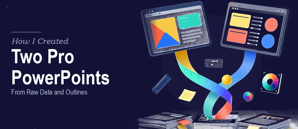
For both presentations, they created distinct design systems that felt appropriate for each company's culture while maintaining professional consistency throughout. One had a more corporate, data-heavy aesthetic. The other felt more innovative and growth-focused.
The final presentations looked like something a consulting firm would deliver to a Fortune 500 client. Every slide had clear purpose, every chart told part of the larger story, and the overall visual impact was exactly what I needed for these high-stakes interviews.
Interview Results and Key Lessons
Both interviews went exceptionally well. The presentations became conversation starters rather than obstacles. Instead of worrying about slide design during my talks, I could focus entirely on demonstrating my strategic thinking and industry knowledge.
The data visualization particularly impressed the interview panels. Complex market dynamics that would have been confusing in spreadsheet form became clear strategic insights on screen. My analysis looked credible and professional because the design elevated the content appropriately.
I learned that presentation design for interviews isn't about decoration—it's about data communication. The right visual approach makes your insights more accessible and your expertise more apparent. Professional design support can transform good content into compelling storytelling.
Ready to Transform Your Presentations?
If you're facing a similar challenge with important presentations that need to move beyond rough drafts, Helion360's presentation design team specializes in exactly this type of transformation. They understand how to take solid content and data and turn it into visually compelling, professionally polished deliverables that support your objectives.