

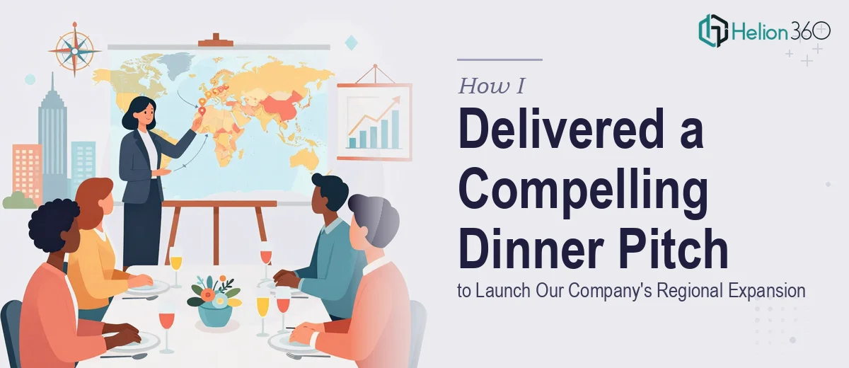
Why an Owner's Dinner Presentation Is Higher Stakes Than It Looks
An owner's dinner presentation sits at an unusual intersection of business strategy and hospitality. The setting is intimate — a room of franchisees, regional stakeholders, or ownership-group partners sharing a meal — but the content being delivered is anything but casual. A company announcing regional expansion in this format is asking the audience to trust a vision, absorb market data, and feel energized enough to act, all while passing the bread basket.
When this kind of presentation is done poorly, the consequences are surprisingly durable. Attendees leave unconvinced, questions go unanswered, and the momentum a company needs to launch a regional push never materializes. Done well, the same presentation becomes the catalytic moment the expansion story gets told from — the night everyone agreed this was the right move.
What makes it hard is that the work requires two separate skill sets operating in harmony: rigorous research that can hold up to tough questions from experienced operators, and a presentation design that feels polished enough for the occasion without being so formal it kills the room. Getting both right under a compressed timeline is where most teams underestimate the effort involved.
What This Kind of Presentation Actually Requires
The first thing to understand is that an owner's dinner presentation for a regional expansion launch is not a sales deck and it is not a board report. It occupies its own lane, and the structure has to reflect that.
The audience already has skin in the game. They are not being sold the company — they are evaluating whether the expansion thesis is sound. That means the presentation needs to lead with data that earns credibility before it asks for enthusiasm. Market size, demographic trends, competitive white space, and site-selection logic all need to appear early and be defensible.
Beyond the data, the narrative arc matters enormously. The best presentations in this format move through a clear sequence: here is where we are, here is what the market data tells us about where the opportunity is, here is the specific expansion plan, here is what success looks like, and here is what we are asking from you tonight. Each section needs to close before the next opens — audiences at a dinner event are not willing to hold five open loops simultaneously.
Finally, the visual quality has to match the occasion. A franchisee evaluating a six- or seven-figure market entry decision will draw unconscious conclusions from the professionalism of the slides. Inconsistent fonts, misaligned charts, or a color palette that drifts across slides quietly erodes confidence in the organization's operational rigor.
The Right Approach: Research, Structure, and Design Working Together
Building the Research Foundation First
The research layer of a regional expansion presentation is where the work either becomes credible or falls apart. The core data set typically needs to cover four areas: regional market sizing, competitive density mapping, target customer demographic profiles, and unit-economics benchmarks from comparable markets.
For market sizing, the approach that holds up best combines top-down TAM figures from industry research with a bottom-up calculation anchored to the specific geography. If the expansion targets a metro area of 2.4 million people with a 12% addressable segment, the presentation should show both numbers and explain the methodology. Audiences with operating experience will spot a TAM figure that was reverse-engineered from a desired conclusion.
Competitive density mapping benefits from a visual layer — a geographic overlay showing existing competitor locations, population concentration, and proposed entry points. This is one of the clearest cases where a well-built data visualization does more work than three paragraphs of text ever could. Tools like Esri ArcGIS or even a cleanly formatted Power BI map visual can carry this section, as long as the underlying data has been verified against current sources rather than pulled from a two-year-old industry report.
Demographic profiling for the target region should go beyond median income and age brackets. The owner audience will want to see traffic patterns, daytime population versus residential population, and any relevant behavioral data that validates why this region fits the brand's customer profile.
Structuring the Narrative for a Dinner Setting
A dinner presentation typically runs 20 to 35 minutes before Q&A, which translates to roughly 18 to 25 slides at a comfortable pace. The structure that works best opens with a two-slide market opportunity summary — a single headline stat and a visual that frames the regional opportunity — before moving into the supporting evidence.
The expansion plan section should be anchored to a timeline with three to four milestone markers, not an exhaustive Gantt chart. The audience needs to see the shape of the plan, not the project management detail. A clean phased rollout visual showing Phase 1 (months 1–6), Phase 2 (months 7–18), and Phase 3 (months 19–36) gives operators the orienting context they need without overwhelming the slide.
The ask slide — what the company is specifically requesting from owners in the room — should appear as its own full slide near the end, not tucked into a crowded closing summary. If the ask involves territory commitments, development schedules, or investment thresholds, those numbers need to be visible and legible at 24pt or larger. Burying financial specifics in 14pt footnote text is a version of hoping no one notices, and experienced operators always notice.
Design Decisions That Signal Credibility
A well-executed owner's dinner presentation follows a disciplined visual system. The typography hierarchy should run at three levels: a primary headline at 36pt, supporting body statements at 24pt, and data callouts or source citations at 16pt. Charts need axis labels that are readable without squinting — 12pt minimum on any projected surface.
The color palette should hold to the brand's primary colors with no more than one accent color introduced for data highlights. Palette drift — where blue shifts slightly across slides because assets were pulled from different source files — is one of the fastest ways to make a presentation look assembled rather than designed. Setting a master slide with exact hex values at the start of the build prevents this entirely.
Animation, if used, should be limited to entrance transitions for data reveals — a bar chart building left to right or a map populating point by point. Anything faster than a 0.5-second duration feels rushed on a large projector screen, and anything decorative that doesn't serve the data narrative should be removed.
What Goes Wrong When This Work Is Rushed
The most common failure mode is skipping the research audit phase and moving straight into slide production. Teams under deadline pressure start building slides before the data has been verified, and then spend the back half of the timeline patching inconsistencies — often introducing new errors in the process. The result is a presentation that looks complete but contains figures that contradict each other across slides.
A second pitfall is misreading the audience and calibrating the depth of data incorrectly. An owner's dinner is not a consumer marketing event — the room is full of people who have read P&L statements and evaluated real estate deals. Presenting market data without methodology, or showing projections without a basis, will generate skeptical questions that derail the Q&A.
Inconsistency across deliverables compounds quickly when multiple people contribute to the same deck. If three team members each format a chart section independently, the output will have three different chart styles, two different legend positions, and at least one font that doesn't match the master. A single controlled template with locked styles is the only reliable defense against this.
Underestimating the polish pass is also pervasive. The gap between a working draft and a presentation that is ready for a high-stakes dinner is real and takes time — typically two to four hours of alignment checks, spacing corrections, and export testing for the specific display environment. Skipping this step because the content feels complete is a decision that shows up visibly on the night.
Finally, building a one-off deck from scratch rather than from a reusable master template means all of that structural thinking disappears after the event. For a company executing a multi-phase regional expansion, a well-architected template is a durable asset that pays forward.
What to Carry Forward From This
The work involved in a strong owner's dinner presentation is genuinely cross-disciplinary — it requires credible research, clear narrative architecture, and disciplined visual execution all landing together. Treating any one of those three as secondary produces a presentation that is visibly unbalanced, regardless of how strong the underlying business case actually is.
The investment in getting it right is proportionate to what is being asked. If owners are being invited to commit capital and market territory based on what they see in that room, the presentation needs to hold up under scrutiny from every angle.
If you would rather have this kind of work handled by a team that builds research-backed, design-ready presentations every day, Helion360 is the team I would recommend. Learn more about how to design high-impact presentation slides for major business events, or explore how to structure data-driven presentations that convert stakeholder buy-in.