

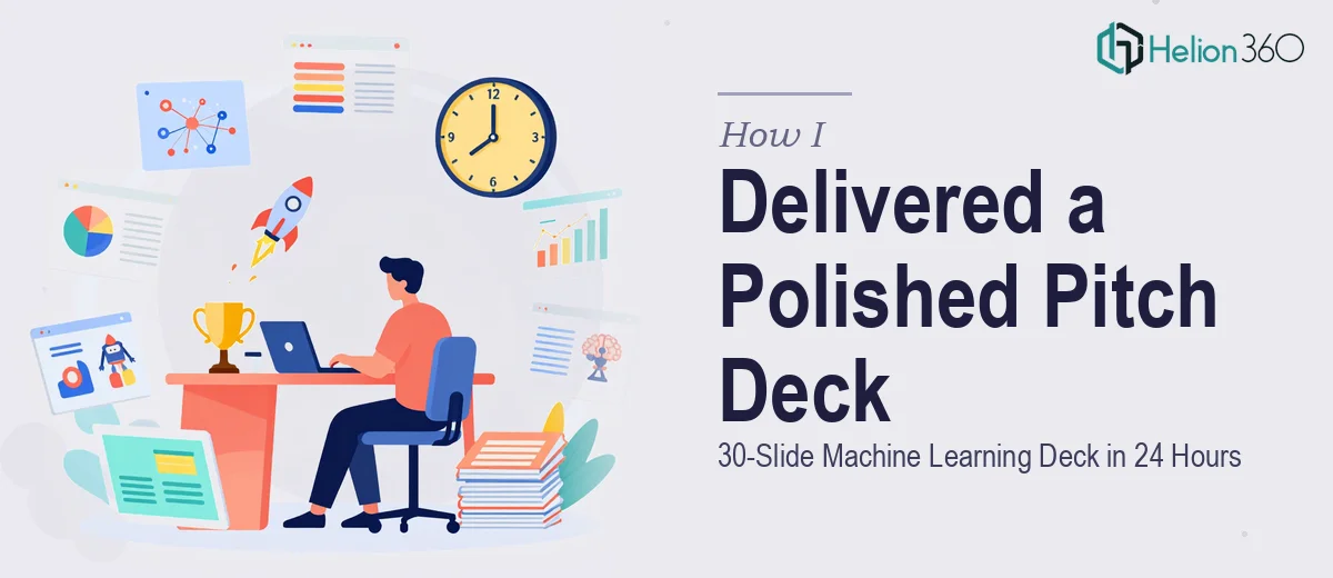
The Situation and What Was Actually at Stake
We had a window. A real one. A meeting with a group of venture capital investors was locked in, and the clock was moving fast. The pitch deck we had — a rough, text-heavy draft with mismatched fonts and zero visual hierarchy — wasn't going to cut it. This wasn't an internal update. It was the presentation that would either open a conversation about funding or close it before it started.
The stakes weren't just about looking polished. Investors see dozens of decks a week. A startup pitch deck that can't communicate its story quickly, clearly, and confidently gets skipped. Ours needed to show the machine learning product, the market opportunity, and the team's credibility — all without losing the room three slides in. I could see immediately that this needed to be done properly, not just cleaned up.
What I Found the Solution Actually Required
I spent a few hours understanding what a genuinely strong investor pitch deck involves before deciding how to approach it. What I found was that the gap between a passable slide deck and one that actually works in a VC room is substantial.
First, the narrative architecture matters as much as the visuals. The story has to follow a logic investors already expect — problem, solution, market size, traction, team, ask — but the way each slide builds on the last has to feel earned, not mechanical. Second, the data visualization layer is its own discipline. Charts showing market projections, model accuracy, or revenue trajectory need to be the right chart type for the claim being made, properly scaled, and visually clean. A bar chart dropped in from a spreadsheet with default colors and gridlines reads as amateur. Third, slide-level visual discipline — consistent type hierarchy, a constrained brand palette, aligned layout grids — requires applying the same rules across 25 to 35 slides without drift. That consistency is what makes a deck feel like a designed artifact rather than a collection of slides.
Each of those layers is a skill set on its own. Together, under a real deadline, they made it obvious this wasn't a weekend task.
What Doing This Well Actually Looks Like
The structural work starts with a full narrative audit of the source material. A strong startup pitch deck runs 25 to 35 slides, with each slide mapped to a single idea — no slide should carry more than one argument. The practitioner's job is to read the draft content, identify where the story breaks, and reroute it so momentum builds toward the ask. That means cutting slides that duplicate each other, reordering sections where the logic jumps, and writing crisp headline statements (typically 8 to 12 words) that carry the argument even if the body copy disappears. For someone without experience in pitch narrative structure, this audit alone can take the better part of a day — and getting it wrong means the visual work that follows is built on a flawed foundation.
The visual mechanics layer is where technical precision becomes non-negotiable. A proper layout uses a consistent grid — typically 12 columns with defined margin gutters — applied through master slides so that every element snaps to the same spatial logic across the full deck. Typography runs on a clear three-level hierarchy: a display size around 36pt for slide headlines, a body size around 24pt for primary content, and a supporting size around 16pt for captions or labels. Color is constrained to a maximum of four brand colors with defined usage rules — primary, secondary, accent, and neutral. Setting this system up correctly in slide master view, so it propagates without manual adjustment on each slide, is a process that takes real hours and breaks easily if you're not fluent in it.
Data visualization inside a pitch deck carries its own set of demands. Each chart type has to match the claim: a line chart for trend over time, a grouped bar chart for category comparison, a scatter plot for correlation. Axes must be scaled without distortion, and labels need to be legible at presentation size — not just at 100% zoom on a laptop screen. Infographic panels that summarize market size or technology architecture need to translate complexity into a visual a non-technical investor can parse in under ten seconds. Designing these elements so they feel integrated with the deck's visual system — rather than pasted in from another source — requires both design skill and judgment about what the audience actually needs to see.
Why I Brought in Helion360 to Handle It
I looked at the scope honestly. The narrative restructuring, the layout system, the data visualization, the brand consistency across 30 slides — all of it under a 24-hour window. Attempting it myself wasn't realistic, and the cost of a weak deck in front of investors wasn't a risk worth running.
Helion360 handled the full project end-to-end. That meant taking the rough draft, restructuring the narrative arc, building the visual system from the ground up, and designing every slide — charts, infographics, layout, typography — to a consistent professional standard. They turned it around fast. The kind of work that would have taken me weeks to learn and execute properly was delivered in a fraction of that time. The deck came back complete: 30 slides, fully designed, brand-consistent, with data visualizations that were clean and investor-ready. No handholding required on my end, no back-and-forth over basics.
The Outcome and What I'd Tell Anyone in My Spot
The deck we walked into that meeting with was a different document entirely. The story was clear, the visuals held attention without overwhelming the content, and the data slides communicated quickly. The investor conversation moved forward. That outcome traces directly to having a presentation that communicated credibility before anyone in the room said a word.
If you're looking at the same situation — a real deadline, a high-stakes investor or stakeholder audience, and a draft that isn't close to ready — check out how a polished investor pitch deck delivered fast transforms outcomes, or see what it takes to get an investor pitch deck polished across the finish line. Helion360 is the team to engage. They do this work end-to-end, they have the expertise and tooling already in place, and they deliver fast.