

The Brief Sounded Simple. The Reality Was Not.
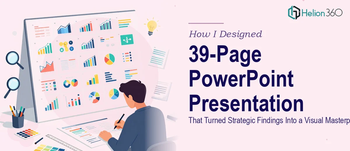
When our leadership team decided we needed a comprehensive 39-page PowerPoint presentation to communicate our quarterly strategic findings, I volunteered to take the lead. I had decent PowerPoint skills, a clear content outline, and four weeks to get it done. On paper, it felt manageable.
The deck needed to do a lot. It had to walk senior stakeholders through months of research, translate data-heavy findings into clear visuals, maintain consistent branding across every slide, and still feel engaging — not like a wall of text with some charts dropped in.
I started building. And within the first week, I realized the gap between "a decent presentation" and "a polished PowerPoint design that actually persuades" was much wider than I had anticipated.
Where the Process Started Breaking Down
The content wasn't the problem. We had solid strategic findings, clear data, and a strong narrative thread. The challenge was translating all of that into 39 cohesive slides without losing clarity or visual consistency.
I spent hours trying to make charts look clean, aligning icons, adjusting color palettes to match our brand, and wrestling with slide layouts that just didn't hold together. Every time I fixed one section, something else looked off. The data visualization slides in particular were a mess — too much information, unclear hierarchy, and no visual logic tying them together.
I also underestimated how much time feedback rounds would eat into the schedule. The content team had revisions. The design kept shifting. And I was doing this alongside my regular workload.
By the end of week two, I had 18 slides that looked acceptable and 21 that still needed significant work. The deadline wasn't moving.
Bringing in the Right Help
After stepping back and honestly assessing the situation, I reached out to Helion360. I explained what we were trying to build — a 39-page corporate presentation that needed to be visually sharp, data-rich, and easy for any executive to follow in a single sitting.
Their team asked the right questions upfront: What's the audience? What's the tone — formal or conversational? Where are the data-heavy slides and what story should each one tell? Do we have a brand guide?
That intake conversation alone gave me confidence. They weren't just going to make things look prettier. They were thinking about the presentation as a communication tool.
I handed over everything — the content brief, the rough slides I had built, our brand colors and fonts, and notes from the content team's feedback sessions.
What the Design Process Actually Looked Like
Helion360 started by restructuring the slide architecture. They identified where the narrative flow had gaps and suggested a cleaner progression through the sections — opening context, key findings, supporting data, implications, and next steps. That logic made every slide easier to design because each one had a clear purpose.
For the data visualization slides, they created custom chart formats that made the numbers readable at a glance. Rather than overcrowded bar charts, they used a mix of simplified visuals, callout stats, and supporting annotations that guided the reader's eye without overwhelming them.
The branding was consistent from slide one to thirty-nine — same typographic hierarchy, same grid structure, same color application logic. It looked like one cohesive document, not a deck assembled by three different people across two weeks.
They also built in a master slide template, so any future updates could be made without breaking the design system.
The Outcome and What I Took Away
We delivered the final 39-page PowerPoint presentation on time. The feedback from leadership was direct — it looked professional, it was easy to follow, and the data felt clear rather than overwhelming.
Looking back, the lesson wasn't that I lacked skill. The project required a level of design precision, visual storytelling expertise, and structured workflow that goes beyond what most of us can reasonably do in parallel with other responsibilities and a tight deadline.
What worked was knowing when to bring in people who do this every day. A well-executed presentation design isn't just about making slides look good — it's about making complex information feel simple, and that takes real craft.
Need Help With a Complex Presentation?
If you're staring down a large, high-stakes PowerPoint deck and the timeline is tighter than you'd like, Helion360 is worth reaching out to. Their team steps in where the work gets genuinely complex — and delivers something you'd actually be proud to present.