

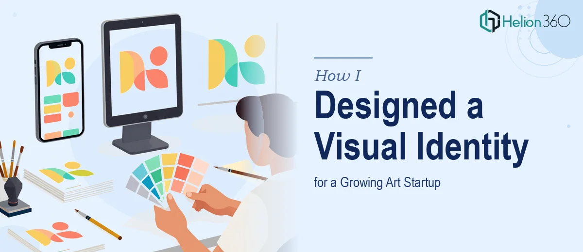
Why Visual Identity Is Make-or-Break for an Art Startup
Art startups occupy a peculiar position in the branding landscape. The work they produce is inherently visual, which means the standards their own brand is held to are immediately higher. A mismatched logo, inconsistent typography, or a color palette that shifts between platforms does not just look careless — it actively undercuts the credibility of an organization whose entire value proposition is aesthetic judgment.
The stakes become clearer when you consider how many surfaces a growing art startup must cover at once: an Instagram grid, a website, printed exhibition materials, pitch decks for gallery partnerships, email newsletters, and digital press kits. Each of those surfaces has different technical requirements. Without a deliberate visual identity system built to scale across all of them, the brand fractures — slowly at first, then all at once when a high-visibility opportunity arrives and the assets are not ready.
Done well, a multi-platform visual identity system gives a small team the leverage to look like a much larger, more established organization. That perception gap is often the difference between landing a partnership and being passed over.
What a Proper Visual Identity System Actually Requires
A visual identity system is not a logo and a color palette stored in a Google Drive folder. It is a structured set of decisions — about hierarchy, flexibility, and constraints — that allows the brand to be applied correctly by different people across different contexts without constant oversight.
The work starts with brand architecture: understanding what the organization is, who it speaks to, and what emotional register it needs to occupy. For an art startup, that might mean sitting with questions about whether the brand should feel editorial and cerebral, warm and community-driven, or bold and commercial. Those distinctions ripple into every downstream design decision.
From there, good execution requires four things that rushed work routinely skips. The system needs a typographic hierarchy that holds across screen and print. It needs a color architecture that is flexible enough for variety but constrained enough for cohesion. It needs a set of layout principles — grid logic, white space rules, compositional signatures — that make the brand recognizable even without a logo in frame. And it needs file infrastructure: master files, export presets, and naming conventions that make future production fast and error-resistant. Each of these is its own body of work. Together they form something an organization can actually use.
How the Design Work Gets Done
Building the Typographic System
Typography is the fastest signal of brand maturity, and it is where art startup identity systems most often feel unresolved. The right approach establishes a three-level hierarchy: a display face for headlines and titles, a text face for body copy and captions, and a monospaced or utility face for labels, metadata, and functional UI elements where needed.
Size relationships matter as much as font choice. A workable starting hierarchy for digital contexts runs at 48pt for display, 24pt for section headers, and 16pt for body text, with captions at 12pt. On print materials the absolute sizes shift, but the ratio logic stays the same. Locking these as named text styles in Figma — or as paragraph styles in InDesign for print — means any team member pulling a template will apply the right scale automatically rather than eyeballing it.
For an art startup, pairing a geometric sans-serif display face with a humanist serif for body copy tends to thread the needle between contemporary and considered. That combination reads as cultured without being cold.
Constructing the Color Architecture
The palette for a growing startup needs to be simultaneously distinctive and versatile. The right structure caps the primary brand palette at four colors: one dominant, one secondary, one accent, and one neutral. Beyond four, the system starts to feel undefined rather than rich.
Each color also needs specified values across three systems: HEX for web, RGB for screen production, and CMYK for print. Skipping the CMYK specs is a common shortcut that creates expensive surprises when exhibition banners or printed lookbooks come back from the printer looking nothing like the digital mockups. A well-documented color system includes a note on the closest Pantone equivalent for each primary brand color, even if spot-color printing is not currently in use — because it will be eventually.
For an art startup with a warm, contemporary positioning, a palette anchored by a deep warm black (something like #1A1714), an off-white (#F5F0EA), a signature accent in a muted terracotta or sage, and a secondary neutral works well across both digital and printed surfaces.
Defining the Layout Principles
Grid logic is what separates a brand that feels coherent from one that feels like a collection of individually competent pieces. The foundational choice is between a 12-column grid for maximum layout flexibility across digital contexts and a simpler 4-column or 6-column grid for print collateral where the compositions are more constrained.
For multi-platform work, the 12-column grid is the right backbone. It subdivides cleanly into halves, thirds, and quarters, which means a layout built for a website header can be adapted for a social graphic, a pitch deck slide, or a printed program without breaking the underlying proportions. The margin and gutter values need to be set as a percentage of canvas width rather than fixed pixel values so they scale correctly across artboard sizes.
Composition signatures — the recurring visual moves that make a brand feel like itself — are the third element of layout identity. These might include a consistent use of full-bleed photography cropped to a specific aspect ratio, a recurring diagonal element derived from the logo, or a signature use of generous white space that signals premium positioning. Documenting these as annotated examples in the brand guidelines file is what makes them reproducible rather than dependent on a single designer's intuition.
File Infrastructure and Naming Conventions
A visual identity system only delivers value if the files that contain it are organized in a way that survives staff changes and scale. The master brand folder should be structured around output type — digital, print, social, presentation — with subfolders for each. Logo files need to exist in at least six versions: full color on light, full color on dark, single color black, single color white, icon mark only, and horizontal lockup. Each should be exported as SVG, PNG at 2x resolution, and EPS.
Naming conventions follow a simple pattern: BrandName_Asset_Variant_Version. For example, ArtStartup_Logo_FullColor_Light_v1.svg. Versioning matters — it prevents the wrong file from being used in production and creates a recoverable history if a direction is reversed.
What Goes Wrong When This Work Is Rushed
The most common failure is treating the logo as the deliverable and everything else as secondary. A logo without a supporting system is not a brand identity — it is a mark. The surrounding typography, color, and layout decisions are where the brand actually lives day to day, and skipping their documentation means every new asset becomes a judgment call rather than an application of an established system.
Color drift is the second most consistent problem. When HEX, RGB, and CMYK values are not locked from the start, colors shift incrementally each time a new designer or contractor touches the files. Over six months and a dozen deliverables, the brand starts to look like it has multiple personalities. The fix is always more painful than the original discipline would have been.
Underestimating the polish gap is another place things fall apart. There is a real distance between a brand system that looks good in a Figma presentation and one that holds up when a team member tries to apply it under deadline to a press release header or a last-minute event graphic. The system needs to be stress-tested against edge cases — long headlines, small-format applications, dark backgrounds — before it is declared finished.
Building assets as one-offs instead of locked templates is the silent killer of brand consistency at the startup stage. Every time a team member recreates a social graphic from scratch rather than pulling from a locked template, there is drift. Master templates in Canva, Figma, or Google Slides — each connected to the brand color and type system — reduce that drift to near zero without requiring design expertise from the people using them.
Finally, reviewing final files alone, late in the process, is a quality failure waiting to happen. Fresh eyes catch what familiarity misses: a slightly off-center logo lockup, a body copy size that dropped to 14pt on one slide variant, a CMYK value that was never updated from an earlier draft.
What to Hold Onto After Reading This
The real insight in multi-platform visual identity work is that the system is the product — not any individual asset. A logo is memorable. A system is defensible. Every hour spent building the grid logic, color architecture, typographic hierarchy, and file infrastructure pays back in compounding consistency across every future touchpoint the brand touches.
Starting with documentation rather than production is the discipline that separates identity work that scales from identity work that needs to be rebuilt in eighteen months.
If you would rather hand this work to a team that builds brand identity systems every day, Helion360 is the team I would recommend.