

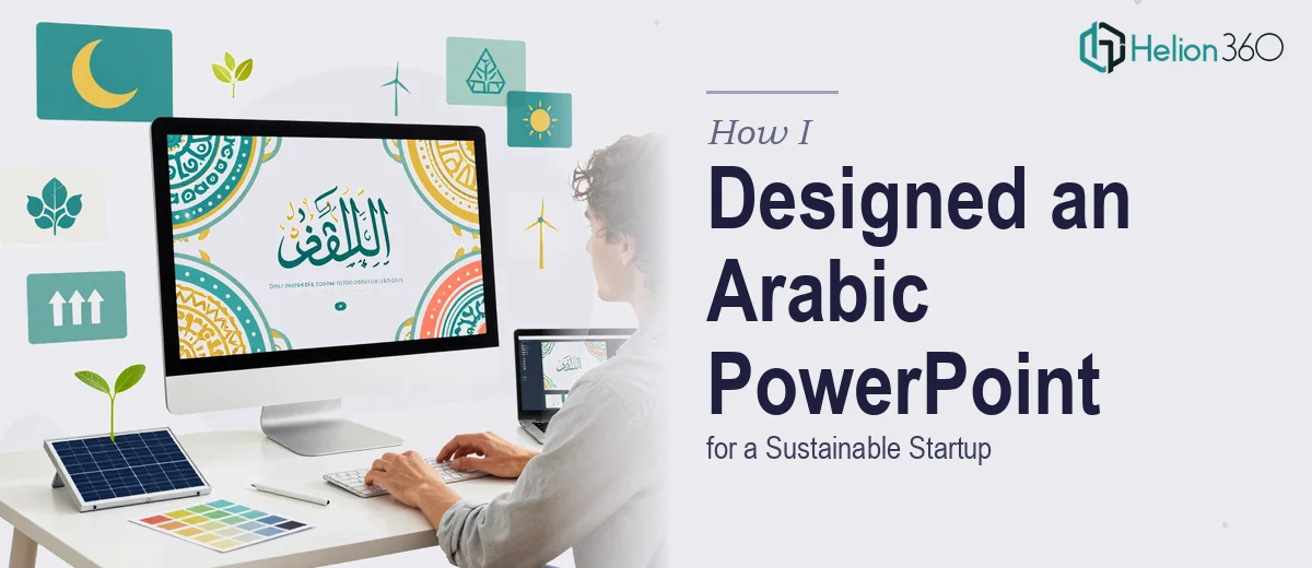
Why Arabic Presentation Design Is a Different Kind of Challenge
Most presentation design advice assumes a left-to-right reading world. When the audience reads Arabic — and especially when the brand sits in the sustainability or cleantech space — that assumption breaks almost everything: layout logic, text alignment, chart labels, icon placement, and even the implied flow of a narrative arc.
The stakes are real. A pitch deck or investor presentation that feels visually inconsistent, or that forces Arabic text into a left-to-right frame, signals to the audience that the creator does not understand the market. For a sustainable startup trying to build credibility in the GCC region or with Arabic-speaking investors, that first impression is costly. Done well, an Arabic PowerPoint presentation communicates the same authority and polish that a world-class English deck would — it just requires a fundamentally different construction approach from the first slide.
This post walks through what that construction actually looks like: the layout decisions, typography choices, color logic, and structural details that separate a professional Arabic presentation from a hurried translation job.
What Professional Arabic Presentation Design Actually Requires
The most common misconception is that designing for Arabic is a translation task followed by a text-flip. It is not. The text direction is only one of several systems that need to be rebuilt.
First, the entire slide canvas must be mirrored. In a right-to-left (RTL) layout, the visual weight of a slide sits on the right side. Navigation cues, progress indicators, section headers, and slide numbers all shift accordingly. A design that simply flips body text but keeps a left-anchored logo, left-aligned headline, and left-to-right progress bar will feel fractured to a native Arabic reader.
Second, typography selection is critical and severely constrained. Not every Arabic typeface is appropriate for a professional presentation. A sustainable startup needs a typeface that reads as modern and legible at 24pt body size — something in the Noto Sans Arabic, GE SS Two, or Tajawal family, depending on brand tone. Mixing a heavy decorative Arabic script with a clean Latin sans-serif for any English labels will create jarring visual tension across the deck.
Third, the data visualization layer — charts, timelines, infographics — needs to be rebuilt rather than mirrored. Chart axes that read left-to-right in English need to be reoriented so that the baseline and value progression flow intuitively for RTL readers. This is not automatic in PowerPoint and requires manual reconstruction of each chart object.
Fourth, the sustainability narrative itself shapes the slide structure. A cleantech or sustainability-focused startup typically needs to communicate mission, market opportunity, technology differentiation, and impact metrics — in that sequence. Mapping that story arc across Arabic slides requires understanding both the rhetorical conventions of the target audience and the visual language of the sector.
How to Build the Deck Correctly From the Ground Up
Establishing the RTL Canvas and Grid
The work starts in PowerPoint's Language and Direction settings. Setting the presentation-level text direction to Right-to-Left propagates through new text boxes, but it does not automatically reorient existing design elements. Every master slide in the Slide Master view needs to be reviewed — placeholder positions, footer zones, logo placement, and slide number positioning all require manual repositioning to mirror the intended layout.
A reliable grid for Arabic presentations uses a 12-column structure with a 32px margin on the right edge (the primary entry point for RTL readers) and a 24px margin on the left. Content columns group in sets of four for a three-zone layout: right zone for headline and lead visual, center zone for supporting data or body text, left zone for secondary elements or white space. This is the inverse of a standard English deck grid, and it matters because it controls where the eye lands first on every slide.
For a sustainable startup brand, the master slide typically includes a right-anchored logo lockup, a right-aligned slide title in the primary brand typeface at 36pt, and a right-aligned subtitle or section label at 20pt. Body text sits at 16pt minimum — going smaller in Arabic reduces legibility disproportionately compared to Latin scripts because of the connected letterform structure.
Typography and Color System
The typography hierarchy for a professional Arabic deck follows a clear three-level system: 36pt for slide titles, 24pt for section subheadings or callout text, and 16pt for body content. Anything below 14pt in Arabic body copy is essentially unreadable at normal projection distance.
For a sustainability-focused brand, the color palette typically draws from nature-adjacent tones — deep greens in the #1A5E3A to #2D8653 range, warm earth neutrals around #C8A97E, and an accent color (often a clean teal or sky blue near #4ABFBF) for data highlights and call-to-action elements. The palette caps at four brand colors: one primary, one secondary, one neutral, one accent. Every additional color introduced without system logic creates visual noise that undermines credibility.
When the deck needs to carry both Arabic and English content — as is common for startups pitching to bilingual audiences — the safest approach is to use a dual-language pairing: Tajawal for Arabic and Inter or Source Sans Pro for Latin characters. Both are open-license, both share proportional harmony, and both render cleanly at standard presentation resolutions (1920×1080px at 96dpi).
Structuring the Sustainability Narrative Across Slides
A sustainable startup pitch deck in Arabic typically runs 14 to 18 slides. The narrative sequence that works best in the GCC context opens with the impact statement (why this matters to the region), moves to the problem definition, then the solution and technology layer, followed by market sizing, business model, traction, team, and a clear funding ask.
Each slide should carry one dominant idea. The cover slide needs the brand mark, the company name in both Arabic and English, and a single line of Arabic positioning text — nothing more. A common mistake is loading the cover with a mission statement, a tagline, and a visual — which fragments the first impression.
For the impact metrics slide — critical for sustainability startups — data visualization needs special care. A horizontal bar chart showing carbon reduction figures, for example, should have its category labels on the right side and value axis on the left, reversing the standard PowerPoint default. The bars extend leftward. This sounds minor but reads as immediately natural to an Arabic audience and signals that the designer understood the audience deeply.
What Goes Wrong When This Work Is Underestimated
The most common failure mode is treating the Arabic version as a derivative of an English master deck. This produces a presentation where the grid, the visual hierarchy, and the reading flow all fight the language direction — and experienced Arabic readers notice it immediately, even if they cannot articulate exactly what feels wrong.
A second persistent pitfall is font substitution errors. When a file built on a licensed Arabic typeface is opened on a machine without that font, PowerPoint substitutes a default — often Times New Roman Arabic or Arial Unicode — which destroys both the visual weight and the line-height spacing of every text block. Building the deck with embedded fonts (File > Options > Save > Embed fonts in the file) prevents this, but it is skipped surprisingly often.
Inconsistent alignment across slides is the third major issue. In a 16-slide deck, even a 4px drift in the right margin alignment between slides is visible when the deck is presented in full-screen mode. Locking element positions using PowerPoint's Size and Position panel (right-click > Format Shape > Position) — rather than dragging — is the only reliable way to maintain consistency across the full slide count.
Fourth, charts pulled from Excel and pasted as linked objects will often reset to left-to-right axis orientation when the source file is refreshed. Any chart that carries data critical to the pitch — market size, revenue projection, impact metrics — should be unlinked and manually formatted after import to protect the RTL orientation.
Finally, the gap between a working draft and a presentation-ready file is consistently underestimated. Alignment review, export quality checks (export to PDF and verify Arabic text renders correctly), and a cold-eyes review from a native Arabic reader each add meaningful time. Skipping any of these steps is how decks ship with obvious errors that erode the credibility of the entire pitch.
What to Carry Forward
Designing a professional Arabic PowerPoint presentation for a sustainable startup is a systems problem, not a translation problem. The RTL canvas, the typography hierarchy, the color logic, the chart orientation, and the narrative structure all need to be built intentionally from the first slide — not retrofitted from an English template.
The result, when done correctly, is a deck that feels native to its audience: one that earns attention and trust before the presenter says a single word. If you would rather have this handled by a team that builds Arabic and multilingual presentations every day, Helion360 is the team I would recommend.