

Why Strategic Presentations So Often Miss the Mark
There is a specific kind of PowerPoint that organizations need when they are communicating direction — not just reporting results, but explaining where the business is going, why, and how each team or initiative connects to the bigger picture. This is the strategic presentation: vision decks, annual planning reviews, OKR rollouts, leadership alignment sessions.
When this kind of presentation is done badly, the damage is real. Stakeholders leave the room with different interpretations of the same slides. Initiatives look disconnected from strategy. Leaders present confidently but audiences walk away confused. The work gets repeated in follow-up emails, one-on-ones, and clarifying calls that should never have been necessary.
Done well, a strategic presentation does something harder than it looks: it takes a complex, multi-layered organizational story — vision, goals, key results, initiatives, owners, timelines — and arranges it so that every audience member follows the same thread from start to finish. That is a design problem as much as a communication problem, and it deserves to be treated as one.
What This Kind of Presentation Actually Requires
Building a strong strategic PowerPoint presentation is not a formatting exercise. It is a structural exercise first, and a visual exercise second. The distinction matters because most people reach for slide templates before they have answered the foundational question: what is the logical sequence of decisions and priorities this audience needs to follow?
The work requires four things done properly. First, a clear information hierarchy — the relationship between vision, goals, and initiatives must be visually explicit, not implied. Second, a consistent visual language — color, typography, iconography, and layout must reinforce meaning rather than just decorate slides. Third, slide-level discipline — every slide should carry one idea, and that idea should be named in the headline, not buried in the body. Fourth, an honest audit of what the audience actually needs to know versus what the presenter wants to say. Those are rarely the same list.
Skipping any of these produces a deck that looks professional on the surface but fails under pressure — when a skeptical CFO asks a hard question, or when someone tries to share the deck asynchronously and finds it impossible to follow without the presenter in the room.
How to Actually Build the Deck
Start With the Architecture, Not the Slides
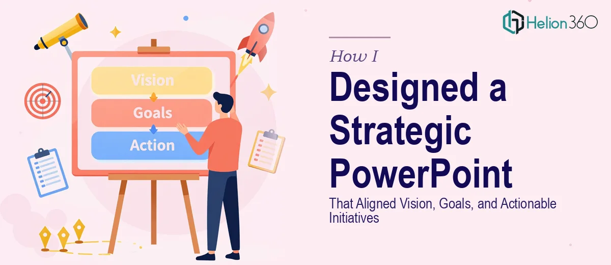
The right approach begins with a content map, not a blank PowerPoint file. The content map defines the three-tier structure: vision at the top, strategic goals at the second level, and initiatives or actions at the third. A well-structured strategic deck typically carries four to six goals beneath one vision statement, with two to four initiatives beneath each goal. That produces a logical hierarchy of roughly 12 to 20 initiative-level items — manageable enough to present in one session, substantial enough to feel complete.
Once the hierarchy is mapped, each tier gets assigned a slide type. The vision gets one anchor slide — a single sentence or phrase, large, centered, with no competing information. Each strategic goal gets a section divider slide and one supporting slide that names the goal, states why it matters, and lists its top initiatives. Initiatives live on a summary grid or roadmap slide that makes relative priority and timing visible at a glance.
Build a Visual System Before Opening a Template
The visual system should be defined before any slide is built. For a strategic presentation, the palette should hold no more than four brand colors — one primary action color for key callouts, one secondary for supporting elements, one neutral background, and one dark text color. Typography follows a three-level hierarchy: a 36pt heading for slide titles, 24pt for sub-labels or category names, and 16pt for body or annotation text. Smaller than 16pt at standard projector distance is functionally invisible.
A 12-column grid underlies every slide layout. The practical implication of this is that two-column layouts align at column 6, three-column layouts align at columns 4 and 8, and all iconography snaps to the same baseline regardless of slide type. This grid-based consistency is what makes a 30-slide deck feel unified rather than assembled.
For example, a goal slide might place the goal headline in columns 1–8 at 36pt, with a supporting metric or rationale in columns 9–12 in a callout box using the primary action color. An initiative grid slide might place four initiative cards across the 12-column span, each containing an icon, a two-line title at 24pt, and a status indicator. The rules stay the same; the content changes.
Structure the Narrative Arc Deliberately
The slide sequence in a strategic presentation follows a recognizable argument structure: context, then direction, then plan. Context slides establish where the organization is today — a single market landscape view, one internal performance summary, no more than three data points per slide. Direction slides introduce the vision and each strategic goal in turn. Plan slides connect goals to initiatives, initiatives to owners, and owners to timelines.
A common structural choice for the roadmap is a swim-lane timeline — one horizontal lane per strategic goal, with initiatives plotted as blocks across a four-quarter or 12-month span. Done in PowerPoint, this is built using the SmartArt timeline base and then converted to shapes to allow precise cell-level formatting. The resulting chart makes cross-initiative dependencies visible in a way that a simple table never can.
One more technique that consistently improves strategic decks: write every slide headline as a conclusion, not a category label. Instead of writing "Q3 Priorities" write "Three initiatives are ready to scale in Q3." The distinction is small in effort and large in clarity.
What Goes Wrong When This Work Is Rushed
The most common failure is jumping straight to slide production without completing the content architecture. The result is a deck that covers everything but communicates nothing — 45 slides of dense text, no clear hierarchy, no thread connecting vision to action.
A second pitfall is color drift across a long deck. When slides are built incrementally over days or weeks, hex codes get approximated, new colors creep in, and by slide 30 the palette has expanded from four colors to nine. The fix is a named color palette saved in the PowerPoint theme file before any slide is built, not added as an afterthought.
Third, strategic decks frequently underestimate the effort required to build the roadmap slide correctly. A swim-lane timeline that looks clean in a screenshot takes three to four hours to build properly in PowerPoint — shapes need to snap to a consistent row height of roughly 48pt per lane, label text needs to clear a 4pt internal margin, and the entire structure needs to survive a slide resize without breaking.
Fourth, presenting a working draft to a senior audience is a specific kind of mistake. The gap between a draft that is 80% complete and a presentation that is ready to land is not 20% of the total effort — it is closer to 40%. Alignment, spacing, animation timing, and export resolution all compound in the final pass, and those details are invisible to the person who built the deck after hours of close work.
Finally, building each strategic presentation from scratch rather than from a template library means the organization can never move fast in a high-stakes moment. A reusable slide system with locked masters, consistent style guides, and pre-built slide types for goals, initiatives, and roadmaps saves four to six hours on every subsequent deck.
What to Remember When You Approach This Work
The quality of a strategic PowerPoint presentation is determined long before the design begins. Architecture first, visual system second, slide production third — in that order, always. The most expensive mistake is reversing that sequence.
Every structural and visual decision should serve one outcome: an audience that finishes the presentation with the same understanding of the strategy that the presenter intended to communicate. That clarity is worth the extra planning time.
If you would rather have this kind of strategic presentation built by a team that does this work every day, Helion360 is the team I would recommend.