

Why LinkedIn Visual Content So Often Falls Flat
LinkedIn has become a genuinely competitive content environment. Brands and startups publishing text posts alone are losing ground to those pairing ideas with sharp visual content — infographics, illustrated diagrams, and cartoon-style graphics that stop the scroll and communicate something meaningful in seconds.
The problem is that most LinkedIn illustrations miss the mark in one of two directions. Either they are too generic — stock-art adjacent, visually bland, and forgettable — or they are too cluttered, trying to say everything at once and ending up communicating nothing clearly. Neither failure is a design accident. Both trace back to a misunderstanding of what this kind of visual work actually requires.
When it is done well, a LinkedIn infographic or original illustration does something specific: it takes a complex idea — a process, a comparison, a data story, a concept — and renders it in a form a reader can grasp in under ten seconds. That is an unusually demanding brief. The gap between a rough concept sketch and a finished, brand-consistent, platform-ready graphic is wider than most people expect.
What This Kind of Illustration Work Actually Requires
Building LinkedIn-ready infographics and cartoon-style illustrations is not a single skill — it is a stack of decisions that need to be made correctly and in the right sequence.
The first requirement is clarity of concept before any drawing begins. The illustrator needs to understand what singular idea the graphic is meant to convey. A technology stack diagram, a process flow, a before-and-after comparison — each has a different visual logic, and trying to force a complex idea into the wrong format produces confusion rather than comprehension.
The second requirement is vector-native execution. LinkedIn graphics that will be repurposed across formats — carousel slides, cover images, web embeds — must be built as scalable vector files in Adobe Illustrator. Raster-based work looks sharp at one size and blurry at another. A well-structured .ai file with properly named layers and grouped objects is the difference between a graphic that lives for one post and an asset that gets used consistently for months.
The third requirement is brand coherence. A startup's LinkedIn presence should feel visually consistent across every post. That means the illustration style, color palette, typography choices, and icon language all need to align with the brand's existing identity — not just look generally professional.
The fourth is platform awareness. LinkedIn crops, compresses, and renders images in specific ways. Knowing the safe zones, the optimal dimensions (1200 × 627px for standard link posts, 1080 × 1080px for square feed graphics), and how much detail survives compression is part of the craft.
The Anatomy of a Well-Executed LinkedIn Illustration
Establishing the Visual Language First
Before a single object is drawn, the right approach defines the visual system that will govern the entire piece. This means settling on three things: the illustration style, the color palette, and the typographic hierarchy.
For LinkedIn content aimed at a startup or tech brand, the illustration style typically lands somewhere between clean flat design and semi-realistic isometric graphics. Cartoon-style characters work well for humanizing concepts — onboarding flows, team dynamics, customer journeys — while flat icon-driven diagrams work better for technical subject matter like architecture maps or process flows.
The color palette should be anchored to the brand's primary colors with no more than four active hues plus a neutral background tone. In practice, that means a primary brand color for key callouts, a secondary accent for supporting elements, a dark tone for text and outlines, and white or off-white for breathing room. More than four colors in a LinkedIn graphic reads as chaotic at feed scale.
Typography inside the illustration should follow a two-level hierarchy: a label size around 14–16pt for primary callouts and a supporting annotation size around 10–12pt for secondary information. Anything smaller than 10pt will be unreadable after LinkedIn's compression renders it at mobile size.
Building the Infographic Structure
The structural logic of an infographic determines whether a viewer can follow it without instruction. The approach that works consistently is to assign a clear reading direction — top to bottom for process flows, left to right for timelines, center-outward for concept maps — and then use visual weight to reinforce that direction.
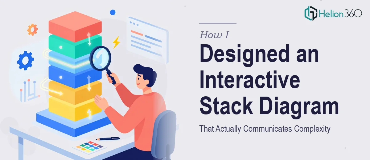
Consider a technology stack diagram as a worked example. The natural structure is vertical: infrastructure at the base, platform services in the middle tier, application layer at the top. Each tier gets a distinct background band (using tonal variations of the brand palette, not entirely new colors), and connecting arrows use a single consistent stroke weight — 2pt works reliably at LinkedIn dimensions. Icon size across the diagram should be uniform within each tier, roughly 40×40px at the native file resolution, so the visual grid reads as intentional rather than assembled randomly.
For a process-flow infographic — say, a five-step customer onboarding sequence — the approach shifts to a horizontal ribbon structure with numbered nodes. Each node should be the same geometric shape (circles or rounded rectangles, not a mix), the connector lines should be a consistent 1.5pt stroke with an arrowhead no larger than 8pt, and the step labels should sit below the node rather than inside it to avoid crowding. This keeps the graphic readable even at 800px wide, which is roughly where LinkedIn renders it in a desktop feed.
Cartoon-Style Illustrations for Human-Centered Topics
Cartoon-style graphics for LinkedIn require a different construction approach. The characters and scenes need to feel consistent — same face proportions, same limb style, same color fill logic — across every piece in a series. The way to enforce this in Adobe Illustrator is to build a character library as a reusable symbol set. The primary character is constructed once with all its component parts on separate named layers (head, torso, arms, legs, accessories), then saved as a linked asset that gets posed and recolored for each new scene.
Skin tones, clothing colors, and background scene elements should all pull from the same brand-defined palette. A startup that uses deep navy, coral, and warm white as its brand colors should have those exact hex values — not visual approximations — applied to every character element. Color drift across a post series is one of the most common quality failures in LinkedIn illustration work, and it is almost always caused by eyedropper-sampling rather than working from locked swatches.
What Goes Wrong When This Work Is Under-Resourced
The most common failure is skipping the concept definition phase and going straight into execution. An illustrator handed a vague brief — "make something that explains our product" — without a defined message hierarchy will produce something visually competent but strategically incoherent. The graphic looks like an infographic but does not actually inform.
A second recurring problem is inconsistency across a post series. When each LinkedIn graphic is treated as a standalone one-off rather than part of a system, small variations compound quickly. Icon stroke weights drift from 1pt to 2pt across posts. The brand blue shifts from #2B4EAF in one graphic to something slightly warmer in the next because the swatch was not locked. These differences are individually minor but collectively destroy the brand's sense of visual professionalism.
Underestimating file hygiene is another persistent issue. Illustrator files with unlabeled layers, ungrouped objects, and embedded raster images inside vector files are extremely difficult to update efficiently. A properly structured file — with named layers, grouped component sets, and all fonts outlined or embedded correctly — saves hours when revisions come in, and revisions always come in.
Exporting without checking compression behavior is a quieter failure but a real one. LinkedIn applies its own JPEG compression to uploaded images. A graphic that looks crisp in Illustrator can emerge from LinkedIn's processing looking muddy around fine lines and small text. The mitigation is to export at 2× the target display size — so a 1080px square graphic exports at 2160px — which gives the compression algorithm more information to work with and preserves edge quality.
Finally, treating the first draft as the finished asset is a mistake that shows up constantly. There is always a meaningful gap between a working draft and something that ships at a professional standard — spacing needs tightening, optical alignment corrections need to be made by eye rather than by grid alone, and the graphic needs to be reviewed at actual LinkedIn feed size before it is considered done.
What to Take Away From All of This
The core insight is that LinkedIn infographics and cartoon-style illustrations are system design problems as much as they are drawing problems. The visual quality of any single graphic matters, but what builds a brand on LinkedIn is consistency — a recognizable style, a locked palette, a repeatable structure — applied reliably across every piece of content.
If you have the time to build that system carefully and the tools to execute it at a vector level, this work is absolutely doable in-house. If you would rather hand it to a team that does this kind of illustration and infographic work every day, Helion360 is the team I would recommend.