

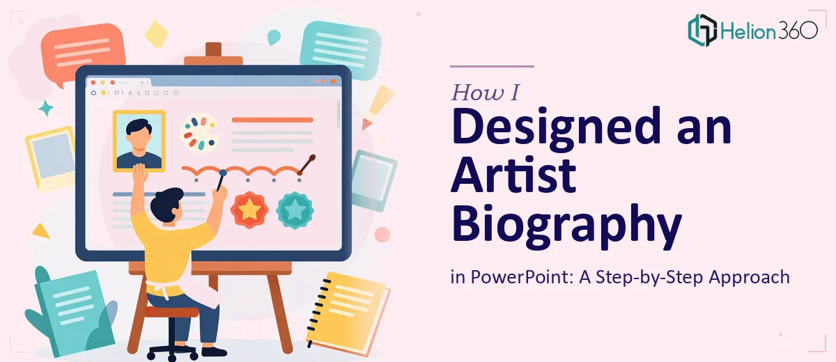
When a Simple Biography Became a Design Challenge
I thought it would be straightforward. An artist biography in PowerPoint — a few slides, some photos, a clean layout, and done. But the moment I sat down to actually build it, I realized the gap between what I imagined and what I could execute on my own was much wider than I expected.
The artist I was working with had a rich visual identity — bold textures, layered imagery, a distinct color palette. The biography needed to feel like an extension of that creative world, not just a formatted document with a profile photo slapped on a title slide.
What I Tried to Do First
I started with a blank PowerPoint file and a folder full of high-quality images. My first instinct was to use one of the built-in templates, but none of them came close to capturing the personality and tone the artist needed. The default layouts felt corporate and flat — exactly the opposite of what this project called for.
I spent time manually adjusting fonts, trying to create custom backgrounds, and experimenting with image placement. I managed to get something together, but it lacked visual cohesion. The typography felt inconsistent, the image sizes clashed with the text, and the overall flow did not tell a story — it just presented information.
An artist biography presentation is not just a slide deck. It is a visual narrative. It needs to carry the viewer through the artist's journey in a way that feels intentional and emotionally resonant. I could write the content and organize the structure, but translating that into polished PowerPoint design was a different skill set entirely.
Bringing in Professional Help
After spending more time than I had budgeted trying to fix the design myself, I reached out to Helion360. I explained what the project was — a biography presentation for a working artist, built in PowerPoint, designed to feel personal and high-end. I shared the images, a rough content outline, and a few visual references.
Their team asked the right questions immediately. They wanted to understand the artist's style, the intended audience, and how the presentation would actually be used — whether it was for gallery submissions, press kits, or digital sharing. That kind of brief-taking made a difference.
What the Final Design Looked Like
Helion360 returned a presentation that genuinely surprised me. The layout had a strong visual hierarchy — large, well-cropped images anchored each slide, with typography that complemented rather than competed with the artwork. They used a consistent color system pulled directly from the artist's existing work, which gave every slide a sense of belonging to the same creative universe.
The biography itself was broken into thoughtful sections — an opening statement, a timeline of key career moments, notable exhibitions, and a closing slide that felt like an invitation rather than an ending. Each section had its own visual treatment, but the whole thing read as a single, unified presentation.
What stood out most was how the design handled the images. Rather than using them as decoration, the team integrated them structurally — full-bleed backgrounds, layered transparencies, and intentional white space that let the artwork breathe.
What I Learned From This Project
Designing an artist biography in PowerPoint is genuinely different from building a standard business presentation. The stakes for visual consistency are higher. The typography choices carry more weight. And the layout needs to serve the artist's identity, not just organize information.
I came into this thinking PowerPoint was a limitation. What I saw in the finished slides changed that view. With the right design approach, PowerPoint can produce presentation work that looks completely custom — nothing off-the-shelf about it.
The experience also clarified when it makes sense to push through on your own and when to bring in someone who works on this kind of material regularly. For a project where the visual output reflects directly on the artist's professional reputation, getting the design right was not optional.
If you are working on something similar — an artist biography, a portfolio presentation, or any project where personal identity needs to come through in the slides — Helion360 is worth a conversation. They took a rough concept and turned it into something that looked exactly as considered as the artist's work itself.