

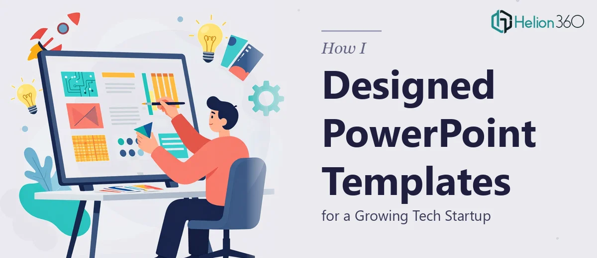
When One Presentation Format Is Never Enough
When our startup started gaining real traction, the presentation problem became impossible to ignore. Every department was spinning up its own slides — product launches, market trend reports, investor updates, customer-facing decks — and none of them looked like they came from the same company. Fonts were inconsistent, colors were off-brand, and the layouts felt like they had been grabbed from random free template sites.
I decided to solve this properly. The plan was straightforward: design a master company PowerPoint template that anyone on the team could pick up, customize for their use case, and present with confidence. It sounded like a weekend project. It was not.
What I Tried Before Hitting a Wall
I started by pulling together our brand guidelines — logo files, hex codes, typography choices — and opened PowerPoint's Slide Master view. I had used PowerPoint for years, so I figured setting up a proper template would be manageable. I built a few base layouts, set the color theme, and applied the fonts globally.
But the moment I tried to make the template genuinely flexible, things got complicated. A layout that worked for a product launch slide looked cluttered when used for financial projections. The placeholder system I set up for data points was too rigid — team members kept breaking the structure when they tried to customize it. I also realized I had no clear solution for slides that needed to work across multiple contexts: investor conversations, internal reviews, and sales pitches all have very different visual needs.
I had the raw materials. What I lacked was the design thinking to turn them into a cohesive, reusable system.
Bringing in the Right Team
After a few weeks of reworking the same layouts without real progress, I reached out to Helion360. I walked them through what we needed: a branded PowerPoint template system that was modern, professional, and genuinely easy for non-designers to use. I shared our brand assets, explained the different presentation types we needed to support, and described the data placeholder requirements.
Their team took it from there. They did not just build a single template — they approached it as a design system. Each slide layout was built with a specific purpose in mind, and the placeholders were set up so that plugging in financial projections, customer testimonials, or market data felt natural rather than forced.
What the Final Template System Looked Like
A Slide Library Built Around Real Use Cases
Helion360 delivered a full slide library covering the presentation types we actually use. There were clean title slides, section dividers, data-heavy layouts with chart placeholders, text-and-visual balance slides for storytelling, and quote-style layouts for testimonials. Every layout shared the same visual language — same grid, same spacing logic, same brand colors — but each was optimized for its specific content type.
Placeholder Logic That Actually Works
This was the part I had struggled with most. The placeholders in the final template were not just text boxes dropped onto a slide. They were thoughtfully placed content zones that preserved layout integrity even when the content inside them changed. A financial projection table could be swapped out without breaking the surrounding design, and a testimonial block could be updated without the whole slide falling apart.
Modern Design with Practical Flexibility
The visual style was clean and current — minimal use of heavy graphics, strong typographic hierarchy, and smart use of negative space. The color system made it easy to apply light or dark backgrounds depending on context. The template also included guidance notes on how to use each layout, which made onboarding the rest of the team much faster.
What Changed After We Launched the Template
The difference was immediate. Teams stopped building slides from scratch and started producing consistent, polished presentations in a fraction of the time. Our product launch decks, market research presentations, and investor updates now all look like they belong to the same brand. The customizable PowerPoint template became the foundation for how we communicate externally and internally.
I also came away with a better understanding of what a well-built template actually requires. It is not just design — it is information architecture, user behavior, and brand consistency all working together. That is a harder problem than it looks on the surface.
If you are in a similar spot — trying to build a professional, flexible PowerPoint template system for your company but finding it harder than expected — consider Business Presentation Design Services. If you want to learn from real examples, check out how others have tackled similar challenges: cohesive PowerPoint master slides and business PowerPoint presentations that simplify complex data offer practical insights on solving this exact problem.