

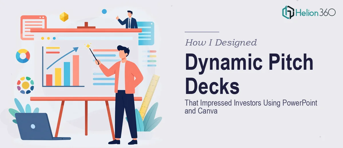
The Pressure of Making a Pitch Deck Actually Work
When our startup started gaining early traction, the pressure to present well to investors became very real. I had sat through enough pitch meetings to know that a cluttered, inconsistent slideshow could quietly kill a conversation before it even got started. We had the story. We had the numbers. What we needed was a startup pitch deck that made all of it land visually.
I decided to take the first pass myself. I had used PowerPoint for years for internal reports and team updates, and I had a working knowledge of Canva from putting together quick marketing graphics. Between the two tools, I figured I could pull something together that looked polished enough for an investor room.
Where Things Started to Break Down
The early slides came together reasonably well. I built a clean title slide in Canva, grabbed a few icons, and translated the general layout into PowerPoint so everything would be editable and consistent. But the further I pushed into the deck, the more I realized how different a startup pitch deck is from anything I had designed before.
The problem was not a lack of effort. It was the gap between knowing what I wanted visually and being able to execute it at a high enough level. The slide hierarchy felt flat. The data visualizations I built in PowerPoint looked functional but not compelling. The Canva elements I brought in looked slightly disconnected from the PowerPoint slides — different padding, inconsistent font weights, a subtle mismatch in tone that I could feel but could not fully fix on my own.
Investors notice these things. Maybe not consciously, but a deck that looks assembled rather than designed sends a quiet signal about how the team operates.
Bringing in a Team That Knew Both Tools
After hitting that wall, I came across Helion360. I explained the situation — a startup pitch deck that needed to work across both PowerPoint and Canva assets, with a tight timeline and investor meetings already scheduled. Their team understood immediately and took it from there.
What I noticed first was how quickly they identified what was not working. The slide structure was reorganized to create a clearer visual narrative. The data slides were rebuilt with custom charts that actually communicated the key numbers without overwhelming the viewer. The Canva-sourced elements were either reworked natively in PowerPoint or replaced with original design elements that matched the overall visual language of the deck.
Every slide followed a consistent visual hierarchy — headline, supporting visual, key takeaway — so the investor's eye moved exactly where it needed to go.
What the Final Deck Actually Delivered
The finished pitch deck looked like something built by a team that knew what they were doing, which, of course, it was. But more importantly, it felt cohesive. The PowerPoint file was fully editable, which meant I could update numbers and talking points without breaking anything. The Canva-informed design elements added a modern, startup-friendly aesthetic without looking generic.
When we walked into our next investor meeting, the deck did what it was supposed to do. It reinforced the story we were telling rather than competing with it. The feedback from that round was noticeably different from earlier meetings — investors were asking forward-looking questions instead of getting stuck on unclear slides.
What I Learned About Presentation Design for Startups
The experience changed how I think about presentation design. The tools — whether PowerPoint, Canva, or anything else — are just part of the equation. What actually matters is understanding visual storytelling, slide hierarchy, and how an investor's attention moves through a presentation. Those are not things you pick up from a tutorial. They come from experience working on compelling pitch decks across many different contexts.
Using both PowerPoint and Canva together can work well, but only when someone manages the relationship between the two intentionally. Otherwise you end up with a deck that looks like it was assembled from parts rather than built as a whole.
If you're working on a startup pitch deck and finding that the gap between what you have and what you need is bigger than expected, Helion360 is worth reaching out to — they handled exactly that kind of problem for us and delivered work that held up in the room.