

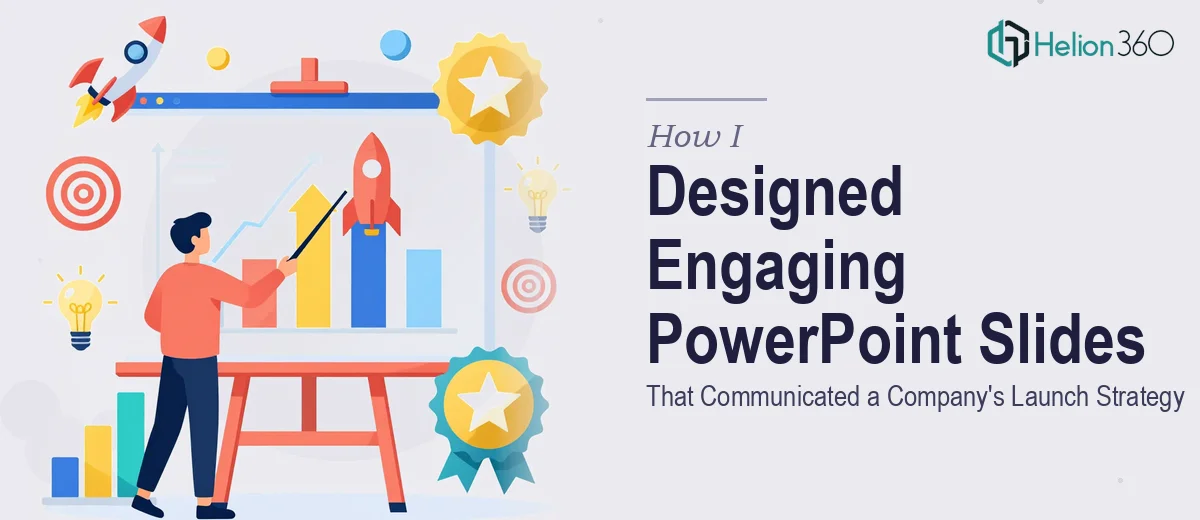
When the Vision Is Clear but the Slides Are Not
When we started planning our company launch, I felt reasonably confident about the strategy itself. We had a clear value proposition, a defined target market, and a roadmap that made sense on paper. What I did not anticipate was how difficult it would be to turn all of that into a PowerPoint presentation that actually communicated the message well.
I sat down and opened PowerPoint with the best intentions. I knew what I wanted each slide to say. I had the data points, the key goals, and even a rough idea of the flow. But somewhere between knowing the content and laying it out on a slide, things started falling apart.
The Gap Between Content and Design
My first attempt looked exactly like what it was — a collection of bullet points and placeholder charts arranged with no real visual logic. The slides were heavy with text, the color palette was inconsistent, and the graphs I tried to insert felt disconnected from the narrative. It did not look like a launch strategy. It looked like meeting notes.
I tried adjusting fonts, swapping backgrounds, and experimenting with layouts for a couple of days. I even downloaded a few free PowerPoint templates, hoping one of them would do the heavy lifting. None of them fit the tone I was going for, and adapting them took more time than starting from scratch.
The problem was not that I lacked the content — it was that translating a business plan into engaging PowerPoint slides requires a skill set that goes beyond knowing what you want to say. Layout, hierarchy, data visualization, and visual storytelling all have to work together, and getting that right takes real design experience.
Bringing in the Right Help
After hitting that wall, I came across Helion360. I explained the situation — that I had solid content for a company launch presentation but needed someone to shape it into something that would hold an audience's attention and communicate the strategy clearly. Their team asked the right questions about tone, audience, and branding, and then took it from there.
What happened next was not just a design job. They structured the slides in a way that created a natural story arc — opening with the vision, moving through the market opportunity, and landing on the strategy and goals in a way that felt logical and compelling. The data I had provided was turned into clean, readable charts and infographics rather than raw tables. Every slide had a clear visual focus, which meant the audience would know exactly where to look.
What the Final Presentation Looked Like
The difference between my draft and the finished deck was significant. Slides that had previously been walls of text were now clean, focused, and visually balanced. The graphs illustrated the points they were meant to support rather than just sitting there as decorative elements. The overall design felt consistent — same type treatment, same color system, same visual language from the first slide to the last.
More importantly, the presentation felt confident. When you are launching a company and asking people to believe in your vision, the way you present matters as much as what you present. A well-designed deck signals that you have thought things through.
What I Took Away from the Process
This experience taught me something practical: knowing your content is not the same as knowing how to present it. A business launch strategy involves complex ideas — market positioning, competitive advantages, growth projections — and communicating all of that clearly in a slide format requires real design thinking, not just formatting.
I also learned that being open to creative input during the design process leads to better outcomes. Some of the layout decisions Helion360 made were ones I would not have thought of, and they made the slides significantly more effective.
If you are in the same position — clear on your strategy but struggling to build a presentation that does it justice — Helion360 is worth reaching out to. They handled the design complexity I could not manage alone and delivered a deck that genuinely represented the work behind it.