

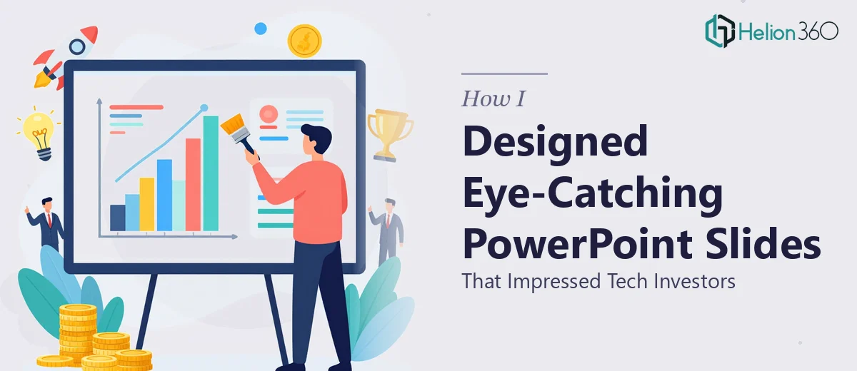
When a Startup Presentation Needs to Do More Than Just Inform
We were preparing for a series of investor meetings and an upcoming industry conference. The pressure was real. This was not just a regular internal update — it was the kind of PowerPoint presentation that could determine whether our tech startup moved forward or stalled. Every slide had to earn its place.
I took on the task myself at first. I had a clear sense of the message, the product roadmap, and the story we wanted to tell. I figured that with a few solid templates and some design sense, I could put together something that looked professional and compelling.
Where DIY Slide Design Starts to Break Down
What I quickly realized is that designing a startup pitch deck that works visually is a different skill set from knowing what to say. I could write the content. I understood the narrative. But translating that into slides with strong visual hierarchy, intentional use of color theory, and layouts that actually guide the eye — that is where things got complicated.
I spent hours adjusting fonts, swapping out stock images, rearranging text boxes, and still felt like the slides looked flat. The information was there, but the design was not doing any of the heavy lifting. For an investor-facing deck, that gap mattered.
I also tried using a few pre-built presentation templates, but they either looked too generic or required so much customization that I was essentially starting from scratch anyway.
Bringing in a Team That Understood the Stakes
After hitting a wall with the design, I came across Helion360. I explained the situation — early-stage tech startup, investor meetings on the calendar, a conference coming up, and slides that needed to look both modern and credible. Their team asked the right questions about the brand, the audience, and the tone we were going for, and then they got to work.
What came back was a level of polish I had not been able to achieve on my own. The slide layouts used space deliberately. The color palette was consistent and professional without being cold. Complex technical information was translated into clean infographics and visuals that made the content easier to absorb at a glance. The hierarchy across each slide was immediately clear — investors could follow the story without having to read every word.
What Made the Difference in the Final Deck
A few things stood out about the approach Helion360 took that I want to highlight, because they apply to any startup PowerPoint presentation built for investor audiences.
First, visual consistency matters more than individual slide aesthetics. Each slide in the final deck felt like part of the same visual system, not a collection of individually designed pages. That consistency builds credibility before a single word is spoken.
Second, infographics and data visualization do real work in a tech pitch. Instead of bullet points describing our market opportunity, the team translated those numbers into a clean, readable chart that told the story instantly. Investors are looking at dozens of decks — slides that communicate quickly get remembered.
Third, restraint is a design decision. The final deck had more white space than my original drafts, fewer words per slide, and stronger visual anchors. It felt more confident because it was not overloaded.
How the Presentation Landed
The deck performed well at both the conference and in our investor meetings. Feedback from people in the room consistently mentioned how clean and professional the presentation looked. A few investors specifically commented that the slides made the pitch easy to follow — which is exactly what you want when you are trying to hold a room's attention.
I learned that a well-designed startup pitch deck is not just a nice-to-have. For early-stage companies, it signals seriousness. It shows that you understand your audience and that you have thought carefully about how your message lands visually.
If you are in a similar position — you know your story but your slides are not doing it justice — Helion360 is worth reaching out to. They understood exactly what a tech investor audience needed to see and delivered a presentation that genuinely represented the work we had put into the business.