

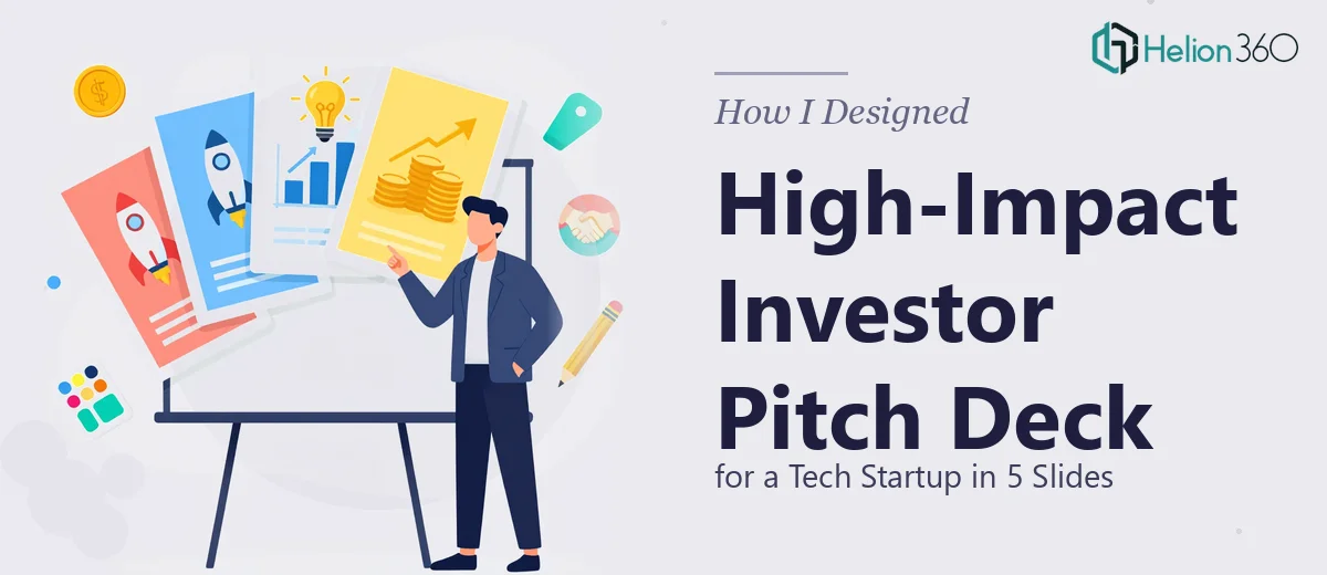
When Five Slides Have to Do the Heavy Lifting
When the founder I was working with said he needed a 5-to-7 slide PowerPoint overview deck ready within days, I did not think it would be particularly complicated. It was a small number of slides, after all. But the moment I sat down with the brief — mission statement, product overview, key achievements, market positioning, and a compelling investor hook — I realized the constraint was the whole challenge. Every slide had to earn its place.
This was a tech startup still finding its footing publicly, but the underlying product was genuinely strong. The problem was translating that strength into a startup pitch deck that felt polished, confident, and clear — without overwhelming investors with text or underwhelming them with generic visuals.
What I Tried First
I started by pulling together a rough structure in PowerPoint. I mapped out the five core sections — mission, problem, solution, traction, and ask — and began dropping in content. That part went smoothly enough.
Where things got complicated was the visual execution. The founder wanted something sharp and modern, with a bit of color personality, but not flashy. That balance is harder than it sounds. I tried a few slide templates online, but they either looked too corporate or too generic to represent a startup with real ambition. I attempted to build slides from scratch, but the design consistency kept breaking down across slides — font weights felt off, the color palette looked uncoordinated, and the icon choices were all over the place.
I also struggled with hierarchy. On a five-slide investor pitch deck, every piece of information needs a visual reason to exist. When I tried to make the traction slide work — combining metrics, a timeline, and a short achievement callout — the slide became cluttered no matter how many times I rearranged it.
After a few iterations that still did not feel right, I recognized this was a design problem more than a content problem, and I needed someone who builds pitch decks specifically.
Bringing in Helion360
I came across Helion360 while looking for a presentation design team with startup experience. I reached out, explained where I was stuck, and shared what I had built so far along with the original brief. Their team took it from there.
What stood out immediately was how quickly they understood the brief. They did not need me to explain what an investor pitch deck should feel like — they already knew the conventions, the visual standards, and how to structure content so that each slide flows naturally into the next. They refined the layout, brought in a clean color system that matched the startup's tone, and handled all the typography and spacing decisions that had been tripping me up.
The traction slide in particular came back looking exactly right — metrics were prominent but not crammed, and the visual hierarchy made the most important numbers land instantly.
What the Final Deck Looked Like
The finished PowerPoint presentation came in at six slides — tight, focused, and visually consistent throughout. Each slide had a clear purpose and nothing extra. The design had a high-end feel without relying on heavy graphics or animation. It looked like the kind of deck that has been through many iterations, even though it had been built in a short window.
The startup used it for an investor overview meeting and later for a client introduction. The feedback in both contexts was that the presentation felt credible and easy to follow — which, for a five-to-seven slide deck, is exactly what you want.
What This Project Taught Me
A small slide count does not mean a simple project. When you are working with a concise investor pitch deck for a tech startup, every design decision carries more weight. There is no filler slide to absorb a bad layout choice. That density is what makes professional presentation design so valuable in these situations — the experience shows in the details that a non-designer would not know to fix.
If you are working on a short overview deck for investors or clients and the design is not coming together the way the content deserves, Helion360 is worth reaching out to. They stepped in at the right moment on this project and delivered something that genuinely represented the startup well.