

Why Architectural Panel Presentations Are Harder Than They Look
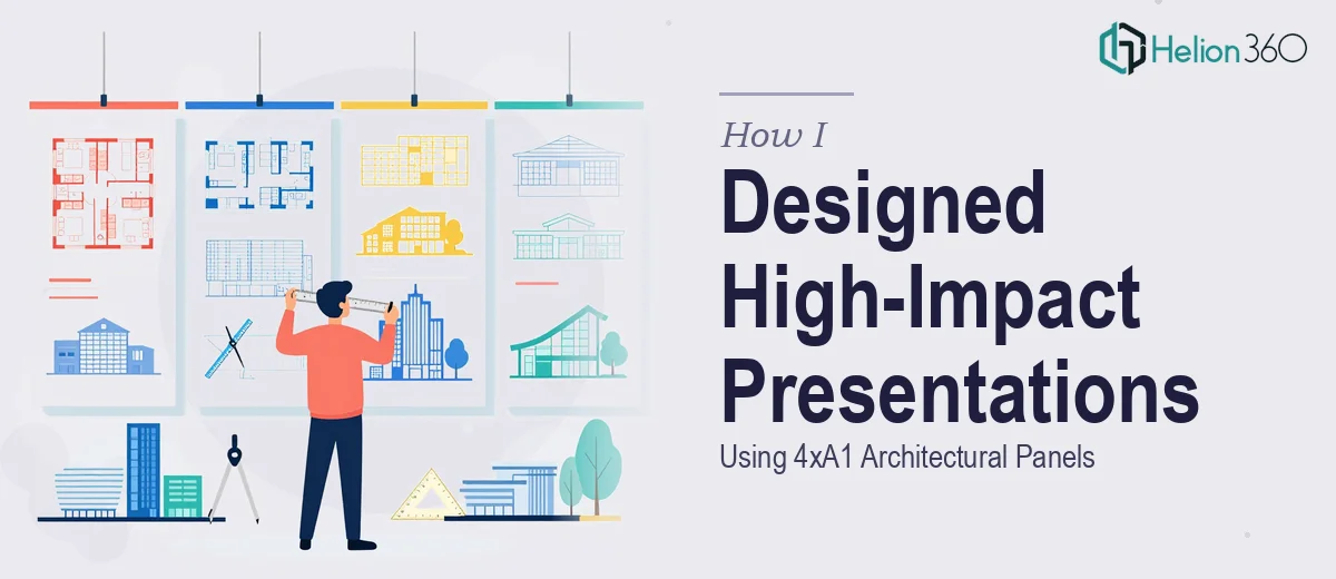
There is a particular pressure that comes with presenting architectural work at scale. A 4×A1 panel layout — four sheets each measuring 594mm × 841mm, typically arranged in a horizontal row or a two-by-two grid — is one of the most common formats used in academic reviews, design competitions, and professional submissions. At that size, every decision is visible. Misaligned columns, inconsistent font sizes, and cluttered drawings do not hide behind a small screen or a projector's low resolution. They are pinned to a wall, viewed from three metres away, and judged by people who know exactly what considered design looks like.
The stakes are real. A strong panel set tells a coherent design story — concept, site logic, spatial proposal, and material thinking — in a single composed view. A weak one forces reviewers to do interpretive work that should have been done by the designer. The presentation becomes the obstacle between the idea and the audience, rather than the bridge.
Understanding what separates disciplined panel design from a rushed overnight export is worth the time, especially if you are preparing for a jury, a competition entry, or a client submission.
What Rigorous Panel Design Actually Requires
A well-executed 4×A1 architectural presentation is not simply a collection of drawings dropped onto large sheets. It is a composed visual argument. Done properly, the work requires four distinct things that are easy to underestimate.
First, there needs to be a clear reading hierarchy across all four panels taken as a whole. A viewer standing back should immediately understand which panel to read first, where the narrative flows, and where to look for resolution. This is a compositional problem before it is a software problem.
Second, the drawings themselves — plans, sections, elevations, axonometrics — must be calibrated to a consistent graphic language. Line weights, hatching conventions, and annotation styles should be governed by a single set of decisions applied uniformly. A section that uses 0.5pt cut lines on Panel 2 cannot use 0.25pt cut lines on Panel 3 without visually breaking the set.
Third, white space has to be designed, not leftover. The temptation is to fill every square centimetre of an A1 sheet with content. The better approach reserves breathing room so that drawings read clearly and text blocks do not compete with imagery.
Fourth, typography at print scale requires a different mental model than screen design. A body text size that looks readable at 100% zoom on a monitor can become illegible when printed at A1 unless the point size is explicitly set for the output resolution and viewing distance.
How to Approach the Layout, Typography, and Visual System
Establishing the Grid
The starting point is a modular grid that spans all four panels. A reliable approach is a 12-column grid per panel, with a consistent gutter of 8mm and margins of 15mm on all sides. This creates a total of 48 usable columns across the full four-panel spread, which gives enough flexibility to compose asymmetric layouts while keeping alignment consistent between sheets.
Drawings should snap to column multiples. A site plan might occupy 8 of the 12 columns on Panel 1; a series of detail sections might each occupy 3 columns on Panel 4, allowing four details to sit in a clean horizontal band. The discipline of the grid is what makes the set feel designed rather than assembled.
In practice, setting this up correctly in Adobe InDesign or Illustrator — with master pages that carry the grid, the margin guides, and the bleed settings — takes two to three hours before any content is placed. That investment pays back in speed and consistency throughout the rest of the process.
Typography at A1 Scale
For a panel viewed at roughly 1.5 to 2.5 metres, a workable typographic hierarchy runs approximately: panel titles at 28–32pt, section headings at 16–18pt, drawing labels at 10–12pt, and caption or annotation text at 8–9pt. Going below 8pt at A1 is a risk — even at 300 DPI print resolution, very small type at oblique viewing angles becomes difficult to parse.
Font choice matters for legibility at distance. A geometric sans-serif — Neue Haas Grotesk, Aktiv Grotesk, or even a well-set Helvetica Neue — holds better at small sizes than a humanist serif. Keeping the typeface to a single family with two weights (regular and medium or bold) is usually the right call. More than two weights introduces visual noise without earning it.
Visual Hierarchy Across the Four Panels
Think of the four panels as a single composition with a reading direction. The conventional flow is left to right: concept and site analysis on Panel 1, developed floor plans and sections on Panels 2 and 3, and resolution — renders, details, material palette — on Panel 4. The largest, most commanding image in the set should appear on Panel 3 or the right half of Panel 2, because that is where the eye naturally arrives after scanning the opening context.
Colour should be used surgingly and purposefully. A common discipline is to restrict the active palette to one project accent colour — a warm terracotta, a slate blue, a concrete grey — applied only to concept diagrams, circulation overlays, or key annotation elements. All orthographic drawings stay in black, grey, and white. This keeps the technical drawing language clean while giving the set a distinct visual identity without decoration for its own sake.
File Management and Export
Exporting four A1 panels at 300 DPI produces files that are large enough to cause problems if not managed correctly. A linked-asset workflow — where high-resolution renders and photography are linked rather than embedded — keeps the working file manageable. Flattening and exporting as PDF/X-1a with bleed set to 3mm on all edges is the standard submission format for most competitions and print bureaus. Verify colour mode is CMYK, not RGB, before final export; this single oversight causes significant colour shifts in print that are invisible on screen.
What Goes Wrong When This Work Is Under-Resourced
The most common failure is skipping the grid setup entirely and placing content by eye. Without a governing structure, drawings drift off alignment across panels, and the set loses the composed quality that signals professional intent. By the time this is visible, hours of content have been placed and would need to be repositioned.
A second pitfall is inconsistent line weight across drawings that were prepared at different times or by different team members. A plan produced in Rhino with one export setting and a section produced in AutoCAD with another will have incompatible graphic languages. Normalising line weights before placing drawings — not after — is significantly less painful.
Typography is frequently undertested. Designing on a screen at 50% zoom and never printing a proof at A1 is a reliable way to discover, the night before submission, that annotation text at 7pt is completely illegible. A test print at A3 (25% of A1 area) early in the process is a useful proxy check.
Another common problem is colour inconsistency between panels — not in the palette choices, but in how images are processed. A render placed at full saturation next to a photograph that has been desaturated will create a jarring tonal break across the set. All raster images should go through a single colour-grading pass before placement so that the panel set feels visually unified.
Finally, panels are almost always underestimated for the time required to reach a submission-ready state. The gap between a working layout that holds all the drawings and a polished final file — with consistent spacing, proofed text, corrected alignments, and verified export settings — is typically four to six additional hours on a well-prepared project. That gap closes faster with a second set of eyes; catching your own alignment errors after a long session is genuinely difficult.
What to Take Away
The two things worth holding onto from all of this: a 4×A1 architectural presentation succeeds or fails at the grid and hierarchy stage, before any drawing is placed; and typography and colour decisions made for screen must be explicitly re-evaluated for print scale. Those two phases — structural and graphic — are where the real design work happens, and both require time that is easy to discount when a deadline is close.
If you would rather have this work handled by a team that does board presentations at this level every day, consider exploring how architectural presentations across 4xA1 panels are designed without doing it yourself, or learn how PowerPoint presentations with charts and multimedia can communicate complex design thinking clearly. Helion360 is the team I would recommend.