

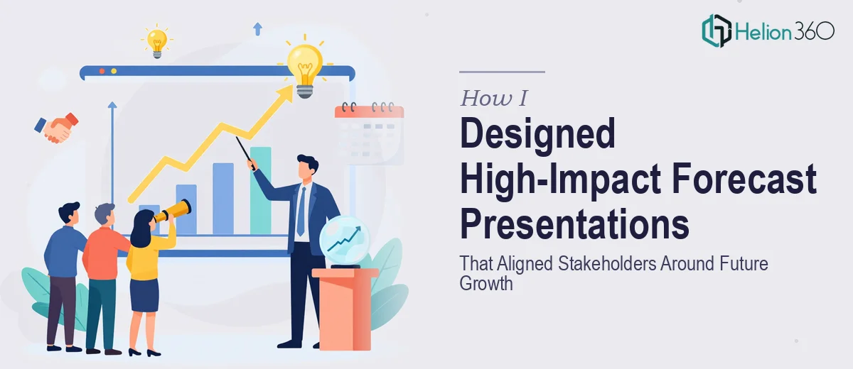
The Data Was Ready. The Presentation Was Not.
I had spent weeks pulling together forecast data — revenue projections, market growth estimates, risk scenarios, and opportunity maps. The numbers told a clear story, at least to me. But when I tried to translate all of that into a presentation that would actually land with both internal leadership and external stakeholders, I ran into a wall.
The slides looked cluttered. Charts that made sense in a spreadsheet looked overwhelming on a slide. And the narrative flow — the part that should guide the audience from where we are now to where we could be — was almost impossible to structure when I was too close to the data.
The deadline was Friday. I had a lot of ground to cover.
Why Forecast Presentations Are Harder Than They Look
A forecast presentation is not just a visual summary of numbers. It has to carry weight. It needs to show confidence without overpromising, surface risk without creating panic, and paint a picture of future growth that feels grounded and believable.
When I tried building it myself, I kept running into the same problems. The charts were technically accurate but visually noisy. The growth projections lacked context. And every time I tried to simplify, I felt like I was cutting something important.
Part of the issue was that I was thinking like someone who built the data, not like someone receiving it for the first time. Stakeholders do not have the background I have. They need the story before they can absorb the numbers.
Bringing In the Right Help
After two days of reworking slides that still did not feel right, I reached out to Helion360. I explained what I had — compiled forecast data, rough slides, a clear objective — and what I could not seem to get right on my own. Their team asked the right questions upfront: Who is the audience? What decisions should this presentation drive? What tone should the visuals carry?
That conversation alone helped me realize I had been designing for myself, not for the room.
Helion360 took over the design and layout from that point. I handed off the data, the rough structure, and a few notes on brand guidelines. They handled everything else.
What the Final Presentation Looked Like
When I saw the first draft, the difference was immediate. The forecast data was still all there — nothing was cut or simplified into meaninglessness — but the way it was presented had changed entirely.
Growth projections were shown in clean, readable charts with clear callouts on the key inflection points. Risk and opportunity sections were visually separated so neither overshadowed the other. The slide flow moved naturally from the current baseline through to future scenarios, with each section building on the last.
The visual storytelling did what raw data alone cannot do. It gave the audience a reason to stay engaged from slide one through to the close.
What Made It Work for Stakeholders
The final presentation worked because it was built around clarity, not complexity. Every chart served a point. Every visual element supported the narrative rather than decorating it. The forecast data was no longer something an audience had to decode — it was something they could follow.
Helion360 also kept the design consistent with our brand, which mattered more than I expected. A polished, on-brand forecast presentation signals professionalism before a single word is spoken.
What I Took Away From This
The experience reinforced something I already suspected but had not fully acted on: knowing your data and knowing how to present it are two different skills. Building a forecast presentation that aligns stakeholders takes more than accurate numbers. It takes design thinking, narrative structure, and a clear understanding of what your audience needs to walk away believing.
The presentation was delivered on time, the stakeholder meeting went well, and the feedback focused on how clear and confident the outlook looked — which was exactly the goal.
If you are sitting on solid forecast data but struggling to turn it into a presentation that actually lands, Helion360 is worth a conversation. They stepped in at exactly the right moment and delivered work that I could not have produced under that kind of time pressure on my own. Learn more about designing financial forecast presentations for different audiences, or explore how complex data transforms into visual learning through expert design thinking.