

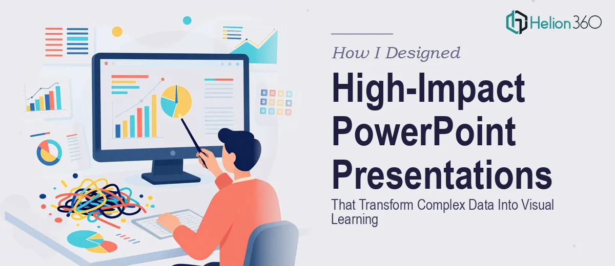
When Course Content Meets a Design Wall
I was deep into building an online course for tech-savvy professionals — the kind of learners who process information quickly and have little patience for slides crammed with bullet points and stock imagery. The content itself was solid. Years of research, structured frameworks, and data-backed insights. But when I opened PowerPoint and started laying it all out, something felt off.
The slides looked functional, not engaging. The information was there, but it wasn't landing the way it needed to. For a visual learning format, that gap matters more than most people realize.
The Challenge of Turning Dense Content Into Visual Learning
Online courses live or die by how well information is communicated visually. Learners are not sitting in a room where a speaker can carry the energy — the slides have to do a lot of the heavy lifting. That means every layout decision, every chart, every visual hierarchy choice either supports comprehension or undermines it.
I tried restructuring the slide flow, experimenting with different layouts, and pulling in design references I admired. I got better at spotting what wasn't working — dense text blocks, inconsistent fonts, charts that required a paragraph of explanation to understand. But fixing those issues at the scale this course required, across dozens of slides with technically complex content, was a different challenge entirely.
The design knowledge I had was enough to identify the problems. It wasn't enough to solve them at the level the course deserved.
Bringing in a Team That Understood the Problem
After going back and forth on the slides for longer than I'd like to admit, I reached out to Helion360. I explained the context — an online course for professionals, technically dense material, and a need for presentation design that would support visual learning rather than just look polished.
What stood out immediately was that they didn't treat it as a generic slide redesign job. They asked about the audience, the learning flow, and where the key concepts needed the most visual support. That kind of thinking before the work begins makes a significant difference in the outcome.
What the Design Process Actually Looked Like
Helion360's team worked through the slide deck with a clear methodology. Complex data that had been sitting in tables or dense paragraphs was rebuilt as clean, purposeful data visualizations — the kind that communicate a relationship or trend in seconds rather than requiring the viewer to decode a wall of numbers.
Slide layouts were restructured around learning progression, not just visual aesthetics. Each screen had a clear focal point. Typography choices reinforced hierarchy so learners could skim, anchor on key ideas, and go deeper when needed. The visual storytelling across the module felt cohesive rather than assembled.
The graphic design work was precise — icons, custom visuals, and slide compositions that matched the professional tone the audience expected. Nothing felt like a template placeholder.
What I Learned From the Experience
Presentation design for course creation is a specific discipline. It combines graphic design skill with an understanding of how adults learn — and that combination is harder to replicate than it looks. Knowing what makes a slide visually compelling is one thing. Knowing how to structure a 40-slide course module so that every screen serves a learning objective is another.
The final result was a set of PowerPoint presentations that I was genuinely confident putting in front of our audience. The feedback during the course pilot confirmed that the visual design was helping people engage with and retain the material — which was the entire point.
Data visualization, consistent slide design, and thoughtful layout choices are not finishing touches. For a course built around visual learning, they are the core of the experience.
If you're working on something similar — course content that's solid but not yet translating well to slides — Helion360 is worth a conversation. They handled the design complexity I couldn't and delivered something that genuinely served the learners it was built for.