

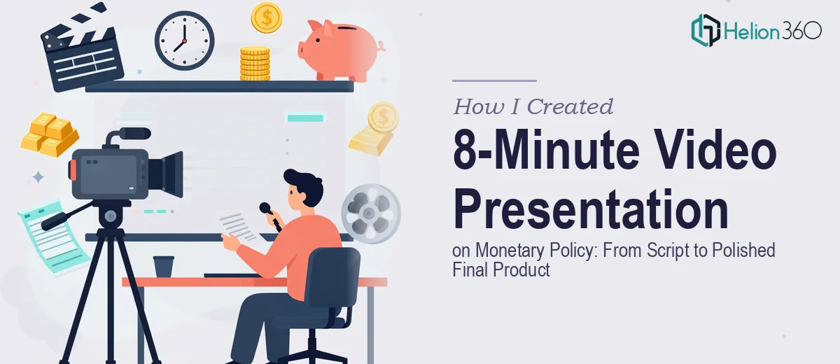
The Assignment That Seemed Straightforward at First
I had a clear goal: produce an 8-minute video presentation on monetary policy that would help a general audience understand how central banks manage the economy. The topic itself — interest rates, inflation targeting, open market operations — is genuinely complex. But I figured that with the right structure, I could break it down into something digestible and visually engaging.
I started with the script. That was the foundation. Everything else — the slides, the narration pacing, the background music — would depend on getting the written content right.
Writing a Script That Doesn't Put People to Sleep
Monetary policy is not exactly a crowd-pleaser topic for most audiences. The challenge was explaining concepts like quantitative easing or the federal funds rate without either dumbing them down too much or drowning viewers in economic jargon.
I drafted a first pass of the script. The opening was fine — I set up the problem of inflation and why central banks exist. But when I got into the tools central banks use, the writing started to feel dense. I was essentially paraphrasing a textbook. I tried restructuring with real-world examples, tying interest rate decisions to things people actually feel, like mortgage payments and job availability. That helped.
But then came the pacing problem. An 8-minute video has to move. Every 60 seconds needs to carry the viewer forward. When I timed my draft out loud, certain sections dragged and others felt rushed. The script needed more than editing — it needed a structural rethink.
Where the Visual Layer Got Complicated
Once I had a working script, I turned to the presentation design. I wanted clean slides that reinforced the narration — not slides full of text that competed with the voiceover. That meant thinking about data visualization for charts showing inflation trends, clear iconography for concepts like monetary tools, and a consistent visual style throughout.
I can work with PowerPoint well enough for standard decks, but designing slides specifically for video — where transitions, timing, and visual flow matter at a different level — was a different challenge. On top of that, sourcing the right background music track, something that felt professional without being distracting, turned out to be more time-consuming than I expected.
After spending two days going in circles on slide layouts and audio options, I decided I needed to bring in a team that handles this kind of end-to-end production work regularly.
Bringing In the Right Team
I reached out to Helion360 and explained exactly what I was working on: a finalized script, a two-week deadline, the need for polished slide design tailored for video, and a background music track that fit the tone — authoritative but accessible.
Their team reviewed the script and came back with structural suggestions before touching a single slide. They identified two sections where the pacing would lose viewers and proposed a reordering that made the narrative arc much stronger. That kind of editorial input, on top of the visual work, was something I hadn't anticipated needing — but it made a real difference.
The Final Product
What came back was a clean, well-paced video presentation that moved through the material logically. The data visualization slides — showing historical inflation curves and central bank rate decisions — were clear without being overcrowded. The transitions matched the narration rhythm. The background music was subtle and stayed out of the way of the voiceover.
The whole thing ran to just under eight minutes and covered interest rate policy, quantitative easing, and the dual mandate of central banks in a way that felt genuinely accessible.
What I Took Away From This
The scripting part of a video presentation on monetary policy is only one layer. The visual design, the pacing, the audio — all of it has to work together, and getting that coordination right under a deadline is harder than it looks. Trying to handle every component solo added time and introduced inconsistencies I wouldn't have caught until it was too late.
If you're working on a professional PowerPoint presentation on a complex topic with a tight turnaround, or need help with presentation design tailored for video, Helion360 is worth contacting. They handled the parts I couldn't move forward on alone and delivered a final product that was ready to go.