

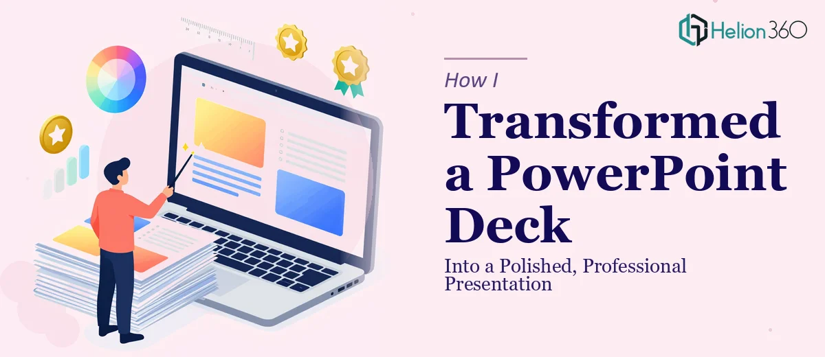
I had a deadline, a messy PowerPoint file, and the quiet confidence that I could clean it up myself over a weekend. Spoiler: the weekend came and went, and the deck still looked like it had been built by three different people who had never spoken to each other.
The slides were a mix of mismatched fonts, inconsistent chart styles, and text blocks that were far too dense to read in a business setting. Some slides had too much whitespace, others were completely overloaded. The charts were functional but visually flat — they communicated data, but they did not communicate it well.
I knew the content was solid. The problem was purely in the presentation design.
Where My Own Efforts Hit a Wall
I started by trying to fix the layout slide by slide, adjusting font sizes and nudging elements into place. That worked for a few slides. But when I got to the charts and graphics, things got complicated fast.
The charts had been built with default Excel styles, copied directly into the deck. They were readable in isolation, but they clashed with everything around them. Aligning them with the overall color palette, resizing them without distorting the data, and making them look like they actually belonged in the presentation — that took a level of design precision I did not have the time or the tools to execute properly.
I also realized the deck lacked a consistent visual language. There was no unifying structure across slides, no clear typographic hierarchy, and no sense that all the information was part of one coherent story. Fixing one slide often broke the logic of the next.
This was not a simple cleanup job. It was a full professional PowerPoint redesign.
Bringing in a Design Team
After a few frustrating hours going in circles, I reached out to Helion360. I explained the situation — a business presentation that needed professional polish, specifically around layout consistency, chart design, and visual alignment — and shared the existing file along with some notes on tone and usage context.
Their team reviewed the deck and came back with a clear read on what needed to change. They identified the structural inconsistencies I had noticed, but also flagged a few things I had missed — like the way certain slides broke the visual flow mid-deck, and how the chart colors were drawing attention away from the actual insights rather than supporting them.
From there, they took over completely.
What the Redesigned Deck Actually Looked Like
The final presentation came back cleaner and more cohesive than I had imagined. The layout was consistent across every slide, with a clear grid structure that made the content feel organized without being rigid. The typography was refined — headings had weight and hierarchy, body text was sized and spaced for actual readability in a room.
The charts were completely reworked. Each one was redesigned to align with the overall color scheme, with cleaner axis labels, better proportions, and visual emphasis on the key data points. They no longer looked like Excel exports dropped into a slide — they looked like they had been designed as part of the presentation from the start.
Graphics and icons were also brought in line with the overall style, giving the deck a unified visual identity that felt appropriate for a professional business context.
What I Took Away From This
The gap between a functional slide deck and a professionally designed one is larger than most people expect — especially once charts and graphics are involved. Adjusting text and layouts is manageable. But making data visualizations, graphics, and overall design work together as a single coherent presentation is a different kind of task entirely.
It requires both design judgment and technical precision, and it takes significantly more time than it appears to from the outside. What looked like a weekend project turned out to be a multi-layered presentation redesign that benefited from dedicated expertise.
If you have a PowerPoint deck that needs professional polish and you are running up against the same kinds of challenges — inconsistent layouts, charts that do not match the design, visuals that feel disconnected — consider business presentation design services. They handled the complexity quickly and delivered a deck that was genuinely ready for a business setting.
You might also find it helpful to read about how to transform bland PowerPoint slides or explore real examples of custom PowerPoint presentation design.