

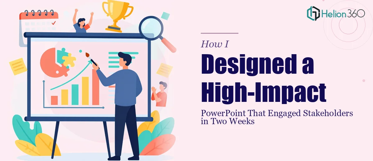
The Brief Was Clear, But the Path Forward Wasn't
Our team had spent weeks developing what we genuinely believed was a strong strategic direction. The ideas were solid, the thinking was sharp, and everyone in the room was excited. The problem? We needed to get those ideas in front of stakeholders in two weeks, and the PowerPoint presentation we had was, to put it gently, not doing the work justice.
I volunteered to take ownership of the presentation design. I figured it wouldn't take long — we had the content, we had the message, and I had a decent handle on PowerPoint. What I underestimated was how much work goes into turning good ideas into a visually engaging, professionally designed slide deck that actually holds an audience's attention.
Where the Self-Build Started to Break Down
I started with a template and began organizing the slides. The structure came together reasonably quickly — an opening, the problem we were solving, the strategy, supporting data, and a clear next step. That part felt manageable.
But when I looked at the actual slides, something wasn't clicking. The content was there, but the design felt flat. Mismatched fonts, inconsistent spacing, charts that technically showed the data but didn't communicate anything at a glance. The kind of presentation that makes an audience work too hard to follow along.
I spent a full weekend trying to fix it. I watched tutorials, rearranged layouts, and played with color schemes. The slides looked better than they did on Friday, but they still didn't feel like the kind of polished PowerPoint presentation that reflects well on a serious strategy. And with the deadline now only ten days away, I couldn't afford to keep iterating.
Handing It Over to People Who Do This Every Day
A colleague mentioned Helion360 after seeing me stress about it. I looked them up, sent over what I had — a rough draft with content, brand guidelines, and a short brief explaining the audience and the goal — and heard back quickly.
The team at Helion360 asked the right questions upfront. What tone did the presentation need to strike? Who was in the room? What should the audience feel when they reached the final slide? Those questions told me they were thinking about the presentation as a communication tool, not just a design job.
They restructured several slides where the narrative flow wasn't quite right, created custom visuals for the strategy sections that made complex ideas immediately clear, and made sure the data slides were readable without being oversimplified. They also kept the branding consistent in a way I hadn't managed to achieve on my own.
What the Final Presentation Looked Like
When the first draft came back, it was a different experience from reviewing my own work. The slides had visual weight and direction. Each section transitioned naturally into the next. The strategy we had built felt, for the first time, like something worth seeing — not just something worth hearing.
We went through one round of revisions, mostly minor copy adjustments and a few layout tweaks, and the deck was done well before the deadline.
The stakeholder presentation itself went well. The audience followed along without confusion, asked the right questions, and left the room with a clear picture of what we were proposing. A few people asked who designed the slides, which isn't something that usually happens.
What I Took Away from the Process
The content of a presentation and the design of a presentation are two genuinely different skills. I could write the strategy, structure the narrative, and know exactly what I wanted to say. But translating that into a high-impact PowerPoint design — one where every slide is doing something intentional — is a craft that takes more than a weekend of effort.
For anyone facing a similar situation — good content, tight deadline, and a growing sense that the slides just aren't getting there — Helion360 is worth reaching out to. They stepped in at exactly the right point and delivered a professional presentation that did the work justice.