

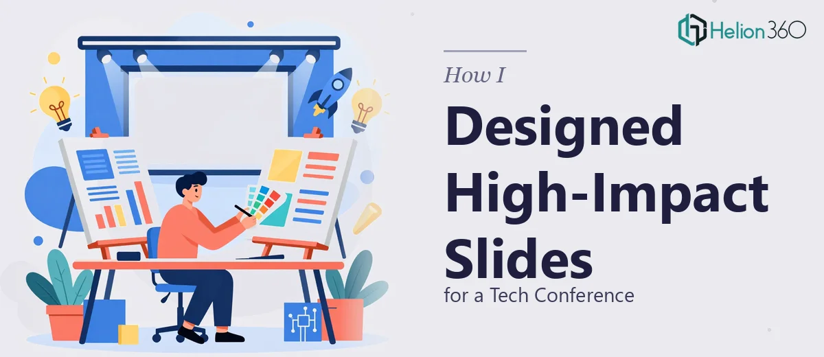
The Brief Sounded Simple. The Execution Was Not.
When the task landed on my desk — design a set of presentation slides for an upcoming tech conference in Paris — I thought it would take a weekend at most. The topic was clear: innovative technology solutions and emerging industry trends. The brand guidelines existed. The content was mostly drafted. How hard could it be?
Harder than I expected.
The moment I opened the slide editor and started arranging content, I ran into the gap between knowing what good slide design looks like and actually being able to execute it. A compelling headline needs typographic hierarchy. Charts and data visualizations need to be clean without losing meaning. The layout needs to breathe. And the color scheme has to work across digital screens, projectors, and printed handouts simultaneously.
I was trying to hit all of those targets at once — and missing most of them.
Where the Process Started to Break Down
The first few slides looked decent in isolation. But when I viewed them as a full deck, they felt inconsistent. The icon styles clashed. Some slides felt heavy with text, others felt sparse and unfinished. The color palette I was pulling from the brand guidelines did not translate well to a large conference screen.
I also realized I was spending far too long on layout decisions that a trained presentation designer would solve in minutes. Moving a text block two centimeters, testing three different chart styles, second-guessing whether the background gradient was too distracting — it was consuming hours I did not have.
The conference date was not moving. The slides needed to be polished, professional, and ready to project in front of a large audience in a matter of days.
Bringing in a Team That Could Actually Deliver
After hitting that wall, I came across Helion360. I shared the brief — the conference theme, the brand assets, the draft content, and the visual direction I had in mind. Their team took it from there.
What I noticed quickly was that they asked the right questions before starting. How would the slides be presented — large projector screen, smaller displays, printed copies? What was the tone — authoritative and data-heavy, or more conversational and narrative-driven? Were there specific slides where we needed the audience to pause and absorb information versus slides meant to move quickly?
Those questions told me they were thinking about the presentation as a communication tool, not just a design exercise.
What the Final Slides Actually Looked Like
The delivered deck was a significant step up from what I had been building. Each slide had a clear visual hierarchy — the headline anchored the message, supporting text was concise, and the visuals did the explanatory work rather than repeating what was already written.
The charts and data graphics were clean and legible at scale. Icons were consistent in style and weight throughout. The color scheme held together across all formats — it worked on screen during the conference and held up when printed for handout packets.
Critically, the design reflected the brand without feeling generic. There was a modern, forward-thinking quality to the layouts that matched the conference context without being flashy or distracting. The slides served the content rather than competing with it.
What I Took Away From This
Presentation design for a professional setting — especially a live conference — is not just about making things look attractive. It is about visual clarity under real conditions: varying screen sizes, mixed lighting, audiences sitting at different distances, and presenters who need to move through slides confidently.
I underestimated how many layered decisions go into getting that right. Slide design at this level requires an eye for layout, typography, color theory, and data visualization working together. That is a specific skill set, and trying to brute-force it under a deadline is rarely a good use of time.
If you are preparing slides for a high-stakes presentation and the design side is slowing you down or producing results that feel off, Business Presentation Design Services from Helion360 is worth reaching out to — they handled the complexity quickly and delivered something that was genuinely ready for a professional stage. Learn more about how others have tackled similar challenges in our guide on high-impact PowerPoint slides for tech webinars and explore how to create clean PowerPoint presentations that drive conference impact.