

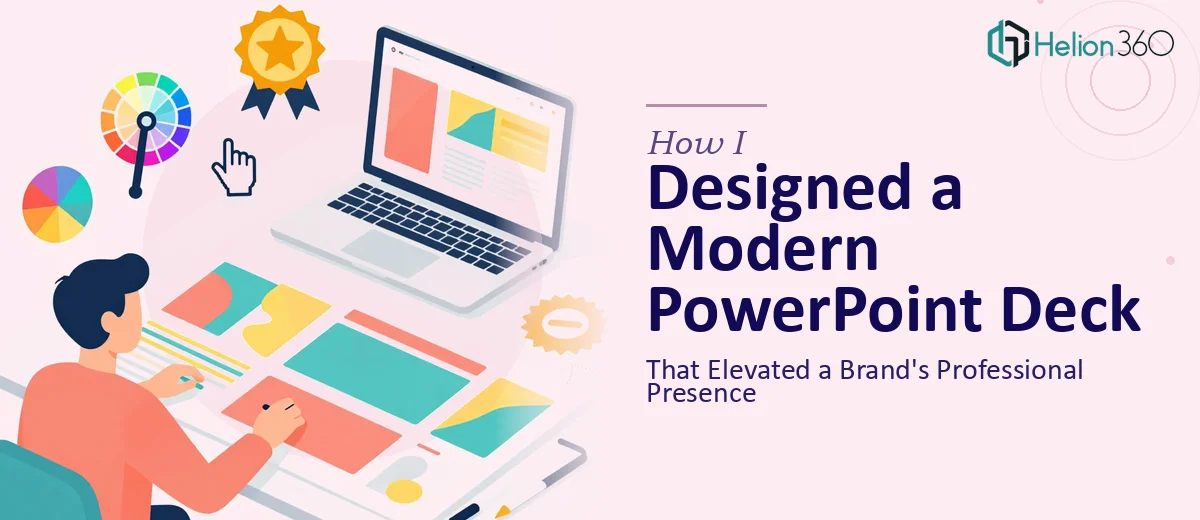
The Brief Sounded Simple — Until It Wasn't
I had a clear enough goal on paper: create a modern PowerPoint slide deck that communicated a brand's values, tone, and personality to a professional audience. The slides needed to look polished, feel cohesive, and land with business professionals who had high visual standards.
I figured I could manage it. I had used PowerPoint before. I knew the brand. I had the content. What I underestimated was how much gap exists between knowing a brand and actually translating it into a professional presentation design that holds attention from the first slide to the last.
Where the Process Broke Down
I started with the basics — picking fonts, pulling brand colors, dropping in some visuals. The individual slides looked acceptable in isolation. But when I ran through the full deck, something felt off. The slides did not speak as one cohesive story. The layouts were inconsistent. Some slides felt cluttered while others looked too sparse. The brand's essence, the very thing the deck was supposed to communicate, was getting lost in the execution.
I spent more hours than I want to admit tweaking alignment, swapping out imagery, and reworking the title slide. Each fix created a new inconsistency somewhere else. The deeper issue was that I was designing reactively rather than building from a clear visual system.
A professional slide deck for brand communication is not just about making things look nice. It requires a structured design language — consistent use of typography hierarchy, a deliberate color application strategy, a slide grid that scales across all layouts, and visual storytelling that keeps the audience oriented throughout. That combination takes more than good taste. It takes experience.
Bringing in the Right Support
After hitting a wall with the second round of revisions, I came across Helion360. I explained where I was stuck — the brand assets I had, the audience the deck was targeting, and the tone I was trying to achieve. Their team asked the right questions upfront: What is the primary use case for the deck? Where will it be presented? How many slides? What is the core message each section needs to land?
Those questions alone reframed how I was thinking about the project. Within a short brief and a clear scope, Helion360 took over the design work entirely.
What the Final Deck Actually Looked Like
The result was a significant step up from what I had been building. The design team established a proper visual system from the ground up — a master slide layout with defined zones for content, consistent iconography style, a refined color palette that honored the brand guidelines without being rigid, and typographic hierarchy that made the slides readable at a glance.
Every section of the deck had a clear visual rhythm. The opening slides established presence. The middle sections communicated values and proof points with a clean balance of text and visual elements. The closing slides were decisive and left a strong impression. It felt like a brand presentation, not a collection of formatted slides.
The turnaround was faster than expected, and the revisions were minimal because the brief had been understood correctly from the start.
What This Experience Taught Me
Building a professional PowerPoint deck for brand communication is genuinely different from building a functional one. When the audience is made up of business professionals with high expectations, every design decision carries weight — the slide transitions, the image quality, the whitespace, the way content is sequenced. Getting these things right is not about effort alone. It is about having a practiced eye and a repeatable process.
I also learned that the earlier you bring in experienced design support, the less time you lose going back and forth on revisions that do not move the work forward.
If you are in a similar situation — you have the content, you know the brand, but the presentation design is not coming together the way it needs to — Helion360 is worth reaching out to. They stepped in at exactly the right point and delivered a deck that actually represented the brand the way it deserved to be represented.