

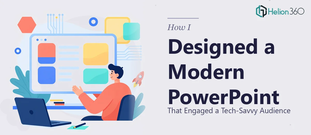
The Brief Sounded Simple — It Was Not
When I was handed the task of putting together a PowerPoint presentation for an upcoming product launch, I thought I had a reasonable handle on it. The ask was clear enough: a clean, modern design that would resonate with a tech-savvy audience and reflect an innovative brand. The slides needed to carry strong visuals, communicate key messages quickly, and hold attention from the first slide to the last.
I had built decks before. Nothing too polished, but functional enough. So I opened PowerPoint, pulled up a few templates, and started working.
Where the Self-Built Deck Started to Fall Apart
The problem showed up quickly. The templates I was working with felt either too generic or too heavily formatted to adapt. Every time I tried to apply the brand colors and typefaces, something looked off — spacing issues, misaligned elements, visual weight that felt uneven across slides.
Beyond the aesthetics, I was struggling with something more fundamental: how to translate dense product information into visuals that would actually land with a technically sharp audience. These were people who would notice lazy design. Throwing bullet points onto a slide with a stock photo was not going to cut it.
I spent two days trying different layouts and found myself going in circles. The slides that looked decent did not flow well as a sequence. The ones that told a coherent story looked visually flat. Getting both right at the same time was harder than I expected.
Bringing in the Right Team
After hitting that wall, I came across Helion360. I explained the project — a product launch presentation design for a tech audience, needing a modern PowerPoint design that balanced brand identity with genuine visual storytelling. Their team asked the right questions upfront: audience profile, key messages, brand guidelines, presentation length, and how it would be delivered.
That intake process alone told me they had done this kind of work before. They were not just taking a brief — they were thinking about the end experience.
What the Design Process Actually Looked Like
Helion360 worked through the presentation systematically. They started with a master slide structure — defining the grid, typography scale, and color usage before touching a single content slide. That foundation made every subsequent slide feel cohesive, even when the content type shifted between data, narrative, and product showcase sections.
The visual approach they took was deliberate. Instead of relying on decorative elements, they used layout and contrast to guide the viewer's eye. Complex product information was broken into digestible visual blocks. Charts were simplified and styled to match the deck's aesthetic rather than dropped in from spreadsheets. Iconography was consistent throughout.
What impressed me most was how the slides read as a sequence. There was a pacing to the design — some slides gave the viewer breathing room, others landed with visual impact. That rhythm is something I had not been able to manufacture on my own.
The Outcome and What I Took Away
The final deck was exactly what the brief called for. Clean, modern, and clearly built for a tech-savvy audience. Every slide communicated its point without clutter. The brand came through without being heavy-handed. And the presentation held together as a complete experience rather than a collection of individual slides.
For the launch event, the feedback was that the slides felt professional and credible — which, for a tech audience that has seen every variation of a badly built PowerPoint, matters more than most people realize.
What I learned from this project is that designing a high-quality PowerPoint for a specific audience is a discipline in itself. It is not just about making things look good. It is about understanding who is in the room, what they expect, and how design can either build or break trust with that group.
If you are working on a product launch or a presentation for a discerning audience and the design is not coming together the way you need it to, Helion360 is worth reaching out to — they handled what I could not and delivered work that held up where it mattered most.