

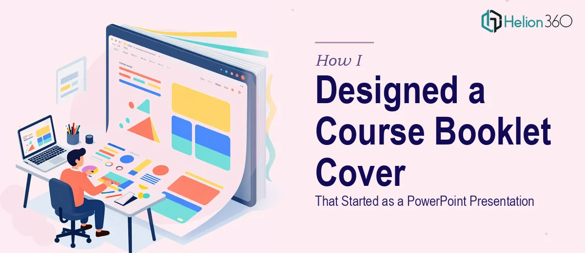
The Task Seemed Simple at First
I was putting together a course — the kind that needed a polished, structured booklet to go along with it. The first thing on my list was creating a PowerPoint presentation that would serve as the cover and opening section of that booklet. It had to be visually engaging, clearly communicate the course structure and objectives, and feel professional enough to hand to participants on day one.
I figured I could handle it. I had used PowerPoint before, knew the basics, and had a rough idea of what I wanted the slides to look like. So I opened a blank file and started working.
Where the Difficulty Crept In
The problem was not the tool — it was everything else. Translating a course concept into a coherent visual flow is a different skill from just knowing how to add text boxes and pick a color. I had content, but I did not have a strong visual language to wrap around it. My slides kept looking either too plain or too cluttered. The cover slide especially was not landing right. It did not capture the tone of the course, and the layout felt disconnected from the internal slides that were meant to outline the course structure.
I also spent more time than I expected tweaking fonts, adjusting alignment, and trying to make custom graphics that looked decent. After a few hours, what I had was functional but not professional. For an internal document, it might have been fine. But this was going to represent the course in print and in presentations — it needed to look the part.
Bringing in Support
After hitting that wall, I reached out to Helion360. I explained what I was building — a PowerPoint that would double as the cover design for a printed course booklet — and what I had already tried. Their team asked the right questions: course subject, target audience, tone, branding preferences, and what the content hierarchy needed to look like across slides.
From there, they took over the design work entirely. I shared my draft and the course outline, and they used that as a foundation rather than starting from zero.
What the Final Presentation Looked Like
The result was a significant step up from what I had. The cover slide had a clean, intentional layout with a strong typographic hierarchy — the course title read clearly at a glance, the subtitle added context without crowding, and the overall visual tone matched what the course was about. It did not look like a generic template. It looked considered.
The supporting slides that outlined the course structure were equally clean. Each section was broken into a logical visual flow, with consistent spacing, iconography that matched the theme, and color usage that felt deliberate rather than decorative. As a PowerPoint presentation, it was easy to present from. As a booklet cover and opening section, it printed well and held up visually.
What Made the Difference
The thing I noticed most was how much the layout decisions improved the readability of the course content itself. Good slide design is not just about aesthetics — it shapes how information is absorbed. The course objectives were now visually prioritized in a way that my original draft had not managed. A viewer could scan the opening slides and immediately understand what the course covered and how it was structured.
I also learned that the gap between a functional PowerPoint and a professionally designed one is often less about software knowledge and more about design judgment — understanding proportion, visual weight, type pairing, and how to organize content spatially so that it communicates clearly.
What I Would Do Differently Next Time
I would not spend three hours trying to force a design direction that was not working. The time I used experimenting on my own would have been better spent refining the content itself and letting people who specialize in presentation design handle the visual execution. The final output was better, delivered faster, and required zero compromises on how the course was represented.
If you are working on something similar — a course booklet, a training presentation, or any situation where a PowerPoint needs to function as both a slide deck and a designed document — Helion360 is worth a conversation. They handled exactly the kind of work that sits at the intersection of content structure and visual design, and delivered something I could not have produced on my own timeline.