

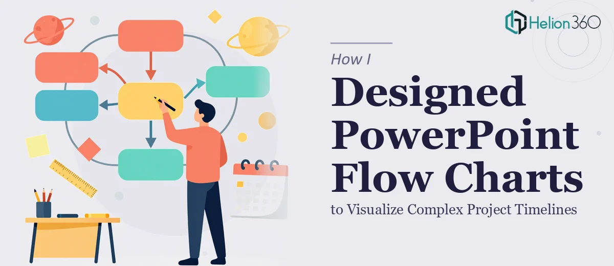
When a Simple Timeline Became Anything But Simple
I had what seemed like a straightforward task: create a set of PowerPoint flow charts to help the team visualize a multi-phase project timeline. The process had dependencies, decision points, parallel workstreams, and approval loops. On paper, it sounded like something a few SmartArt shapes could handle. In practice, it turned into one of the more frustrating afternoons I had that month.
The challenge was not just drawing boxes and arrows. It was making the flow chart readable, logically structured, and aligned with the company's visual branding — all within a tight two-week window before an internal review meeting.
What I Tried on My Own
I started in PowerPoint, which seemed like the natural choice. I pulled up the SmartArt library and experimented with a few process templates. They worked fine for simple linear flows, but our project timeline was anything but linear. We had phases that ran concurrently, milestones that triggered multiple downstream steps, and decision nodes that branched into different paths depending on approval status.
Every time I got one section looking clean, another section would feel cramped or visually disconnected. Aligning shapes manually took longer than expected, and when I tried to apply our brand colors and fonts consistently across all the diagrams, the whole thing started to look inconsistent. I also realized I was spending more time wrestling with slide formatting than actually thinking through the process logic itself.
After a full day of revisions, I had something functional but far from presentation-ready. The flow charts communicated the information, but they did not look like something I would want to put in front of a room full of stakeholders.
Bringing in the Right Help
That is when I reached out to Helion360. I explained the scope — multiple flow charts covering different project phases, all needing to align with our brand guidelines, with a clear visual hierarchy that made the process easy to follow at a glance. I shared the draft I had built, the brand color palette, and a rough outline of the process steps.
Their team asked a few clarifying questions about the level of detail needed on each slide, how the diagrams would be presented (projected in a meeting versus shared as a document), and whether any steps needed to stand out as critical path items. It was clear they were thinking about the design from a communication standpoint, not just a visual one.
What the Final Slides Looked Like
The flow charts Helion360 delivered were structured, clean, and genuinely easy to read. Each phase of the project timeline had its own slide, with a consistent visual language across all diagrams. Decision points were marked clearly, parallel tracks were laid out side by side without feeling cluttered, and the color coding made it immediately obvious which steps were completed, in progress, or pending.
The branding was applied consistently — typefaces, colors, and spacing all matched our internal style guide. The slides also worked well in both projected and printed formats, which was something I had not thought to plan for on my own.
What This Whole Process Taught Me
Creating process flow diagrams that actually communicate complex information well is not just a design task — it is a combination of process thinking, visual hierarchy, and technical execution in PowerPoint. Getting one of those right is manageable. Getting all three right under a deadline is where things get complicated.
I also learned that the time I spent trying to fix alignment and formatting myself would have been better spent reviewing the logic of the process. Letting someone with the right skill set handle the visual side meant I could focus on making sure the content was accurate before it went into the final slides.
The diagrams made a noticeable difference in the review meeting. People could follow the timeline without needing a walk-through, which was exactly the goal.
If you are working on a similar project — swim lane business process maps, workflow diagrams, or visual timelines that need to be both accurate and presentation-ready — Helion360 is worth reaching out to. They handled the parts I was getting stuck on and delivered slides that were ready to use.