

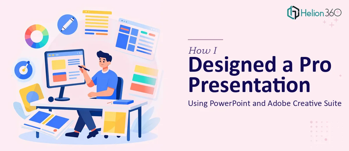
The Brief Was Clear. The Execution Was Not.
We had an important company presentation coming up. Leadership wanted something that looked polished and on-brand — not just a deck of bullet points, but something that actually communicated who we are and what we do. The brief called for professional slide design, high-quality graphics, and clean layouts that matched our brand identity.
I volunteered to take the first pass. I knew PowerPoint reasonably well, and I had basic experience with Adobe Illustrator. How hard could it be?
As it turned out — quite hard.
Where the Process Started to Break Down
The content was ready. I had the company overview, service lines, team structure, and a few key stats. Structuring that into a compelling visual flow was the challenge.
I spent the better part of two days on the first few slides. The layout kept feeling either too crowded or too sparse. I tried working with Adobe Photoshop to clean up a few images, but the resolution issues persisted when I imported them back into PowerPoint. The fonts weren't rendering consistently across slides. The color palette I was using didn't match the brand guide exactly.
I was also trying to create custom icons and graphics in Illustrator — which is possible, but time-consuming when you're not at an expert level. Every element I touched created a new problem somewhere else in the deck.
The presentation needed to be high-resolution, export-ready, and consistent across 20+ slides. That combination of technical requirements and visual quality was beyond what I could deliver cleanly within the timeframe we had.
Bringing in the Right Help
After hitting a wall on day three, I reached out to Helion360. I explained the situation — a corporate presentation that needed professional PPT design with Adobe Creative Suite-quality graphics, consistent branding, and clean layouts. I shared the content, the brand guidelines, and a few reference slides I had started.
Their team asked the right questions upfront: What's the audience? What tone — formal or slightly dynamic? Do we want any subtle animations or keep it static? That conversation alone gave me confidence that they understood the scope.
They took it from there.
What the Final Presentation Looked Like
The difference was visible in the first draft. The slide layouts were structured but not rigid — each section had visual breathing room. The graphics were high-resolution and felt custom, not like stock templates. The brand colors and typography were applied consistently throughout the deck.
Specifically, a few things stood out:
Slide consistency — Every slide followed a clear grid. Headers, body text, and visual elements all had a defined position. It made the deck feel professionally produced, not assembled.
Custom visuals — Instead of generic icons or clipart, the team created branded visual elements in Adobe Illustrator that matched our identity. When exported to PowerPoint, they held resolution at full screen and in print.
Typography and color accuracy — The exact hex codes from our brand guide were used throughout. Font hierarchy was clean — large titles, supporting subheads, and minimal body copy. It made each slide readable in under five seconds.
Flow and structure — The narrative arc was improved too. Slides that felt disconnected in my draft were repositioned to build a clearer story from intro to close.
Helion360 delivered the final file in both editable PowerPoint format and high-resolution PDF, which we needed for printing as well.
What This Experience Taught Me
PowerPoint presentation design looks straightforward until you're trying to meet a professional standard under a real deadline. The combination of slide layout, brand accuracy, graphic quality, and file optimization requires more than basic tool knowledge — it requires design expertise.
Using Adobe Creative Suite alongside PowerPoint is the right approach for high-quality company presentations. But doing it well means knowing when to keep design work in Illustrator versus building directly in PPT, how to export assets without quality loss, and how to maintain visual consistency at scale.
I learned more watching the Helion360 team's process than I would have from hours of tutorials.
Need a Presentation That Actually Looks the Part?
If you're working on a company presentation and realize the gap between what you have and what you need is wider than expected, Helion360 is worth reaching out to. Their team handles the full design process — from slide structure and brand alignment to high-resolution graphics and final file delivery. They step in where the complexity starts, so you can focus on the content and the message.