

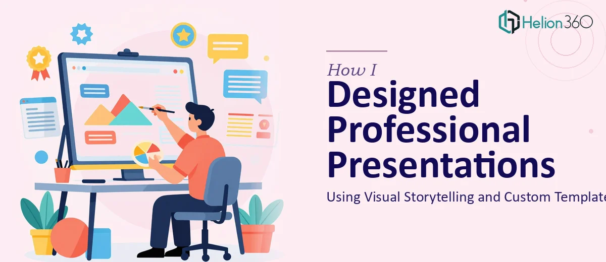
When a Simple Presentation Turns Into a Real Design Challenge
I had been asked to put together a professional PowerPoint presentation for an upcoming internal review. On the surface, it sounded manageable — a few slides, some data, maybe a chart or two. But the moment I sat down to actually build it, I realized the scope was far bigger than I had anticipated.
The content alone was sprawling. There were multiple sections that needed to flow logically into one another, data that needed to be visualized clearly, and a brand identity that had to stay consistent across every single slide. I knew what the presentation needed to communicate. I just could not get the design to match that clarity.
Where My Own Efforts Hit a Wall
I started by building out a rough structure in PowerPoint. I organized the content, chose a color palette that roughly matched the brand, and tried to create a master slide template from scratch. That is where things started to break down.
The custom template I built looked inconsistent — fonts were mismatched across slides, spacing felt off, and the visuals I was pulling in did not quite align with the tone the presentation needed to strike. I spent a weekend trying to fix it, adjusting layouts, swapping images, and rebuilding slide masters. Each fix seemed to create a new problem somewhere else.
Visual storytelling is something I understood conceptually. I knew the presentation needed a narrative arc — a clear beginning, middle, and end that guided the audience through the content rather than dumping information on them. But translating that into slide-by-slide design decisions, while also managing consistent branding and tight formatting, was more than I could handle on my own within the deadline I was working with.
Bringing in the Right Team
After hitting that wall, I came across Helion360. I explained what I was working on — the content structure I had drafted, the branding guidelines, the type of visual language the presentation needed to carry — and their team took it from there.
What I handed over was essentially a rough framework with a lot of unresolved design problems. What came back was a fully cohesive PowerPoint presentation built around a custom template that actually worked. The slide master was clean and properly set up. Every layout followed a consistent visual logic. The content had been organized to support a genuine narrative flow rather than just a sequence of bullet points.
What the Final Presentation Looked Like
The difference between what I had built and what Helion360 delivered was significant. The custom template they created had a clear visual hierarchy — headings, body text, data labels, and accent colors all served distinct roles and stayed consistent throughout the deck.
The visual storytelling aspect was handled through deliberate layout choices. Key messages were given room to breathe. Supporting data was presented through clean charts rather than cluttered tables. Transitions between sections felt intentional rather than abrupt. The branding was integrated throughout without feeling forced — it was present in the color usage, typography choices, and the way icons and visuals were selected to match the overall tone.
The presentation was also built to be practical. Slides were formatted so that content could be updated without breaking the template. That kind of forward-thinking in the design saved time later when minor revisions were needed before the actual review.
What I Learned From This Process
The biggest takeaway for me was that professional PowerPoint design is genuinely its own discipline. Knowing how to use the software is not the same as knowing how to design a presentation that communicates well. Visual Enhancement of Presentation, custom template architecture, graphic design principles, and consistent branding all work together — and when any one of those elements is off, the whole thing suffers.
I also learned that good presentation design is not just about making slides look attractive. It is about making the content easier to follow, the message easier to remember, and the overall experience more credible for whoever is watching.
If you are in the same position I was — staring at a half-built deck that is not coming together despite real effort — Helion360 is worth reaching out to. They handled the complexity I could not manage alone and delivered a result that was ready to present without further rework.