

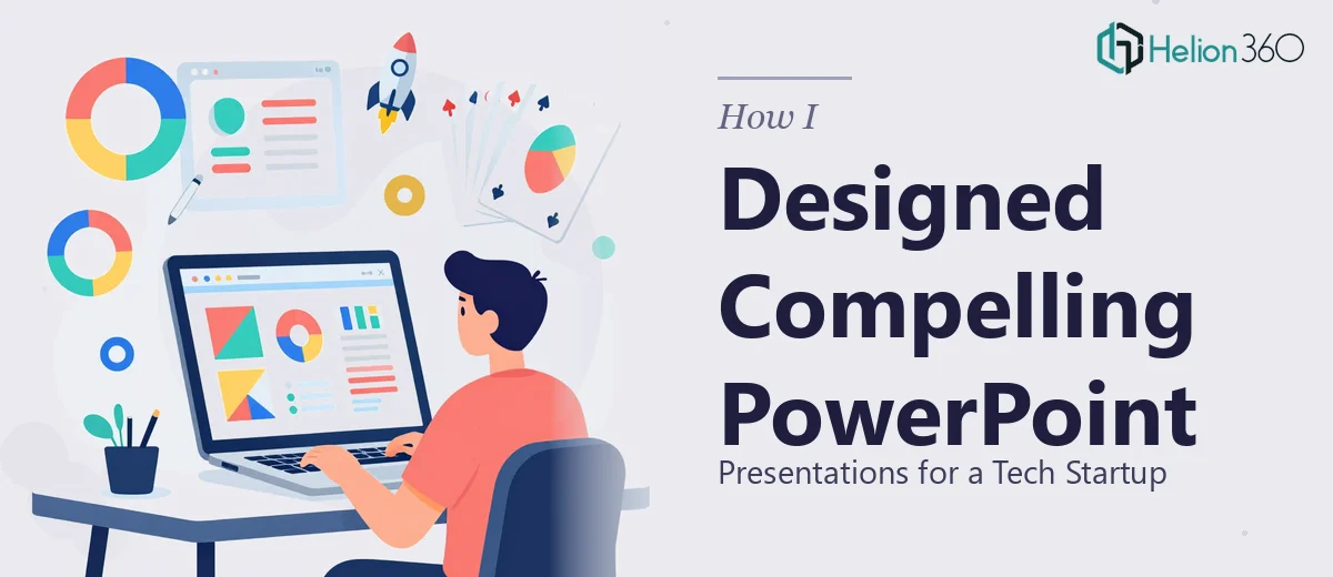
The Problem Was Simpler Than It Looked — Until It Wasn't
We had the content. The slides were structured, the messaging was clear, and the narrative made sense. But every time we opened the decks to review them, something felt flat. Walls of text, placeholder icons, and stock imagery that had nothing to do with what we were actually saying. For a tech startup trying to make an impression — whether pitching investors or walking clients through a product — that kind of presentation just does not cut it.
I took it on myself to fix it. I figured adding high-quality images to the PowerPoint slides would be a weekend task. I'd find the right visuals, drop them in, and the decks would come alive.
That is not quite how it went.
Why Adding Images to PowerPoint Is Harder Than It Sounds
The first issue was sourcing. Finding images that actually matched our tech product context — not generic handshakes or vague server rooms — took far longer than expected. Then came the layout problem. Dropping a high-resolution image onto a slide without disrupting the existing text, spacing, and brand colors required real design judgment, not just drag-and-drop.
I tried cropping and repositioning images manually, experimenting with transparency overlays, and adjusting slide backgrounds to make everything feel cohesive. Some slides improved. Most looked inconsistent. The decks had different aspect ratios, different font hierarchies, and no unified visual language tying them together. What started as a simple image enhancement task had turned into a full slide design exercise across multiple decks.
I also realized that good visual storytelling in PowerPoint is not just about placing a nice photo. It is about choosing imagery that reinforces the message on each specific slide, maintaining visual rhythm across the deck, and ensuring nothing distracts from the core content. That requires both design instinct and technical fluency — and I was running short on both time and the right skills.
Bringing in the Right Team
After a few frustrating rounds of trial and error, I reached out to Helion360. I explained the situation — multiple decks, inconsistent visuals, a startup context, and a team that had feedback but needed someone to take the lead on execution. Their team asked the right questions upfront: What was the audience for each deck? What brand guidelines existed? What feeling did we want the slides to evoke?
That conversation alone told me they understood this was more than an image-insertion job. It was a visual enhancement project that required design thinking.
What the Process Actually Looked Like
Helion360 worked through each deck systematically. They sourced contextually relevant visuals for the tech industry rather than generic stock photos, integrated them in ways that complemented rather than competed with the slide content, and applied consistent styling across all the decks. Where the existing layouts were too rigid to accommodate strong imagery, they made subtle structural adjustments — shifting text blocks, refining spacing, adding visual hierarchy — without altering the core content.
They also flagged a few slides where the content itself was too dense to let any visual breathe, and suggested cleaner alternatives. The feedback loop with our internal team worked smoothly, and revisions came back quickly.
The final result across all the decks was a level of visual consistency and professionalism that would have taken me weeks to achieve on my own — if I could have achieved it at all.
What I Took Away From This
Enhancing a PowerPoint presentation with compelling visuals sounds like a small task until you are actually in it. Sourcing the right images, integrating them without breaking slide layouts, maintaining brand consistency, and applying genuine design judgment across multiple decks is a skill set that takes time to develop. For a startup with limited bandwidth, getting this wrong means walking into meetings with outdated PowerPoint decks that undermine an otherwise strong story.
The better approach, as I learned, is to recognize where your skills end and bring in people who do this every day.
If you are working through the same challenge — presentation decks that need real visual work and not just a few images pasted in — Helion360 is worth reaching out to. They handled the complexity, communicated clearly throughout, and delivered slides that actually looked the part.