

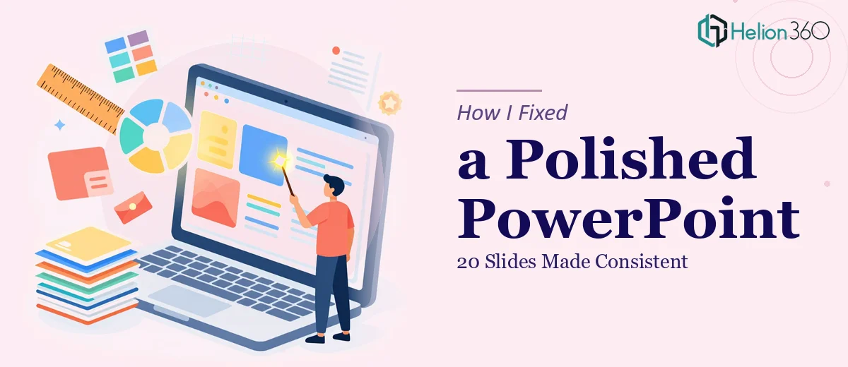
The Presentation Was Done — But It Didn't Look Done
I had spent a good amount of time putting together a 20-slide PowerPoint presentation. The content was all there — the key points, the images, the data. But when I sat back and looked at it as a whole, something felt off. The fonts weren't consistent across slides. Some images were cropped awkwardly or stretched. The spacing felt random. A few slides looked clean while others looked cluttered.
The presentation was technically complete, but it didn't look professional. And that gap matters — especially when you're presenting to someone whose first impression will be formed by how the deck looks before they even read a word.
What I Tried to Fix on My Own
I went back through the slides and tried to manually clean things up. I standardized a couple of font sizes, adjusted some image placements, and tried to create a consistent color scheme. But the more I fixed, the more I noticed other things that needed attention. The alignment was inconsistent. Some slides had too much white space while others were too dense. The image quality varied because different images had different resolutions, and scaling them up made things worse.
I also realized that making a PowerPoint look professional is not just about fixing individual elements — it's about visual consistency across the entire deck. That's a design skill, not just a technical one. I could fix obvious problems, but I wasn't going to achieve the kind of polished, cohesive result the presentation needed on my own.
Handing It Off to Someone Who Could Actually Fix It
After a few hours of going in circles, I reached out to Helion360. I explained the situation — 20 slides, existing content, needed a clean professional look with better image presentation and consistent design throughout. They asked a few clarifying questions about the purpose of the deck and the visual tone I was going for, then got to work.
What I appreciated was that they didn't ask me to rebuild the presentation from scratch. They worked with what I had and improved it systematically — slide by slide.
What the Redesign Actually Involved
The result that came back was noticeably different from what I had submitted. The typography was unified across all 20 slides — same font family, consistent sizes for headings and body text, clear visual hierarchy. Images were properly cropped, resized, and positioned so they actually enhanced the content rather than competing with it.
The slide layouts had been regularized too. Similar slides had the same structure, which made the deck feel like a single cohesive document rather than a collection of individually built slides. Color usage was consistent — backgrounds, accent colors, and text colors all followed a clear system.
Small things I hadn't even noticed before, like uneven padding around text boxes and slightly misaligned elements, had been corrected. Those details are easy to overlook when you're building a deck yourself, but they show up immediately when someone else is evaluating the presentation.
What I Took Away From the Process
The content of the original presentation was good. What it needed was someone with a trained eye to bring it all together visually. Making a PowerPoint look professional isn't just about fixing mistakes — it's about applying consistent design principles across every slide so the deck reads as a unified, intentional piece of work.
I learned that there's a real difference between a presentation that's finished and one that's ready. The first version I put together was finished. What came back from the design pass was ready — ready to be presented with confidence.
If your PowerPoint is in the same situation — all the content is there but it doesn't quite look the way it should — Helion360 is worth reaching out to. They handled the kind of detailed, slide-by-slide visual work that's hard to do well on your own, and the difference in the final output was clear.