

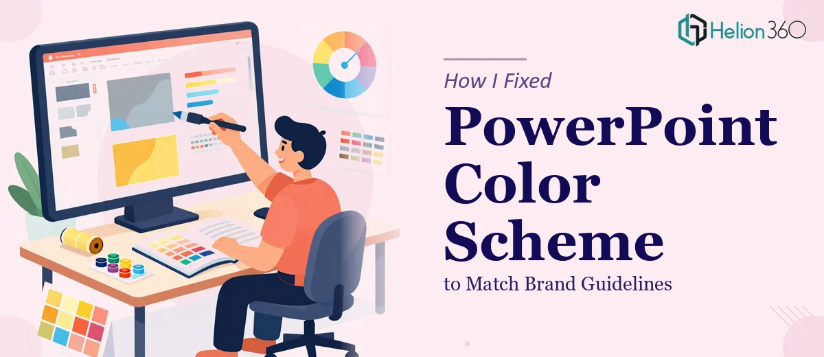
The Presentation Looked Fine — Until It Didn't
We had a presentation going out the next afternoon. The content was solid, the structure made sense, and the slides were already built. The only problem was the colors were all over the place. Some slides used an old version of our brand palette, others had default PowerPoint blues and grays, and a few accent colors had crept in from somewhere that had nothing to do with our brand guidelines.
It seemed like a small fix. Change a few colors, apply the right hex codes, move on. I figured I could handle it in under an hour.
Where It Got Complicated
I opened the deck and started making changes manually. The first few slides went fine. But the further I went, the more I realized how inconsistent the file was underneath the surface. Some colors were applied directly to shapes, others were embedded in the slide master, and a few text elements had inline color overrides that weren't visible until I clicked into them.
Every time I thought I had matched the brand color correctly, something else would look off. The backgrounds weren't syncing, the icon fills were inheriting different values, and some charts had their own color sequences that were completely disconnected from the rest of the deck. What I assumed was a one-hour color fix was turning into an afternoon of chasing down inconsistencies across 30-plus slides.
The deadline wasn't moving, and I needed a clean, consistent deck — not a patchwork of partial fixes.
Handing It Off to Someone Who Knew the File Structure
That's when I reached out to Helion360. I explained the situation — existing PowerPoint deck, brand color update needed across all slides, specific hex codes to apply, deadline the next afternoon. Their team asked a few straightforward questions about the brand guidelines and the slide master setup, then took the file from there.
I didn't have to explain the problem twice or walk anyone through what branding in a presentation should look like. They already understood what needed to happen: a consistent color scheme applied at the right level of the file — master slides, layouts, and individual elements — so the fix would hold and not break anything else in the deck.
What Came Back
The revised deck came back well ahead of the deadline. The color scheme was consistent across every slide — backgrounds, headings, shapes, chart elements, and icon fills all aligned to the brand palette. The slide master had been updated properly, which meant future edits wouldn't revert to the old colors.
Looking at it side by side with what I had started with, the difference was clear. It wasn't just that the colors were correct — the whole deck looked more put together because the visual consistency was finally there. That's what brand color alignment actually does when it's done properly across the full file.
What This Taught Me About PowerPoint and Brand Consistency
I learned that color changes in PowerPoint are rarely as simple as selecting elements and swapping hex values. When a deck has been built or edited by multiple people over time, the color data ends up stored in different places — theme colors, direct fills, inherited styles — and fixing it properly means knowing where to look and in what order to apply changes.
Branding in a presentation isn't a surface-level task. It touches the file's underlying structure, and if that structure isn't updated correctly, the deck will look inconsistent the moment someone edits it again. Getting it right the first time saves a lot of back-and-forth later.
If you're staring at a messy PowerPoint presentation that needs its color scheme corrected to match brand guidelines and you're running out of time to figure out why the changes aren't sticking, Helion360 is worth reaching out to — they handle exactly this kind of work and turn it around quickly. Learn more about how pitch deck redesigns can transform your presentation's impact.