

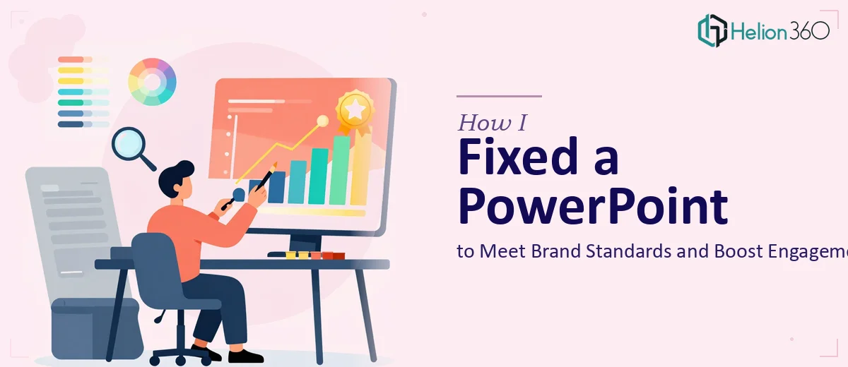
The Presentation Was Done — But Not Really
I had spent several hours building out an educational PowerPoint for an internal training program. The slides were all there. The content existed. On the surface, it looked like the job was mostly done.
But every time I opened the file and flipped through it, something felt off. The fonts shifted between slides. Some sections used our brand colors and others didn't. A few slides were visually heavy while others looked too sparse. The presentation had no real rhythm to it — and for a program meant to train employees, that inconsistency was going to be a problem.
What I Tried to Fix on My Own
I went back into the file and started working through the issues slide by slide. I updated the font choices on the slides that looked wrong, tried to reapply the brand color palette, and rearranged a few content blocks that felt cluttered. That took a couple of hours on its own.
But the more I fixed in one area, the more I noticed problems elsewhere. Slide layouts that looked fine in isolation looked mismatched when viewed as a full deck. The content itself needed tightening — some slides had too much text and others didn't have enough to make the point clearly. I also wanted to add some interactive elements to break up the monotony, but I wasn't confident enough in PowerPoint's animation and trigger features to pull that off cleanly without making things worse.
At a certain point, I had to be honest with myself. The issue wasn't just aesthetics — it was structural. Getting this presentation to a professional standard was going to take more than a few tweaks.
Bringing in Help at the Right Moment
After a bit of searching, I came across Helion360. I explained what I had — a pre-designed PowerPoint that needed brand alignment, content cleanup, visual consistency, and a few interactive touches — and sent over the file along with our brand guidelines.
Their team reviewed everything and came back with a clear plan. They weren't going to rebuild the deck from scratch unnecessarily; the goal was to refine what was already there and bring it up to the standard the presentation needed to meet.
What the Refinement Process Actually Looked Like
Helion360's designers went through the deck systematically. They standardized the typography across all slides, making sure heading sizes, body text, and captions followed a consistent hierarchy throughout. The brand colors were applied correctly and uniformly — not just on the obvious elements like title slides, but also on dividers, icon accents, and background elements.
The content was restructured on several slides where the original layout was working against the message. Dense text blocks were broken into more digestible formats using visual spacing and subtle design elements rather than overcrowding the slide. Where slides felt too thin, they helped reinforce the point with supporting visuals that didn't distract from the content.
They also added interactive components — click-through sections, a navigable menu, and a few slide transitions that made the overall flow feel intentional rather than static. Nothing overproduced, but enough to make the experience noticeably better for the people sitting through the training.
What the Final Deck Looked Like
When I received the revised file, it felt like the same presentation had been put through a proper filter. Every slide matched. The brand elements were consistent without being repetitive. The content read clearly and the pacing made sense. The interactive components worked smoothly and added real value to the flow.
The team that reviewed the final version before the training rollout immediately noticed the difference. Several people commented that it looked professionally designed — which, at that point, it effectively was.
What I Took Away From This
Editing a pre-designed PowerPoint sounds simple until you're actually inside a file trying to fix cascading inconsistencies while also improving content and adding engagement features. It's not just about knowing the software — it's about having the design judgment to know what should change and what should stay.
I also learned that bringing in help doesn't mean starting over. For presentations that need this level of refinement, business presentation design services like Helion360's work with what you've already built and make it genuinely better, which saves time and preserves the work you've already done.
If your presentation is mostly there but not quite right — inconsistent branding, mismatched layouts, content that needs polish — Helion360 is the kind of team that can take it the rest of the way without making the process complicated.