

When the Data Volume Gets Ahead of You
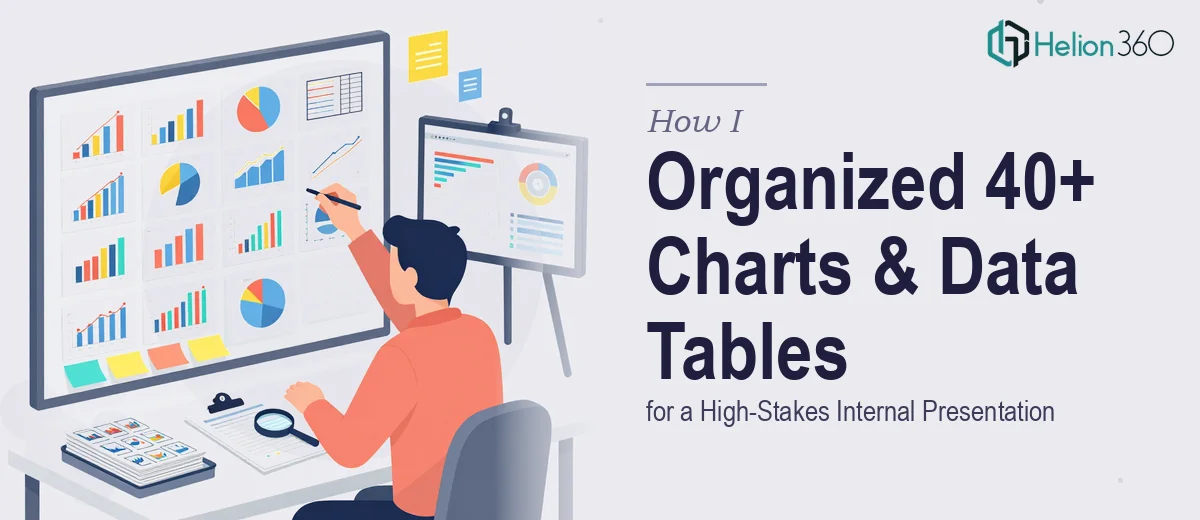
I knew this internal presentation was going to be heavy on data. What I did not fully anticipate was just how much formatting work 40+ PowerPoint charts and 22 separate data tables would actually demand — especially with a deadline sitting at the end of the week.
The task on paper sounded straightforward enough: highlight key figures across the charts, label the important data points, and format the tables cleanly. Nothing wildly complex in theory. But once I opened the files and started working through them, the sheer scale of it became clear fast.
What I Tried to Handle on My Own
I started by working through the PowerPoint charts manually — going slide by slide, identifying which numbers needed to stand out, and applying highlight formatting. For the first eight or ten charts, the process was manageable. I had a system going.
Then the consistency problem crept in. With 40+ charts, keeping the highlight colors, font weights, label placement, and overall visual style perfectly uniform across every single slide was harder than expected. I would fix something on slide 12 and realize it no longer matched what I had done on slide 4. Scrolling back and forth, cross-referencing, re-adjusting — the pace slowed to a crawl.
The 22 data tables were a separate challenge. The raw data was provided and required minimal reformatting in principle, but laying it out cleanly — consistent column widths, aligned headers, readable row spacing — took real attention to detail at scale. One table was fine. Twenty-two tables with consistent formatting standards across all of them was something else entirely.
I was maybe a third of the way through when I realized the timeline was not going to hold if I kept working alone.
Bringing In the Right Support
After hitting that wall, I came across Helion360. I explained the situation — the chart count, the table count, the deadline, and the formatting standards I was trying to maintain. Their team understood the scope immediately and did not overcomplicate it.
I handed over the files, shared the data that needed to go into the tables, and pointed out the visual style I was going for — clean, professional, no decorative elements, just clear and readable formatting for an internal audience. From there, Helion360 took it over.
What the Finished Work Looked Like
The turnaround was quicker than I expected given the volume. When I reviewed the completed deck, the first thing I noticed was the consistency. Every chart had its key figures highlighted in the same way — same treatment, same visual weight, same label style throughout all 40+ slides. It was the kind of uniform execution that is genuinely difficult to maintain when you are working through something this large on your own.
The 22 data tables were formatted just as cleanly. The column structures were aligned, the data was easy to scan, and the overall look matched the professional tone the presentation needed. Nothing flashy — just well-organized PowerPoint data presentation that would hold up in a room full of people reading from a screen.
For an internal presentation, that kind of clarity matters. Leadership teams reading through dense data do not want to work hard to find the key numbers. Good chart highlighting and clean table formatting does that job quietly and effectively.
What I Took Away from This
The lesson for me was less about technical skill and more about recognizing when volume becomes its own problem. Formatting one chart well and formatting 40+ charts with perfect consistency are genuinely different tasks. The same goes for tables.
When the work is repetitive at scale, the challenge shifts from knowing what to do to executing it cleanly and fast across everything — without errors or inconsistencies creeping in. That is where having a capable team makes a measurable difference.
If you are sitting on a similar pile of charts and tables with a deadline approaching, consider PowerPoint formatting services. They handled what I could not finish alone and delivered exactly the clean, consistent result the presentation needed.
For similar challenges at scale, you might also find it helpful to learn about professionally formatted PowerPoint presentations and how multi-deck PowerPoint fixes can address formatting and design issues under tight timelines.