

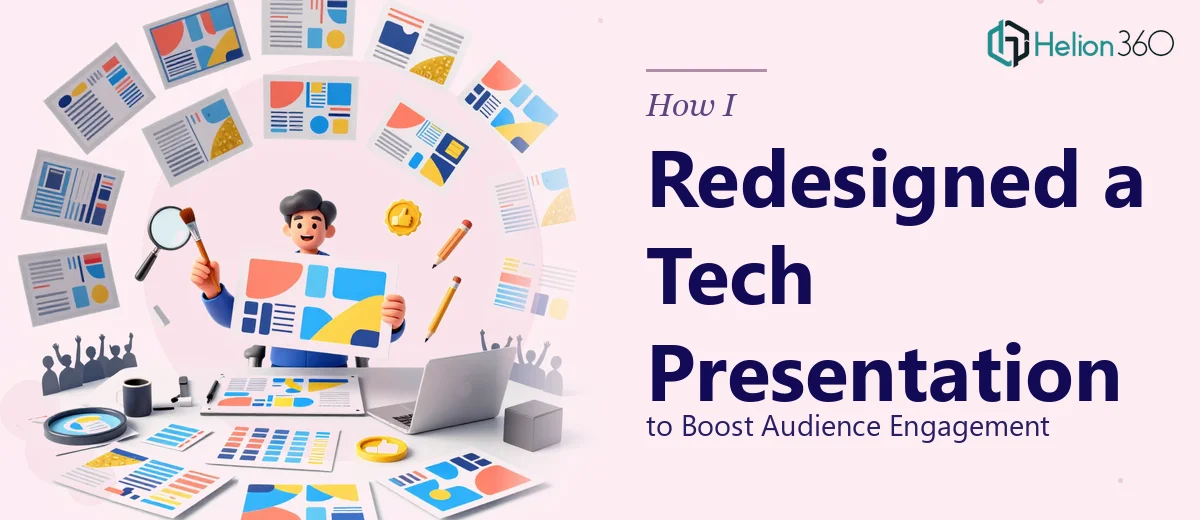
The Presentation Was Done — But It Wasn't Ready
Our team had spent weeks putting together a 13-page presentation. The content covered our company's strategic vision and product roadmap in detail. The research was solid, the messaging was clear, and everyone on the team had contributed. On paper, it should have been ready to share.
But when I looked at it as a whole, something felt off. The slides were dense with text. The layout was inconsistent from page to page. There was no clear visual hierarchy guiding the reader's eye. And the color scheme — while technically using our brand colors — felt flat and dated for a tech company trying to signal forward momentum.
The content told a good story. The design was not telling it well.
Where My Attempts Hit a Wall
I'm comfortable working in PowerPoint for day-to-day tasks, so I tried to clean things up myself. I simplified a few slides, adjusted some fonts, and rearranged content blocks. It improved things slightly, but not meaningfully.
The core issue was that I was fixing symptoms rather than redesigning the structure. Every time I updated one slide to look better, it clashed with the ones around it. The presentation needed a cohesive visual system — consistent layouts, purposeful use of space, intentional typography, and a color approach that felt modern without abandoning the brand identity we already had.
That kind of work requires more than basic editing. It requires someone who thinks about visual communication as a craft, not just a cleanup task.
Bringing in the Right Support
After hitting that wall, I reached out to Helion360. I explained the situation — 13 slides, finished content, a clear brief about the audience and brand expectations, and a deadline that didn't leave much room. Their team looked at the existing file, asked a few targeted questions about tone and audience, and then got to work.
What stood out early was that they didn't just jump into aesthetics. They reviewed the flow of the presentation first and flagged a few structural issues — slides that were trying to do too much, transitions that broke the narrative, and sections that could be consolidated without losing any substance. That kind of thinking made the final redesign much stronger than if they had simply reskinned what was already there.
What the Presentation Redesign Actually Involved
The visual overhaul touched every slide. Layouts were rebuilt to create clear focal points on each page. Text-heavy sections were broken up using supporting visuals and icons that reinforced the message rather than decorating around it. The product roadmap section — which had been a dense table — was rebuilt as a clean visual timeline that was far easier to follow at a glance.
The color work was subtle but effective. Rather than replacing the brand palette, the team extended it with more intentional use of contrast and white space. Slides that had felt crowded now had room to breathe. The overall result looked like the same brand, just expressed with far more confidence and clarity.
Navigation between sections also improved. Each major section of the presentation now had a consistent visual cue, so the audience always knew where they were in the story. For a strategic roadmap presentation, that sense of structure matters.
The Outcome and What I Took Away
When the redesigned file came back, the difference was significant enough that the internal team noticed immediately without being prompted. The slides were easier to present from, easier to follow as an audience member, and looked aligned with the kind of company we want to be perceived as.
The experience reinforced something I already suspected but hadn't fully acted on: presentation design is a distinct skill set from content creation. Writing the strategy and visualizing it are two different disciplines. Knowing when to hand one of those off is not a shortcoming — it's just good judgment.
I also came away with a clearer sense of what makes a strong slide redesign brief. The more specific you can be about audience, purpose, and tone upfront, the faster the work moves and the fewer revision rounds you need.
If you're sitting on a finished presentation that isn't landing the way the content deserves, check out how I redesigned a cluttered presentation or learned from transforming a scientific presentation — Helion360 is worth reaching out to, and they handled the design complexity I couldn't resolve on my own and delivered something the whole team felt confident presenting.