

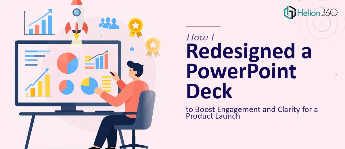
The Deck Was Ready — But It Wasn't Working
We had a product launch coming up, and the PowerPoint deck had been sitting in a shared folder for weeks. Multiple people had added to it over time — different fonts, inconsistent slide layouts, walls of text, and charts that were impossible to read at a glance. On paper, all the information was there. But opening the file and scrolling through it felt exhausting, and I knew the audience would feel the same way.
I volunteered to rework it. It seemed like a reasonable task at the time.
What I Tried to Fix on My Own
I started by going through the deck slide by slide, cutting down text and trying to standardize the layout. I replaced a few dense paragraphs with shorter bullet points and tried to align fonts across the slides. I spent a couple of hours tweaking colors to match our brand guidelines and repositioned images that felt out of place.
But the more I worked on it, the more I realized the problems were deeper than formatting. The content flow did not tell a clear story. There was no visual hierarchy guiding the eye. Some slides were doing the work of three slides, while others felt like filler. I could clean up the surface, but rebuilding the structure and visual design to actually engage an audience during a live product launch presentation — that was a different level of work entirely.
Bringing in the Right Help
After hitting that wall, I came across Helion360. I explained the situation — tight timeline, a product launch audience, a deck that needed both content restructuring and a full visual overhaul. Their team asked the right questions: Who was the audience? What was the core message? What had to stay and what could go?
That conversation alone helped me see the project differently. Within a day, they had a plan.
The Redesign Process
Helion360 started with the content layer. They restructured the slide sequence so the deck built toward a clear narrative — problem, solution, product features, and the reason to act. Slides that were doing too much were split into focused, single-idea slides. Content that was buried in dense paragraphs was distilled into clean, readable statements.
Then came the visual work. The layout was standardized across all slides using a consistent grid. Typography was cleaned up with clear size hierarchy so the eye always knew where to go first. Data slides were rebuilt using charts that were easy to read in seconds. Custom graphics replaced generic stock visuals, and the overall color palette was tightened to reflect the product's brand identity.
The result was a PowerPoint presentation redesign that looked intentional and professional — not assembled over time by a committee.
What the Final Deck Actually Did
When I presented the updated deck internally before the launch, the reaction was immediate. People who had seen the original version said they finally understood the product story. The flow made sense. Nothing felt cluttered. The key messages landed.
During the actual product launch presentation, the audience stayed engaged. We did not lose people at the data-heavy slides the way we had feared. The visual clarity made a real difference in how the information was received.
What I Took Away From This
I learned that a PowerPoint deck redesign is not just about making slides look better. It is about deciding what story the deck tells and making sure every element — layout, type, color, content sequence — serves that story. Those decisions compound across 20 or 30 slides, and getting them right requires both design skill and a clear understanding of how presentations communicate.
Trying to do that alone under a deadline is where most people, including me, run into trouble.
If you are working on a presentation that needs both clarity and visual impact before a high-stakes moment, Helion360 is worth reaching out to — they handled the complexity I could not manage alone and delivered a deck that actually worked.