

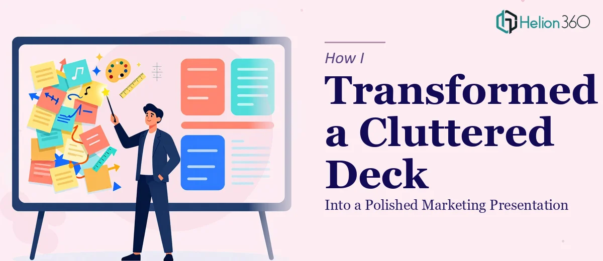
The Deck That Was Doing More Harm Than Good
I had a PowerPoint deck sitting on my desktop that had gone through too many hands. Slides with mismatched fonts, walls of text, graphics that looked like placeholders, and a flow that jumped around without any clear logic. The presentation was supposed to represent a young tech company's flagship product — something the team was genuinely excited about. But looking at it, you would never know that.
The product was real, the energy behind it was real, and the potential was there. The problem was purely visual and structural. The deck was not communicating any of that excitement. It was cluttered, inconsistent, and honestly a little hard to follow.
Why I Could Not Just Fix It Myself
I tried. I spent a few hours cleaning up the layout, swapping out a few images, and tightening the language on a couple of slides. And I made some progress — but not nearly enough.
The issue was not just aesthetics. The deck needed a complete reorganization. The narrative structure was off. Some sections front-loaded information that should have come later, and the product's strongest selling points were buried near the end. The graphics needed to be rebuilt from scratch, not just resized. And the whole thing needed a visual identity that matched the startup's personality — friendly, modern, and confident — without looking like a generic template.
I knew enough about PowerPoint to make minor edits. I did not know enough to pull off a full presentation redesign at this level without it taking me a week and still not being right.
Bringing in the Right Team
After hitting that wall, I reached out to Helion360. I explained what I had — a marketing presentation for an early-stage tech company that needed to be reorganized, rewritten in places, and visually rebuilt to match the product's energy. I shared the deck and gave some context about the audience and the tone the company was going for.
Their team came back with questions that made it clear they understood the brief. They wanted to know how the presentation was being used, who would be in the room, and what impression the company wanted to leave. That kind of intake process told me they were not just going to apply a pretty template and call it done.
What the Redesigned Deck Actually Looked Like
The final version was a different experience from the first slide to the last. The structure had been reworked so the story built naturally — starting with the problem the product solves, moving into the solution, and landing on the value in a way that felt earned rather than forced.
The language across the slides was sharper. Long paragraphs were replaced with tight, readable statements. The graphics were custom and clean, and the visual style matched the startup's tone without feeling overdone. It was still professional, but it also had energy — which is exactly what the company needed going into a room to present their product.
The slide count stayed similar, but every slide now had a purpose. Nothing felt like filler.
What This Whole Process Taught Me
PowerPoint redesign sounds simple until you are actually inside a deck that needs structural, language, and visual work done all at once. These are three different skill sets. Getting the story right, getting the copy tight, and making it look polished — that is not a one-person, one-afternoon job when the stakes are real.
For a startup trying to make a strong impression with a marketing presentation, the deck is not a supporting document. It is often the first real thing an audience interacts with. If it looks rushed or disorganized, that is the impression they walk away with.
If you are sitting on a deck that you know is not doing the job it should, Helion360 is worth reaching out to — they stepped in at the point where my own effort had stalled and delivered something that actually reflected the product's potential.