

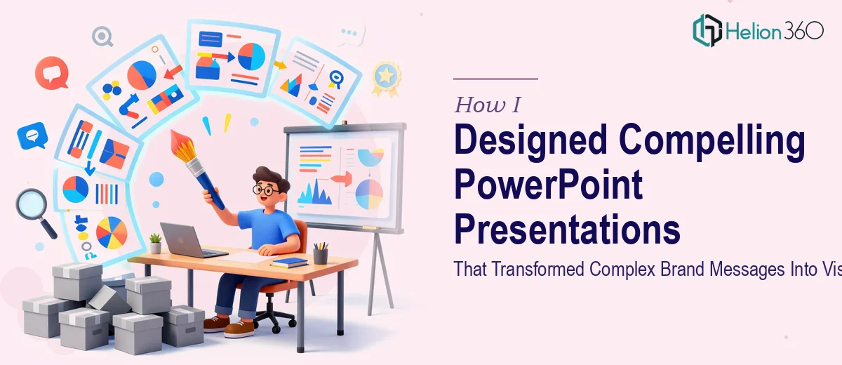
When the Brief Is Bigger Than the Slide Count
Our company was going through a brand revamp. New positioning, new tone, new visual identity — and someone needed to translate all of that into PowerPoint decks that actually made sense to an audience. That someone ended up being me.
On paper, the ask seemed manageable. Take the raw content, apply the new brand, and create slides for marketing campaigns, product launches, and internal communications. But once I sat down to start, the complexity hit fast.
The Gap Between Raw Content and a Visual Narrative
The content I received was dense. Strategy documents, product briefs, internal memos — all valuable, but none of it was shaped for visual storytelling. My job was to figure out what to show, how to show it, and in what order, while keeping each deck aligned with a brand identity that was still being finalized.
I started with the marketing campaign deck. I knew the message I wanted to land, but translating that into a slide flow that felt cohesive and visually compelling was harder than I expected. I could design a slide that looked decent, but when I stepped back and looked at the full deck, the narrative felt disjointed. The visual rhythm was off. Some slides were overloaded with text, others felt sparse and unfinished.
The product launch deck had a different problem. There was a lot of information that needed to be communicated clearly, and I kept second-guessing whether I was making the right calls on hierarchy, layout, and which data points deserved visual treatment versus plain text.
After a few rounds of iteration, I realized I was spinning. The individual slides were improving, but the overall story was not coming together the way it needed to.
Bringing in the Right Team
That is when I reached out to Helion360. I explained what we were trying to do — a full marketing presentation design effort across multiple decks, each serving a different audience and purpose. Their team asked the right questions upfront: what was the brand trying to say, who was sitting in the room, and what did success look like after each presentation.
Helion360 took the raw content I had already organized and rebuilt the decks from a story-first perspective. They established a master slide framework that reflected the new brand identity — consistent typography, a deliberate color system, and layouts that gave the content room to breathe. Then they applied that framework across all three decks while adjusting the visual weight and pacing to match each presentation's specific goal.
What Good Slide Design Actually Looks Like
Seeing the before and after was instructive. The decks I had started were functional. The decks that came back from Helion360 were purposeful. Every slide had a clear focal point. The flow from one slide to the next felt intentional. Complex ideas that I had been trying to explain in paragraphs were now expressed through structured visuals that an audience could absorb in seconds.
The internal communications deck, which I had been least confident about, ended up being the most polished of the three. The team found a way to make internal data feel engaging without making it feel like a report. That balance — informative but not dry, visual but not decorative — is harder to strike than it sounds.
What I Took Away From the Process
Designing effective PowerPoint presentations is not just about making slides look good. It is about understanding what story the slides are meant to tell, who is listening, and how to lead them through that story without losing them. Visual storytelling at this level requires both design skill and communication thinking working together.
I also learned that brand consistency across multiple decks does not happen automatically. It requires a system — a master template, defined rules, and someone who knows how to apply those rules without making every deck feel identical.
If you are working through a similar situation — multiple decks, a brand in transition, content that needs to be shaped into something an audience will actually engage with — consider how clean and modern presentations can deliver the results you need. Helion360 handled the complexity that had stalled my progress and delivered presentations that were ready to use.