

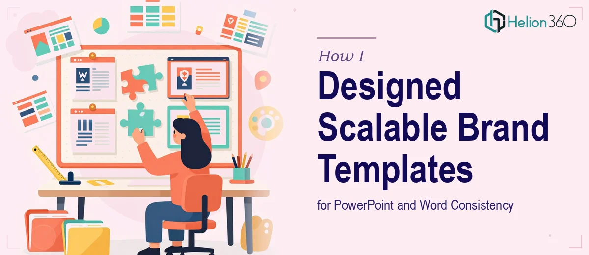
The Problem With Patchwork Documents
Every time someone on the team produced a new document or presentation, it looked slightly different. The logo sat in a different corner, the font weights did not match, and the color values were close but never quite right. We had brand guidelines sitting in a shared drive that nobody was fully following, not because they did not care, but because there was no reliable template to anchor the work.
I took it upon myself to fix this. The goal was straightforward: build a set of custom PowerPoint and Word templates that anyone on the team could open, fill in, and send out, without a single design decision left to chance.
Where I Started and Where I Got Stuck
I began by auditing everything we already had. Presentations, reports, proposals — I pulled them all together and noted where the inconsistencies were showing up most. Typography was a big one. We had documents mixing three different heading sizes with no logical hierarchy. Color was another problem. Slides were using hex values that were close to the brand palette but not exact.
I started building the templates myself in PowerPoint, setting up slide masters, defining color themes, and locking down font styles. For a while it felt manageable. But once I got into the more complex layouts, things started to unravel. Slides that needed to hold data charts alongside branded imagery required careful grid work that I did not have the experience to execute cleanly. The Word templates were even harder. Getting styles, section breaks, heading hierarchies, and table formatting to behave consistently across different versions of Word was genuinely difficult.
I also realized that building one template was one thing. Building a suite of templates — for sales decks, internal reports, proposals, and team updates — each with their own layout logic but all sharing the same visual language, was a much larger undertaking than I had anticipated.
Bringing in the Right Help
After spending more time than I had budgeted trying to get the slide masters to behave, I reached out to Helion360. I explained what we were trying to accomplish: a scalable template system in both PowerPoint and Word, built to our branding guidelines, with enough flexibility for different content types but enough structure to keep everything consistent.
Their team asked the right questions upfront. They wanted to understand how the templates would be used, who would be using them, and what level of customization each user would need. That conversation alone told me they had done this kind of work before.
What the Finished Templates Actually Looked Like
Helion360 delivered a full set of custom PowerPoint templates covering multiple layout scenarios — title slides, section dividers, content-heavy slides, data visualization layouts, and closing slides. Each one was built on a properly structured slide master, meaning any edit to the master cascaded correctly through every layout. The color palette was locked to exact brand values, and the typography was set up so that heading and body styles applied automatically.
The Word templates followed the same logic. Heading styles, table styles, page margins, and footer placements were all defined and consistent. Switching between a proposal format and an internal report format no longer meant reformatting the whole document from scratch.
The thing I appreciated most was that the professional templates were genuinely usable. They did not require design knowledge to operate. Someone could open a blank slide, pick a layout, and start typing without breaking anything.
What I Took Away From This
Building custom PowerPoint and Word templates that actually work at scale is more technical than it looks. It is not just about making things look good — it is about setting up the file architecture so that consistency is enforced automatically, not manually. That requires real expertise in how Microsoft Office handles masters, styles, and themes.
The time I saved after the templates were in place was significant. Onboarding new documents became faster, review cycles shortened because formatting issues stopped appearing, and the brand finally looked the same everywhere it appeared.
If you are dealing with the same inconsistency problem across your documents and presentations, Helion360 is worth reaching out to — they handled the complexity I could not manage alone and delivered something the whole team could actually use.