

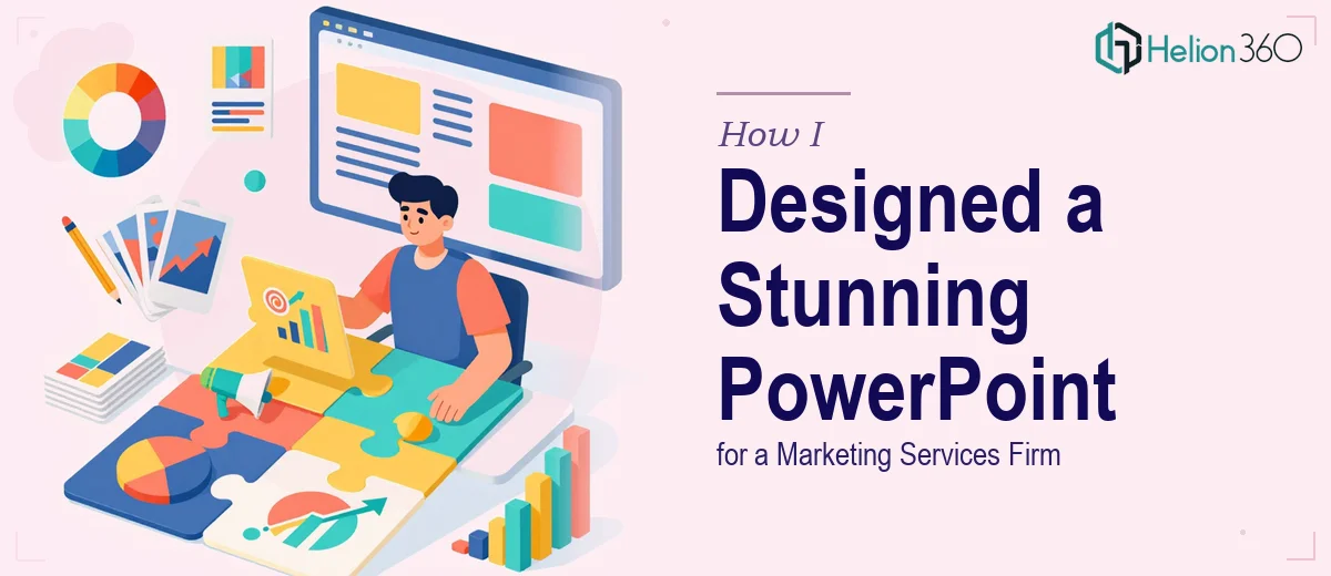
When a Simple Slide Deck Turns Into a Full Creative Challenge
I run a small marketing firm, and like a lot of small business owners, I wear a lot of hats. When the time came to put together a presentation that would showcase everything we offer — content marketing, social media strategy, email campaigns, and more — I figured I could handle it myself. I had PowerPoint open, I had our service list ready, and I thought it would take an afternoon.
It took three afternoons, and I still wasn't happy with what I had.
The Problem With DIY Marketing Presentations
The content was all there. I knew exactly what we do and how we help clients. But getting that knowledge into a deck that looked credible enough to send to potential clients? That was a different challenge entirely.
Every slide felt either too text-heavy or too bare. I tried using a template, but nothing quite matched the tone I was going for — something professional, visual, and easy to absorb at a glance. I kept tweaking fonts, rearranging sections, and staring at color combinations that never felt right. The problem wasn't understanding our services. The problem was translating them into a visually engaging marketing presentation that could do real work in a sales conversation.
When you're preparing something that will go directly in front of potential clients, the design has to hold up on its own. A rough-looking deck sends the wrong message, especially for a marketing firm where visual credibility matters.
Reaching Out for Professional Presentation Design Help
After a few failed attempts at pulling this together on my own, I started looking for someone who actually specialized in this kind of work. That's when I came across Helion360. I reached out, explained the project — a marketing services presentation that needed to be polished, client-ready, and built around our specific offerings — and their team took it from there.
I shared our service breakdown, some notes on tone, and a rough idea of the flow I had in mind. They asked a few clarifying questions about the audience and the visual direction, and then got to work.
What the Design Process Actually Looked Like
What came back was considerably better than what I had been working on. The slides were structured in a way that told a clear story — who we are, what we do, and why it matters to a client. Each service area had its own section with supporting visuals that reinforced the message without cluttering the slide.
The color palette was consistent and on-brand. The typography was clean and readable. Charts and icons were used to break up text without making the deck feel like a brochure. There was a real sense of hierarchy to the information — something I hadn't managed to achieve on my own — so that anyone flipping through the deck could immediately understand what we offer and what to focus on.
The section on social media strategy came out especially well. Instead of a bulleted list of features, it was laid out as a visual flow that showed how our work connects to a client's goals. That kind of layout takes time and design judgment to get right.
What I Took Away From This
I came away with a presentation I'm genuinely confident sharing with prospective clients. More than that, I understand now that a marketing services presentation isn't just a document — it's a sales tool. The design directly affects whether a potential client takes your offering seriously or scrolls past it.
Building professional PowerPoint for client-facing purposes is a different skill set from knowing your business well. You can have all the right content and still produce something that doesn't land the way it should. That gap is where good presentation design makes a real difference.
If you're in a similar position — you know your services inside and out but can't seem to get a client-ready deck across the finish line — Helion360 is worth a conversation. They handled the parts I was stuck on and delivered something that actually represents the business well.