

When a High-Level Concept Needs to Become a Convincing Document
We had a strong product idea. Our software platform was designed to simplify project management for businesses at every scale, and internally, the team understood it well. But when it came time to put together a formal project proposal for investors and potential partners, I quickly realized that our internal clarity was not translating onto the page.
I sat down to structure the document myself. I had the high-level concepts, the technical architecture mapped out in rough diagrams, and some early wireframes. The problem was bringing it all together into something that communicated both the technical depth and the business case — clearly, professionally, and in a format that would hold the attention of an investment committee.
The Gap Between Having an Idea and Presenting It
The first draft I put together read more like an internal memo than a proposal. It was dense with technical detail but had no visual hierarchy, no narrative flow, and nothing that made a reader want to keep going. I knew investors were not going to spend twenty minutes decoding a wall of text.
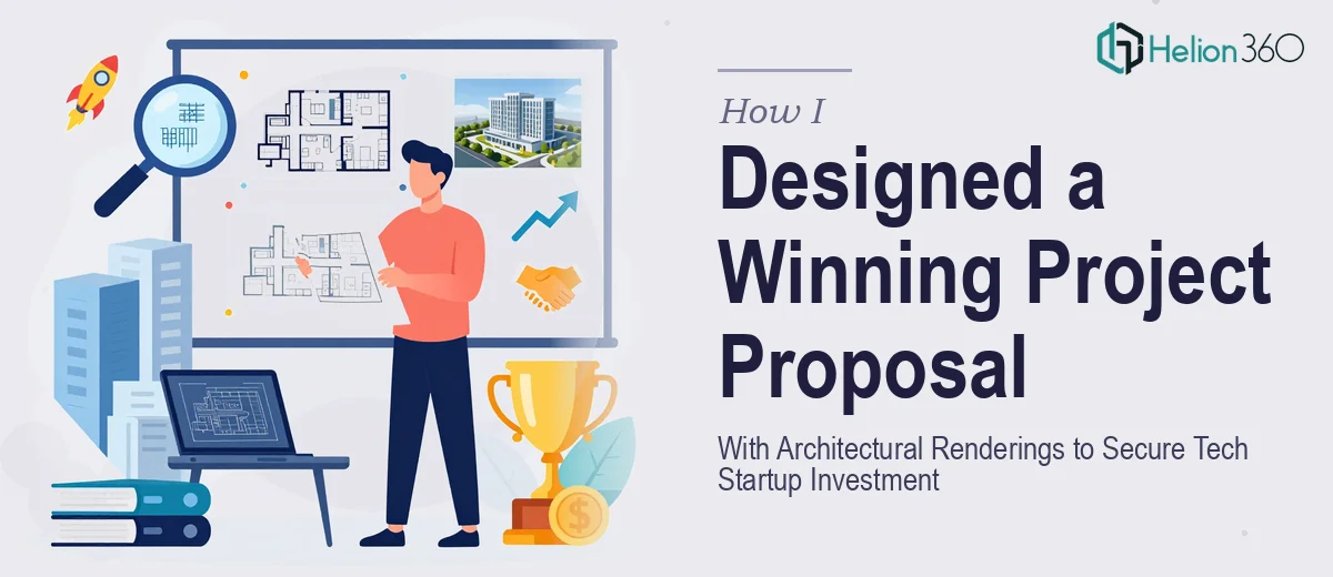
I also needed architectural renderings — visual representations of the platform's structure and how different components connected. I had basic flowcharts, but they were not presentation-ready. Turning those into polished, credible visuals that could stand alongside a business narrative required a level of design skill and layout thinking I did not have bandwidth for at the time.
The content was there. The problem was presentation design — structuring the proposal in a way that made the architecture legible, the business case compelling, and the whole document visually coherent.
Bringing In the Right Support
After spending a few days trying to push the draft further and hitting the same wall, I reached out to Helion360. I explained the situation — a tech startup proposal that needed to combine software architecture, visual renderings, and a clear investment narrative into a single, polished document.
Their team asked the right questions upfront. They wanted to understand the audience, the stage of funding we were targeting, and what level of technical detail was appropriate. That conversation alone helped me realize the proposal needed two layers: a high-level business story for investors and a supporting technical layer for due diligence.
What the Final Proposal Looked Like
Helion360 restructured the entire document around that dual-audience approach. The opening sections covered the problem, the solution, and the market opportunity in clean, visual slides. The platform architecture was presented using refined system diagrams — not the rough flowcharts I had started with, but clear architectural renderings that showed how the components interacted without overwhelming a non-technical reader.
The presentation plans were also organized into a logical sequence that walked a reader from the problem statement through to the roadmap and financials. Each section transitioned naturally into the next. The visual design stayed consistent throughout — typography, color, layout — which gave the whole document a credibility it had been missing.
By the time the final version came back, it looked like something that belonged in front of serious investors. More importantly, it read that way.
What I Took Away From This Process
The biggest lesson was that having the right content is only half the work. A project proposal for investor presentation purposes lives or dies on how clearly that content is communicated. Technical architecture, no matter how sound, needs to be visualized in a way that a financial or strategic decision-maker can process quickly.
I also learned that narrative structure of a proposal matters as much as the information inside it. Investors are reading dozens of decks. Anything that requires extra effort to follow gets skipped.
If you are in a similar position — you have the concept and the content but the proposal is not landing the way it should — Helion360 is worth contacting. They handled the gap between what I had and what the document needed to be, and the result made a real difference in how the work was received.