

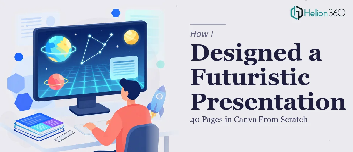
The Brief Sounded Simple Enough
I had the content ready. Forty pages, organized, written, and structured. All I needed was someone to turn it into a visually compelling presentation with a futuristic, creative theme. How hard could that be?
As it turned out, harder than I expected.
I started in Canva myself. I picked a template that felt close to the direction I wanted — dark backgrounds, geometric shapes, a bit of a tech-forward feel. I got through about eight slides before I ran into the first real problem. The template was not built for 40 pages. Scaling it consistently across that many slides while maintaining visual rhythm, typographic hierarchy, and a coherent futuristic aesthetic was a different challenge entirely from just picking fonts and colors.
Where the Complexity Crept In
A futuristic presentation design is not just about making things look sleek. There is a specific visual language involved — how light and shadow are used, how negative space is treated, how icons and graphic elements reinforce the tone without overwhelming the content. When you are doing that across 40 slides with varied content types — text-heavy slides, data slides, visual statement slides — the consistency challenge becomes significant.
I also realized I was spending too much time on design decisions that were slowing down everything else. Every time I adjusted the layout on one slide, it created a ripple effect across the others. The spacing felt off. The color accents were inconsistent. Some slides looked sharp; others felt like they belonged to a different deck entirely.
I needed someone who could hold the entire presentation in their head as a unified design system, not just slide by slide.
Bringing in the Right Help
After hitting a wall around the midpoint of the deck, I reached out to Helion360. I explained the project — 40 pages, content already written, futuristic and creative theme, needed Canva as the delivery format. Their team asked a few clarifying questions about tone, color preferences, and how the presentation would be used, then took it from there.
What stood out immediately was that they approached it as a design system problem, not just a decoration task. They established a consistent visual framework first — the color palette, the type scale, the spacing rules, the way graphic elements would be used — and then applied it across all 40 slides.
What the Final Presentation Looked Like
The finished deck had a clear visual identity from the first slide to the last. Dark, deep backgrounds with carefully chosen accent colors gave it that futuristic presentation design feel without looking like a generic tech template. Each slide type had its own layout logic, but everything read as part of the same story.
The content-heavy slides used typographic hierarchy well, so nothing felt dense or cluttered. The statement slides were bold and confident. The transitions between sections felt intentional, not arbitrary.
It was the kind of Canva presentation design that made the content itself look more credible — which is ultimately what a well-designed deck should do.
What I Took Away From the Process
Designing a 40-page presentation in Canva from scratch is not the same as designing a 10-page one. The scale changes everything. Visual consistency, design system thinking, and the ability to maintain a creative theme across dozens of different content types — these are skills that go well beyond knowing how to use the tool.
I also learned that having the content ready does not mean the design work is simple. If anything, good content raises the bar for the design because it deserves to be presented properly.
If you are working on a large-scale presentation with a specific creative direction — futuristic, branded, or otherwise — and you are finding that the visual execution is harder to nail than expected, Helion360 is worth reaching out to. They handled the complexity I could not manage alone and delivered a professional presentation system that genuinely matched the brief.