

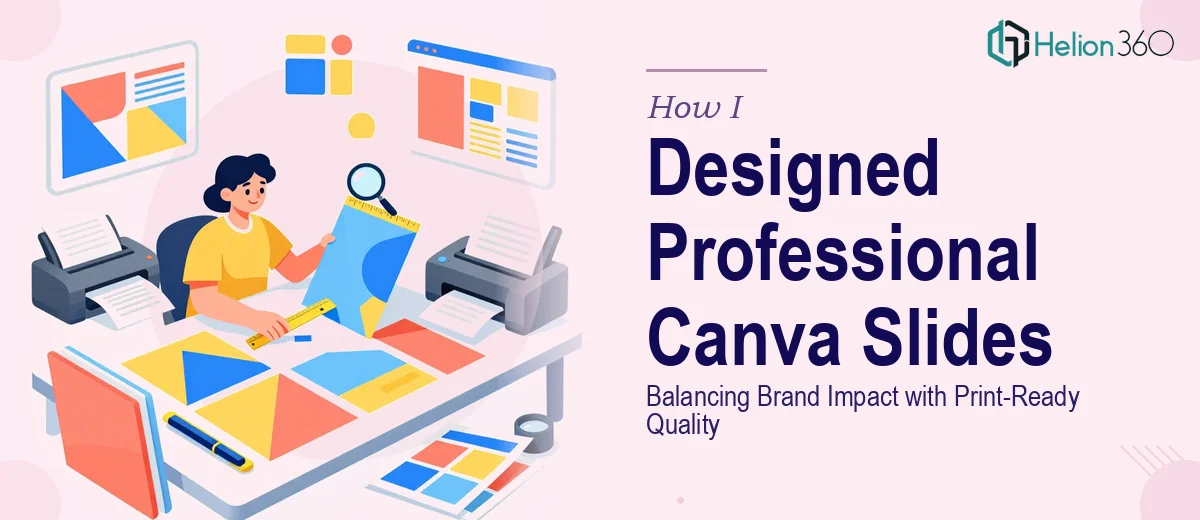
The Brief Sounded Simple Enough
I needed a set of Canva presentation slides that could do a few things at once — highlight key achievements, introduce upcoming projects, give a snapshot of our team, and look sharp whether displayed on a conference room screen or printed for a boardroom handout. The content was ready. The structure was mostly mapped out. What I needed was for it to actually look the part.
I figured Canva would make it straightforward. I had used it before for basic graphics, so I started building the slides myself. A few hours in, the cracks started to show.
Where It Started to Fall Apart
The challenge was not Canva itself — it is a capable tool. The challenge was making slides that held together as a cohesive, professional presentation rather than a collection of decent-looking individual pages.
Every time I adjusted the layout on one slide to fit a longer headline or a larger image, something broke on the next one. The font sizing was inconsistent. The color palette drifted as I worked through the deck. And the team section, which needed portraits and short bios laid out clearly, looked cluttered no matter how I arranged it.
Then there was the print issue. Slides that looked fine on screen were turning out muddy or misaligned when exported for print. Canva's default settings are built for digital, and adjusting for print-ready quality — proper bleed, resolution, and color profiles — is a different skill set entirely.
I was spending more time fixing small layout problems than actually working on the content.
Bringing in the Right Team
After losing most of a weekend to this, I reached out to Helion360. I shared the content brief, the brand colors and fonts, and a rough version of the deck I had started. Their team asked a few focused questions — about the print format, the audience, and how formal the tone needed to be — and then took it from there.
What came back was a fully built Canva presentation that actually looked like one coherent deck. The achievements section used a clean visual hierarchy that made the numbers stand out without feeling like a data dump. The upcoming projects slides were structured to hold attention, with clear section breaks and supporting visuals that did not overwhelm the text. The team page was laid out in a grid that felt warm but professional.
What Made the Difference
The detail that stood out most to me was how they handled the dual-use requirement. The slides were built to look polished on a digital screen but were also exported with proper print resolution. There was no pixelation, no cropping surprises, and the colors translated accurately to the printed version. That alone saved me from a last-minute scramble before the presentation.
Beyond the technical side, the visual storytelling was noticeably stronger. Instead of every slide looking like a standalone graphic, the deck had a flow to it. Each section transitioned naturally into the next, which made the whole presentation feel intentional rather than assembled.
The branding was consistent throughout — same typeface treatment, same spacing logic, same use of the brand palette across every slide. That kind of consistency is hard to maintain when you are building a deck yourself, especially under time pressure.
What I Took Away From This
Building Canva presentation slides that genuinely work for a professional audience — and for print — is more technical than it looks. It is not just about picking a nice template and filling in the content. It is about maintaining visual consistency, understanding how design choices translate across output formats, and making sure the layout supports the story rather than competing with it.
For a deck covering as much ground as this one did, having a team that understands both the design and the technical requirements made a real difference in the final result.
If you are working on a similar project — one that needs to cover multiple content areas and hold up in both digital and print formats — Helion360 is worth reaching out to. They handled the parts I could not and delivered a cohesive presentation deck I was genuinely confident presenting.