

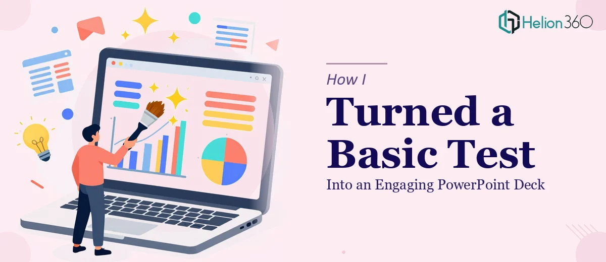
The Test Presentation That Needed a Real Makeover
I had a presentation sitting in my folder for weeks. It started as a test deck — something we threw together quickly to outline ideas and structure content before a proper build. The problem was, the deadline moved faster than expected, and that rough draft suddenly needed to become the real thing.
The slides were functional, but barely. Text-heavy, no consistent layout, a few stock images dropped in without much thought, and no real visual flow from one slide to the next. It communicated the information but did nothing to hold attention or tell a story. Anyone who looked at it could tell it was a placeholder — and that was a problem.
Why I Tried to Fix It Myself First
I figured I could clean it up. I know my way around PowerPoint well enough to adjust fonts, tweak colors, and rearrange content. So I started working through it slide by slide — standardizing the font sizes, adding some spacing, pulling in a few icons.
But the more I worked on it, the more I realized the issue wasn't cosmetic. The structure itself needed rethinking. Some slides were trying to do too much. Others had too little context to stand on their own. The visual hierarchy was off — there was no clear way for a viewer to know what mattered most on any given slide. Fixing the surface without fixing the underlying layout was just rearranging the same problem.
I also didn't have the design sensibility to know what a genuinely engaging PowerPoint presentation should feel like in terms of typography, color balance, and visual storytelling. That's a specific skill, and I didn't have enough of it to take this from rough to polished on my own.
Handing It Off to a Team That Could Actually Deliver
After hitting that wall, I came across Helion360. I sent them the test deck along with a brief explanation of what the presentation was for and what kind of audience would be seeing it. Their team asked a few focused questions about the message we wanted to land and the tone we were going for — professional but engaging, structured but not stiff.
Then they got to work. What came back wasn't just a cleaner version of what I'd sent — it was a fully rethought deck. The content had been restructured so each slide carried a single, clear idea. The visual design was consistent throughout, with a layout that guided the eye naturally from the headline to the supporting detail. Charts and data points that had just been pasted in as raw numbers were rebuilt into clean, readable visuals. The whole thing felt like it had been built with intention.
What the Final Deck Actually Looked Like
The transformation was significant. The slide count went down slightly because some content was consolidated smartly instead of spread across multiple half-empty slides. Every slide had a visual anchor — whether that was an icon, a well-placed image, or a clean data graphic — so the audience always had something to focus on beyond just reading text.
The typography was handled with real care. Hierarchy was clear. Headers read like headers. Supporting text supported rather than competed. The color palette was pulled from our brand guidelines but applied in a way that felt dynamic rather than flat.
Most importantly, the data-heavy PowerPoint now told a story. There was a beginning, a middle, and a close — and each section transitioned logically into the next.
What I Learned From the Process
The biggest lesson was recognizing where DIY stops making sense. I can handle minor edits, formatting fixes, and template adjustments. But taking a rough test presentation and turning it into something genuinely engaging requires design thinking — not just design tools. Knowing how to open PowerPoint and knowing how to build a compelling slide deck are two very different things.
The other thing I learned is that briefing matters. The clearer I was about the purpose of the deck and the audience it was for, the faster and more accurately the work came back.
If you're sitting on a presentation that started as a draft and never quite got to where it needed to be, Helion360 is worth reaching out to — they handled exactly the kind of transformation I couldn't manage on my own, and the result was a deck I was actually confident presenting.