

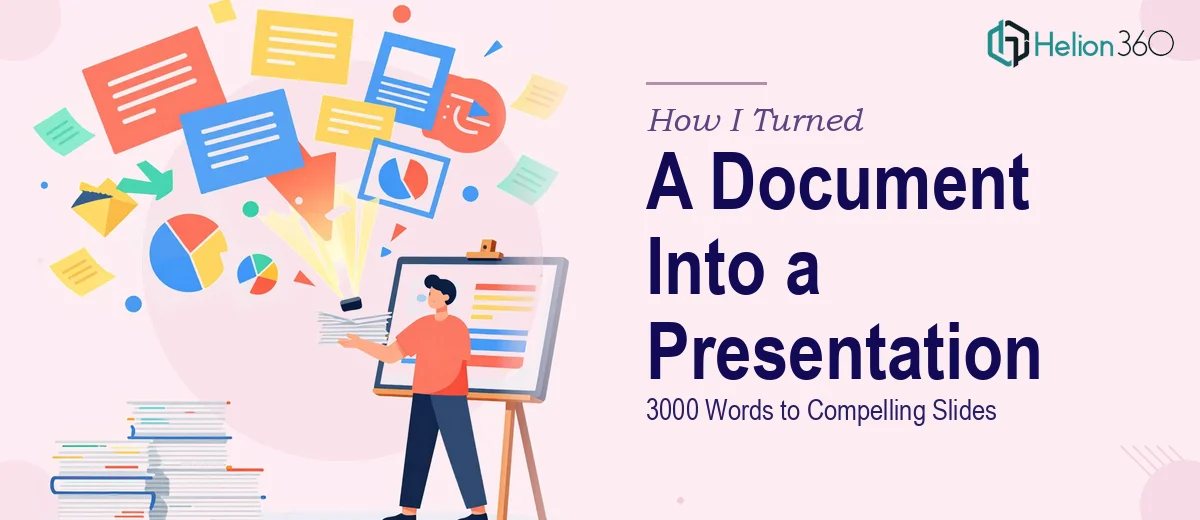
The Document Was Ready. The Presentation Was Not.
I had spent weeks putting together a 3000-word document — research, structure, data, commentary — all of it carefully written and logically organized. The next step was straightforward, or so I thought: convert it into a PowerPoint presentation for an upcoming review meeting.
How hard could it be? I opened a blank deck and started copy-pasting.
Where the Self-Attempt Broke Down
About an hour in, I had slides full of text blocks, inconsistent formatting, and no real visual hierarchy. The content made sense as a document. On slides, it felt suffocating. Paragraphs that read cleanly on paper turned into walls of text that no one would sit through in a room.
The real challenge was not typing — it was restructuring. A 3000-word document carries a level of detail that simply does not translate directly to a presentation. You have to decide what stays, what gets condensed, what becomes a visual, and what disappears entirely. That judgment call, repeated across dozens of slides, takes a specific kind of skill.
I tried trimming the content down manually, but I kept second-guessing myself. Cut too much and the message gets lost. Keep too much and the slides become unreadable. I also had no consistent design language — fonts were mismatched, spacing was off, and there was nothing visually tying the slides together.
After a few frustrated attempts, I accepted that turning this document into a proper presentation layout was going to take more than a free afternoon.
Handing It Over to Helion360
A colleague had mentioned Helion360 after a similar experience with a report-to-presentation conversion. I reached out, explained the situation — 3000 words, one document, needed as a clean, well-formatted PowerPoint — and shared the file.
Their team asked a few focused questions about the audience, the purpose of the presentation, and whether there were any brand guidelines to follow. That alone told me they were thinking about the presentation as a communication tool, not just a formatting exercise.
What the Final Presentation Looked Like
When I received the completed deck, the transformation was noticeable. The content had been reorganized into a logical slide-by-slide flow. Dense paragraphs had been broken down into clean key points with supporting visuals. Sections that were purely explanatory in the document had become structured layouts with headers, callout boxes, and well-placed whitespace.
The design was consistent throughout — a unified color scheme, readable typography, and a visual rhythm that made the deck feel intentional rather than assembled. Nothing felt templated or generic. It matched the tone of the content.
More importantly, it was actually presentable. Someone could stand in front of this deck and walk an audience through it without reading off the screen.
What I Learned From the Process
Converting a long-form document into a presentation is genuinely a different discipline. Writing is about completeness. Presentation design is about selectivity. You are not just reformatting content — you are making editorial decisions about hierarchy, emphasis, and what an audience can absorb in real time.
The formatting side — slide layouts, typography, visual consistency — is the part most people underestimate. It is what separates a deck that looks assembled from one that looks designed. Getting that right across 20 or 30 slides, while also restructuring 3000 words of content, is a full project on its own.
I also realized that attempting it myself was not wasted time. Working through the document helped me understand the structure better, which made it easier to brief the team clearly and review the output confidently.
If you are sitting on a long document that needs to become a polished PowerPoint and you are running into the same wall I did, Helion360 is worth reaching out to — they took a text-heavy file and returned something genuinely ready to present.