

When Your Slides Don't Match Your Vision
I had a clear idea of what the presentation should look like. Clean lines, bold greens, a layout that felt both modern and mission-driven. The startup I was working with — a sustainable technology company building eco-forward solutions — had a story worth telling. The problem was that their existing Canva slides told a very different story. They looked rushed, inconsistent, and honestly a little dated.
I volunteered to take on the Canva presentation redesign. I figured with some solid design instincts and a few hours in Canva, I could pull it together. I was wrong — at least about the timeline.
The Challenge Was Bigger Than Expected
The moment I opened the existing files, I could see the scope of the problem. There were no consistent type styles. Colors jumped from slide to slide. The brand tagline — Transforming Technology for a Greener Tomorrow — appeared in three different fonts across the deck. The header that was supposed to anchor the whole thing, GreenGrove Innovations: Leading the Way in Sustainable Tech, was buried in a generic text box that looked like a default template.
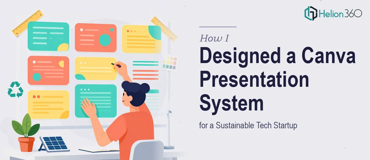
I spent the better part of a day trying to build a cohesive layout from scratch. I experimented with color palettes, tried several green-dominant schemes that felt both tech-savvy and eco-conscious, and worked on a slide master that could unify the deck. But every time I got one section looking right, another would fall apart. Spacing felt off. The visual hierarchy wasn't landing. And I wasn't confident that what I was building would actually scale across 20-plus slides without looking inconsistent.
This wasn't a matter of not understanding the brand — I knew exactly what the startup needed. The issue was execution at a level of detail and speed that I couldn't sustain on my own.
Bringing In the Right Team
After hitting that wall, I reached out to Helion360. I explained the situation — the outdated slides, the brand direction, the specific elements the startup wanted incorporated — and their team took it from there.
What I noticed immediately was how methodically they approached it. Rather than just polishing the existing slides, they built a proper Canva presentation system from the ground up. They established a consistent color framework anchored in the startup's bold green palette, introduced clean whitespace that gave the slides a modern, breathable feel, and made sure the brand messaging appeared with proper hierarchy throughout. The header slide with GreenGrove Innovations: Leading the Way in Sustainable Tech was redesigned with a strong visual anchor — not just text on a background, but a thoughtfully composed layout that commanded attention.
Every slide that followed felt like part of the same family. Font choices were deliberate. Icon styles matched. The tagline had its own dedicated visual treatment rather than being crammed into a corner.
What the Final Deck Actually Looked Like
The redesigned Canva presentation was a significant shift from what we started with. The layout was clean and structured — the kind of design that signals the company takes its work seriously. The green color story was strong without being overwhelming, which is a real balance to strike when representing a sustainability-focused brand in a tech space.
Helion360 also made sure the deck was built in a way that the startup's team could actually maintain. Slide templates were set up so anyone on the team could swap content without breaking the design. That practical consideration made the whole thing genuinely useful long-term, not just a one-time visual fix.
The startup's founder walked through the final deck and immediately saw the difference. The presentation now reflected the company's actual positioning — serious, modern, and purpose-driven.
What I Took Away From This
This project taught me that a Canva presentation redesign isn't just about making things look prettier. It's about building a visual system that holds together across every slide, every use case, and every audience. When that system needs to carry a brand's credibility into investor meetings, partner conversations, or public pitches, the details matter far more than I had initially estimated.
Knowing when to hand the work to people who do this at a professional level is not a failure — it's just efficient decision-making.
If you're working on a presentation redesign and realizing the complexity is beyond what you can manage solo, Helion360 is worth reaching out to — they stepped in when the work got too layered for me to handle alone and delivered something the startup was genuinely proud to use.