

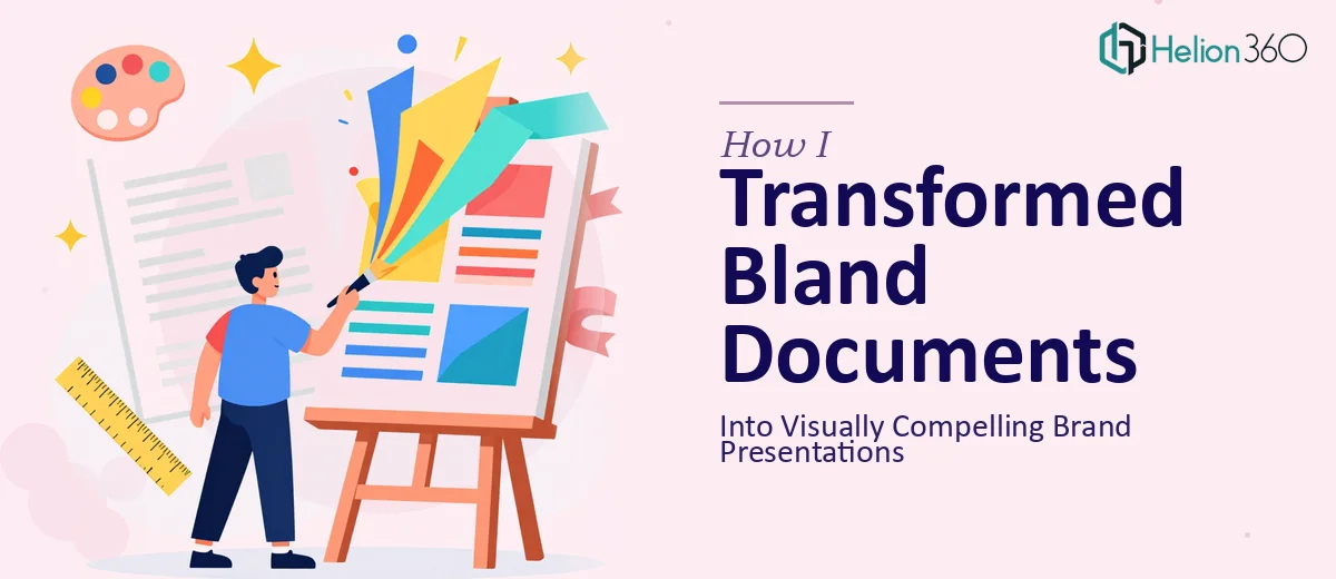
When Good Content Is Trapped in Bad Design
We had a solid story to tell. The problem was that nobody could see it through the formatting.
Our startup had been putting together PowerPoint decks and Microsoft Word documents for months — pitch overviews, product briefs, internal reports. The content was strong. But every time I opened one of those files, I saw the same thing: default fonts, misaligned text boxes, inconsistent colors, and slides that looked like they were built in a hurry — because they were.
For a growing startup trying to build brand credibility, that gap between what we were saying and how it looked was starting to matter.
Why I Tried to Fix It Myself First
I figured document design was something I could handle. I knew our brand colors and fonts. I had access to PowerPoint and Word. How hard could it be to clean things up?
The answer: harder than I expected.
Every time I adjusted one element, something else broke. I would fix the slide layout and the text would overflow. I would align the brand colors and suddenly the contrast made the text unreadable. The Word documents were even worse — section headers kept shifting, the logo placement wouldn't hold, and the page margins were inconsistent across different machines.
Beyond the technical issues, there was a bigger problem. I was too close to the content. I kept rearranging words instead of thinking visually. I could not step back and treat these as design problems. I was approaching them like editing problems, and that is a very different skill set.
After a few evenings of going in circles, I accepted that this needed someone who actually understood presentation design and professional document formatting — not just someone who used the tools occasionally.
Handing It Off to a Team That Actually Knew What to Do
I came across Helion360 while looking for a team that worked specifically on PowerPoint and Word document design. I explained the situation — a set of brand presentations and supporting documents that needed to look polished, consistent, and aligned with our visual identity.
What helped immediately was that they asked the right questions. They wanted to know about the brand guidelines, the audience for each document, and which files were highest priority. That level of structured thinking told me they were approaching this as a real design brief, not just a formatting task.
I sent over the files along with our brand kit, and their team took it from there.
What the Redesigned Files Actually Looked Like
The difference was significant — and I am not saying that loosely.
The PowerPoint decks came back with a clear visual hierarchy. Each slide had breathing room. The typography was consistent, the color usage was intentional, and the layouts actually guided the eye through the content in a logical order. The brand identity came through without being heavy-handed.
The Word documents were equally cleaned up. Section headers, body copy, spacing, and logo placement all held together the way they were supposed to. The files looked like they came from the same organization, which sounds like a low bar but is surprisingly hard to achieve when documents have been built by different people over time.
Helion360 also made some layout suggestions I had not considered — moving certain content blocks for better readability, simplifying some slides that had too much going on, and tightening the visual flow in the Word reports. These were not just cosmetic changes. They made the documents easier to use.
What This Process Taught Me
Presentation design and document formatting are not the same as knowing PowerPoint or Word. The tools are accessible to everyone, but knowing how to apply visual storytelling, brand consistency, and layout principles across a full document set is a distinct skill.
The other thing I learned is that trying to handle design work while also managing the content is genuinely difficult. The two tasks compete for attention, and neither gets done as well as it should.
For a startup that needs to make a strong impression — whether in a pitch meeting, a client proposal, or an internal review — the quality of your documents sends a signal before anyone reads a single word.
If your PowerPoint decks and Word documents are telling a weaker story than your content deserves, Helion360 is worth reaching out to — they handled the full scope of what I described here and delivered files that were ready to use without a second round of fixes.