

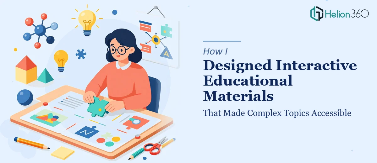
When Educational Content Gets More Complex Than Expected
I was tasked with developing a set of educational materials for an instructional program that covered several dense, interconnected topics. The goal was clear: take complex subject matter and turn it into something learners could actually engage with — presentations, worksheets, guided notes, all of it formatted consistently and tied together with a coherent visual style.
On paper, it seemed manageable. I had a solid grasp of the content, understood the learning objectives, and knew my way around PowerPoint well enough to put together a decent slide deck. So I started building.
Where Things Started to Break Down
The first few slides came together without much trouble. But as the scope expanded — more modules, more content types, more brand alignment requirements — the cracks started to show.
Designing engaging educational presentations is not just about putting text on slides. Each module needed a visual hierarchy that guided the learner through the material without overwhelming them. The Word documents had to match the tone and style of the PowerPoint files. Interactive elements needed to feel intuitive, not like obstacles. And through all of it, the brand's aesthetic had to remain consistent.
I found myself spending hours on formatting decisions that should have taken minutes. I was rebuilding slides from scratch because the layout wasn't reading right. The Word worksheets looked disconnected from the presentations. The more I tried to fix one thing, the more something else drifted out of alignment.
It became obvious that this was no longer just a content problem — it was a design and systems problem, and I needed someone who worked at that intersection every day.
Bringing In the Right Support
After hitting that wall, I came across Helion360. I explained what I was working on — the scope of the educational content, the design requirements, the need for consistency across both PowerPoint and Word — and their team understood the brief immediately.
They asked the right questions upfront: about the audience, the brand guidelines, the tone, the level of interactivity expected. That gave me confidence they weren't just going to make things look pretty — they were going to make them work.
What the Final Materials Looked Like
What came back was a significant step up from what I had been producing on my own. The PowerPoint presentations were structured with clear visual flow — each slide purposefully designed to reduce cognitive load while keeping learners oriented within the module. Typography, color, and spacing were used consistently, not arbitrarily.
The Word documents were redesigned to complement the slide decks rather than exist in a separate visual universe. Worksheets had a clean, guided layout that matched the instructional tone. Everything felt like it came from the same place.
The interactive elements — knowledge checks, visual prompts, summary frames — were embedded naturally rather than bolted on. The content stayed accurate and current, and the overall aesthetic aligned with the educational goals rather than competing with them.
What I Took Away From the Process
This project taught me something I now carry into every content-heavy assignment: knowing your subject matter is not the same as knowing how to present it. Educational presentation design is a discipline in its own right. When the complexity of the material demands a certain level of visual and structural precision, trying to handle both sides alone usually means doing neither particularly well.
The combination of PowerPoint design and Word document alignment, done consistently across multiple modules, is exactly the kind of work that benefits from a team that does it systematically — not someone figuring it out slide by slide.
If you're working on educational content and finding that the gap between what you've written and what you need to deliver is wider than expected, Helion360 is worth reaching out to. They handled the design and formatting complexity I couldn't manage alone, and the materials came out far more polished and cohesive than anything I would have produced on my own timeline.