

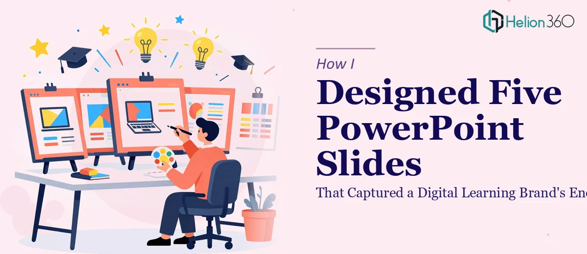
The Task Looked Simple at First
Five slides. That's all I had to work with. A digital learning company needed their existing PowerPoint presentation refreshed — not rebuilt from scratch, just elevated enough to match their brand's energy and look professional in front of a real audience.
On paper, it sounded manageable. But once I opened the files, I realized this was more nuanced than a quick formatting pass.
What Was Actually on Those Slides
The slides covered the company's core course offerings and learning materials. The content itself was solid — clear, structured, and on-message. The problem was purely visual. The layouts were flat, the typography felt generic, and the brand colors were applied inconsistently across slides. The logo appeared in different sizes and positions depending on the slide. There was no visual rhythm holding everything together.
For a digital learning brand, this mattered. These slides weren't internal-only documents. They were being shown to potential learners, partners, and stakeholders. The design had to reflect the same energy the company put into its actual courses.
Where I Hit a Wall
I started by trying to fix the color application and reposition the logo for consistency. That part went fine. But when I moved on to rethinking the layouts to make them genuinely engaging — without changing any of the core content — I ran into a real design problem.
The slides needed custom visual elements, better hierarchy, and some creative layout thinking that would feel fresh but still professional. This wasn't about knowing PowerPoint. I know my way around the tool well enough. It was about having the design instinct to look at flat slides and know exactly what they needed to come alive — and then execute that quickly, because the deadline was tight.
After spending more time than I should have on a single slide, I decided to stop spinning my wheels. I reached out to Helion360 and explained the situation. I shared the five slides, the brand colors, the logo files, and a brief note about the tone the company was going for — vibrant but still professional.
What Helion360 Delivered
Their team picked it up quickly. What I got back wasn't a template swap or a cosmetic touch-up. Each slide had been rethought from a layout perspective while keeping every piece of content exactly where it needed to be. The color scheme was applied with intention — accent colors used to draw attention to key points, neutral backgrounds giving the content room to breathe. The logo was placed consistently across all five slides and sized correctly relative to each layout.
The typography also got a proper treatment. Heading sizes, line spacing, and font weights were all aligned to create a clear visual hierarchy on every slide. The result looked like it came from a brand that takes its presentation seriously — which, for a digital learning company, is exactly the impression you want to make.
Helion360 turned it around fast, which mattered given the timeline I was working with.
What This Project Taught Me
I went into this thinking five slides would be a quick job. What I underestimated was how much design judgment goes into making a presentation feel cohesive and on-brand — especially when the constraint is that you cannot change the content, only the visual delivery.
PowerPoint slide design for digital learning materials is a specific skill. It's not just about making things look nice. It's about communicating the brand's credibility and energy through layout, color, and visual hierarchy, all within a format that has real limitations.
The final five slides looked like they belonged together and like they came from a company that knows what it is doing. That's exactly what the client needed, and it came from knowing when to bring in people who do this kind of work every day.
If you're sitting on a presentation that has good content but just isn't landing visually, Helion360 is worth contacting — they handled what I couldn't within the time I had, and the output was genuinely strong.