

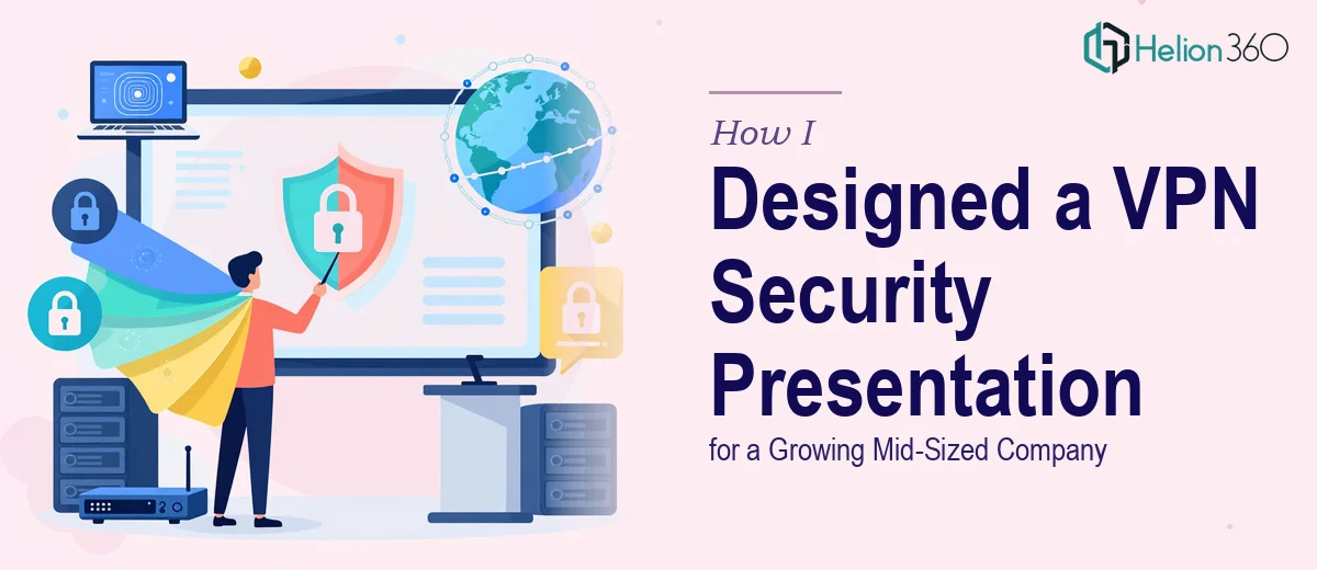
The Task That Looked Straightforward at First
When the request landed on my desk, it seemed manageable enough. A growing company with around 60 employees needed a polished PowerPoint presentation explaining VPN technology — what it is, why it matters, and how it would improve their day-to-day security and remote connectivity. The goal was to take something technical and make it clear, visual, and convincing for a non-technical leadership team.
I had handled internal presentations before, so I figured I could pull this together without too much trouble. I started by gathering information — reading up on VPN protocols, encryption standards, data privacy regulations, and remote access use cases. I had good content. What I underestimated was how long it would take to turn that content into something that actually looked professional and communicated clearly across 25 or more slides.
Where the Complexity Started to Show
The first draft I put together covered the basics well enough. I had a slide on what a VPN does, a few on why data privacy matters for a workforce of that size, and some points on implementation. But when I looked at it honestly, it read like a technical document dropped into a slide template. There were no real diagrams, no visual flow, and the data I had found — statistics on data breaches, remote workforce growth, cost of security incidents — was sitting in bullet points rather than being shown in a way that would actually land with an audience.
The company had a diverse team. Some employees were remote, some were in-office, and leadership needed to understand not just the concept but the business case. A wall of text was not going to do that. I needed proper infographics, a logical visual narrative, and slides that could hold attention without needing a presenter to explain every detail.
I also realized the scope was larger than I initially planned. A corporate VPN security presentation done properly means covering the problem context, the technical solution in plain language, implementation steps, security policy implications, and a compelling argument for why the investment makes sense. Four weeks suddenly felt tighter than expected.
Bringing in the Right Support
After hitting a wall with the visual design and overall structure, I came across Helion360. I explained what the project needed — a complete, well-designed PowerPoint presentation on VPN security for a company of 50 to 80 employees, built to communicate clearly with both technical and non-technical audiences. Their team took it from there.
What they brought to the project was the combination I was missing: strong visual design paired with an understanding of how information should flow in a corporate presentation. They restructured the content into a clean narrative arc — starting with the problem (why this company needed a VPN in the first place), moving through the solution and how it works, and closing with a clear implementation roadmap and supporting data.
What the Final Presentation Covered
The finished deck opened with context that made the risk tangible — statistics on small-to-mid-sized business data breaches and the specific vulnerabilities that come with remote and hybrid teams. From there, it explained VPN technology in plain terms with a well-designed network diagram showing how data flows with and without protection.
Middle sections addressed the practical side: how a VPN would work across different device types in the company, what the onboarding process for employees would look like, and what security policies would need to support it. The final slides made the business case directly, using visual data comparisons rather than raw numbers, which made a noticeable difference in how the information read.
The design itself was clean and consistent — branded to feel like a professional corporate document without being overdesigned. Every slide had a clear purpose and could stand on its own.
What I Took Away from This
Building a VPN security presentation for a mid-sized company is not just a content exercise. The visual design and information architecture matter just as much as the facts themselves. A technically accurate slide deck that no one can follow is not a useful tool — and Helion360 understood that distinction from the start.
The experience reminded me that there is a real difference between knowing the subject and knowing how to present it effectively to a specific audience. The company walked away with something they could actually use in a leadership meeting, and that outcome was only possible because the design work matched the quality of the content.
If you are working on a similar corporate technology presentation and finding that the design side is where things are stalling, Helion360 is worth reaching out to. Learn how to develop your team and streamline operations with Company Training Modules, explore how to design a polished company presentation, or review strategies for getting a high-impact PowerPoint presentation completed professionally — they stepped in at exactly the right point and delivered a finished product that held up under scrutiny.