

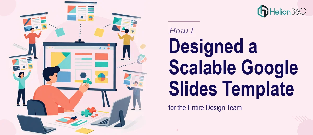
The Problem With Starting From Scratch Every Time
Every time someone on the team needed to put together a presentation, they would open Google Slides, pick a random theme, and start over. The result was a different look each time — different fonts, inconsistent color usage, misaligned logo placement. It looked like five different companies had made five different decks.
I was tasked with fixing this. The goal was simple: create one master Google Presentation template that carried our brand consistently, was easy to customize, and could be handed off to anyone on the design team without requiring a briefing session every time.
Simple in theory. Harder in practice.
Why a DIY Approach Wasn't Enough
I started by pulling together our brand guidelines — logo files, color codes, approved fonts. I opened Google Slides and began building out a template from scratch. The first few slides came together reasonably well. A title slide, a section divider, a content layout.
But then things got complicated. I needed to build in editable data visualization sections that would work across different slide types without breaking the layout. I also needed to make sure the custom fonts rendered correctly across different machines and browsers when other team members opened the file. And I wanted a clean, modern design aesthetic that didn't feel like a default Google theme — something with enough structure that designers could work quickly but enough flexibility that no two decks looked identical.
After a few days of iteration, I had a half-finished template that worked on my machine but was inconsistent when shared. The master slide logic wasn't fully set up, placeholder behavior was unpredictable, and the data visualization placeholders I had tried to build looked clunky.
I had the vision. I didn't have the execution bandwidth to see it through — at least not on the timeline we needed.
Bringing in the Right Help
A colleague pointed me toward Helion360. I reached out, shared the brief, and explained what the template needed to do: brand-aligned visuals, consistent typography, editable sections for data and charts, clean layout logic that a team of designers could use without running into formatting issues.
Their team asked the right questions upfront — about how many slide layouts we needed, what kinds of data visualizations were most common in our presentations, and whether the template needed to support both light and dark versions. That conversation alone told me they understood what a scalable Google Slides template actually required, not just a pretty first slide.
What the Final Template Included
Helion360 delivered a fully structured Google Presentation template that covered every core use case our team had. The master slide setup was clean and logical, which meant any designer on the team could open it and immediately understand which layouts to use for which content types.
The typography was locked in using approved fonts, with fallback instructions included for team members working across different environments. The color scheme was embedded at the theme level, so every new element defaulted to our brand palette automatically. The logo placement was handled through master slides, so it appeared consistently without needing to be manually added to each new deck.
The data visualization sections were the part I had struggled with most on my own. The delivered template included pre-built chart placeholder layouts — bar charts, comparison tables, metric callout boxes — all formatted to match the overall aesthetic. They were easy to update with real data without disrupting the surrounding design.
The whole thing was organized into clearly labeled sections so any designer could navigate the template file in under a minute.
What Changed After the Template Was Deployed
The difference was immediate. Presentations that used to take half a day to format were done in an hour. More importantly, they looked like they came from the same company. Stakeholders noticed. Internal reviews stopped getting sidetracked by design inconsistencies.
Having a solid custom Google Slides template also raised the baseline quality of everything we presented externally. When your starting point is already on-brand and well-structured, the final output almost always ends up better.
I also learned something practical through this process: building a presentation template that works for a team is a different skill from building a presentation for a single use. The structural logic, the master slide hierarchy, the placeholder behavior — these things matter a lot when multiple people are editing the same file type repeatedly.
If you're in a similar situation — trying to create a branded, team-ready Google Presentation template and running into the same kinds of structural and design challenges — Helion360 is worth reaching out to. They handled exactly the parts that were slowing me down and delivered something the whole team could actually use.